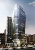
I think this is actually a vast improvement over the original design, and I'm much more excited about this one! The overhang and top-heavy features that some of you are complaining about actually seems like something I would like to see accentuated even more. The symmetry on the Old Stock Exchange facade looks great from Howe Street side, and the way it meets the street is quite sophisticated.
I'd like to see another daytime rendering showing the effect of the glass. The one we see looking up from Howe Street shows a favourable view with plenty of symmetry, but would like to see from Pender side also.
Looking at the project site at
http://www.theexchangebuilding.ca/, I do think a pure hexagon floorplate would have been a better solution to address the Jameson proxmity issues. It would have been so much better than taking out a notch in that corner, and could have turned a problem into an opportunity for a clever response. Although... I am not certain the floor plans shown on the site are correct, since they seem at odds with what I see in the renders.
My only other criticism so far, is that I might think it would be better if it had been taller and/or narrower from the Howe Street (main) side.
Its a serious-minded building and I think that is a good thing.





 Prev
Prev


 ...went from a unique, interesting design to the typical "Vancouver Special" style of highrise office tower construction. The first version outclasses this drek version by 100X. The only missing now is the green glass and converting most of the tower to condos and the typical Vancouver ugly trifecta will be complete Epic Fail!!


 Linear Mode
