HomeDiagramsDatabaseMapsForum About
     

Go Back   SkyscraperPage Forum > Regional Sections > Canada > Alberta & British Columbia > Vancouver > Downtown & City of Vancouver


    The Exchange in the SkyscraperPage Database

Building Data Page   • Comparison Diagram   • Vancouver Skyscraper Diagram

Map Location

Reply

 
Thread Tools Display Modes
     
     
  #241  
Old Posted Feb 26, 2013, 8:31 PM
Graham_Yvr's Avatar
Graham_Yvr Graham_Yvr is offline
Registered User
 
Join Date: Oct 2009
Location: Vancouver
Posts: 270
Quote:
Originally Posted by Mininari View Post
Yikes. I have not been following this story close enough.
I say let this one die... try again in 10 years.
AGREED! This is ghastly!
Reply With Quote
     
     
  #242  
Old Posted Feb 26, 2013, 8:35 PM
East Van East Van is offline
Registered
 
Join Date: Jan 2003
Location: PacificNorthWest
Posts: 713
This sure turned out to be an ugly waste of 'height'. The look of the tower is severely dated before it gets built. To the resident whiners at Jameson, fack off!

How big is the floor plate ??

Last edited by East Van; Feb 27, 2013 at 4:28 AM.
Reply With Quote
     
     
  #243  
Old Posted Feb 26, 2013, 9:15 PM
itinerant's Avatar
itinerant itinerant is offline
Registered User
 
Join Date: Jan 2008
Location: Vancouver
Posts: 230
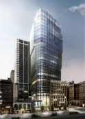
I think this is actually a vast improvement over the original design, and I'm much more excited about this one! The overhang and top-heavy features that some of you are complaining about actually seems like something I would like to see accentuated even more. The symmetry on the Old Stock Exchange facade looks great from Howe Street side, and the way it meets the street is quite sophisticated.

I'd like to see another daytime rendering showing the effect of the glass. The one we see looking up from Howe Street shows a favourable view with plenty of symmetry, but would like to see from Pender side also.

Looking at the project site at http://www.theexchangebuilding.ca/, I do think a pure hexagon floorplate would have been a better solution to address the Jameson proxmity issues. It would have been so much better than taking out a notch in that corner, and could have turned a problem into an opportunity for a clever response. Although... I am not certain the floor plans shown on the site are correct, since they seem at odds with what I see in the renders.

My only other criticism so far, is that I might think it would be better if it had been taller and/or narrower from the Howe Street (main) side.

Its a serious-minded building and I think that is a good thing.

Last edited by itinerant; Feb 26, 2013 at 9:28 PM. Reason: Floor plan is disappointing after viewing project website
Reply With Quote
     
     
  #244  
Old Posted Feb 26, 2013, 10:27 PM
officedweller officedweller is offline
Registered User
 
Join Date: Jul 2001
Location: Vancouver
Posts: 41,578
Quote:
Originally Posted by phesto View Post
I really don't get the angled facade on the Pender St. side...is this to mimic the setback on Jameson side?

It looks like Gugger was trying really hard to avoid a box, but would've been better suited with a simple, clean box. The angled cut back on the Jameson side is fine since nobody will see the building from that angle.
The angle on the Pender side was there in the original design too - not sure why - maybe to provide a better view from the offices?

Agreed that a clean simple box would have looked better. Or even an art deco reference by having a larger lower floorplate and then stepping back the tower, rather than overhanging.

If they are hoping to design a "contorted" tower, then make it even more contorted than just a couple of overhangs on just one side.
Maybe they did the overhang to avoid "copying" Telus with the protruding box?

Another nighttime pics from the website - looks like there is a garden atrium on the Pender side:


http://www.theexchangebuilding.ca

Last edited by officedweller; Feb 26, 2013 at 10:49 PM.
Reply With Quote
     
     
  #245  
Old Posted Feb 26, 2013, 10:51 PM
queetz@home's Avatar
queetz@home queetz@home is offline
Go Rotem! Die Bombardier!
 
Join Date: Jul 2001
Location: Ortigas
Posts: 3,679
Oh dear lord!!! All this because of some rich b*tch and people like her living in the Jaimeson??? Goodness gracious, those people have no business living in the business district with that kind of attitude, and now look what they have done to our beautiful proposed office tower!

I too am no longer sad that this project is dead. Yes, maybe 10 years from now, a new design will come up when it is time to build another set of office towers in downtown Vancouver...
Reply With Quote
     
     
  #246  
Old Posted Feb 26, 2013, 11:07 PM
Millennium2002 Millennium2002 is offline
Registered User
 
Join Date: Jun 2009
Posts: 1,742
... ehh?

I agree that the original design was the best, and that this current iteration looks too top-heavy.

However, I think it'll look more elegant if they just adjusted the proportions of the overhang like this:


Credits to CTV for the base image. I just edited it to illustrate a different take. No firm technical specs e.g. # of floors per overhang is implied in this photo.

Or even better, take these proportions as a base and make the overhang flat-slanted or smoothly curved...

In any case, it's not a write-off... yet. There's room for improvement, as they say.
Reply With Quote
     
     
  #247  
Old Posted Feb 26, 2013, 11:53 PM
trofirhen trofirhen is offline
Registered User
 
Join Date: Oct 2008
Posts: 9,045
Doesn't one rule of aesthetics state that a tower should be stepped BACK, if it's going to be stepped at all ... and not OVERHANG like this piece of ugly trash?

And what about the colour? Another grey-black charcoal materpiece to illuminate they grey Vancouver sky? Freak it!! I'm so disgusted and angry ... I hope there'll be a massive public outcry against this,against the fat-cat residents who comandeered it, the weak-kneed civic government that caved into it, and the awkward boxy design, complete with the nice dark drab colour scheme
Reply With Quote
     
     
  #248  
Old Posted Feb 27, 2013, 12:32 AM
Canadian Mind's Avatar
Canadian Mind Canadian Mind is offline
Registered User
 
Join Date: Aug 2006
Posts: 3,907
Honestly if they just removed the kick-out portions, increased the height to make up for the square footage, and gave it a decent crown (preferably something that tapers in and is lit), it wouldn't be so bad.
__________________
"you're eating chicken periods" - Vid
"I love eggs, especially the ones with runny yolks" - Me
"EWWWWWWWWWWWWWWWWWWWWWW, you're disgusting!" - Vid
Reply With Quote
     
     
  #249  
Old Posted Feb 27, 2013, 12:41 AM
trofirhen trofirhen is offline
Registered User
 
Join Date: Oct 2008
Posts: 9,045
Quote:
Originally Posted by Canadian Mind View Post
Honestly if they just removed the kick-out portions, increased the height to make up for the square footage, and gave it a decent crown (preferably something that tapers in and is lit), it wouldn't be so bad.
That's true, in fact!! But given that this is Vancouver, the question is ..... will they? Would they?
Reply With Quote
     
     
  #250  
Old Posted Feb 27, 2013, 1:19 AM
ckkelley's Avatar
ckkelley ckkelley is offline
Bridge Walker!
 
Join Date: Feb 2006
Location: The Forest City
Posts: 1,037
Dear god.
__________________
Just chimin' in.
Reply With Quote
     
     
  #251  
Old Posted Feb 27, 2013, 2:21 AM
logan5's Avatar
logan5 logan5 is offline
Registered User
 
Join Date: Feb 2011
Location: Mt.Pleasant - The New Downtown South
Posts: 8,157
The rendering is a little vague, but it looks a lot like Oceanic Plaza at 1066 W. Hastings. That building is quietly one of the nicest looking buildings in Vancouver.

This Credit Suisse proposal will surely be superior to 99% of the condo towers that dominate our skyline, so I hope it is quite prominent.
Reply With Quote
     
     
  #252  
Old Posted Feb 27, 2013, 2:52 AM
officedweller officedweller is offline
Registered User
 
Join Date: Jul 2001
Location: Vancouver
Posts: 41,578
I think the curtainwall will most resemble the Howe & Cordova corner of PWC Place tower at Granville Square.
It's the massing that is incredibly awkward.
Reply With Quote
     
     
  #253  
Old Posted Feb 27, 2013, 4:01 AM
Cypherus's Avatar
Cypherus Cypherus is offline
Registered User
 
Join Date: Jan 2007
Location: Surrey
Posts: 1,759
Even if the Jamieson residents were the catalyst for the redesign, there is no excuse for the architect to come up with travesty instead.
Reply With Quote
     
     
  #254  
Old Posted Feb 27, 2013, 4:21 AM
officedweller officedweller is offline
Registered User
 
Join Date: Jul 2001
Location: Vancouver
Posts: 41,578
True - it really shows a lack of imagination.

I'd rather see protruding boxes like warts all over the facade than just a couple of overhangs.
Reply With Quote
     
     
  #255  
Old Posted Feb 27, 2013, 4:53 AM
EdinVan EdinVan is offline
EdInVan
 
Join Date: May 2008
Location: Sodom and Gomorrah
Posts: 785
Quote:
Originally Posted by Architype View Post
The design is very restrained, understated, which admirably puts more focus on the older building.
I agree. I quite like it. Reminds me a bit of the CBS Building.
Reply With Quote
     
     
  #256  
Old Posted Feb 27, 2013, 5:57 AM
CBeats CBeats is offline
Registered User
 
Join Date: Mar 2009
Posts: 422
This is laughably unattractive.
Reply With Quote
     
     
  #257  
Old Posted Feb 27, 2013, 3:21 PM
EastVanMark EastVanMark is offline
Registered User
 
Join Date: Oct 2006
Posts: 1,610
just shocking...went from a unique, interesting design to the typical "Vancouver Special" style of highrise office tower construction. The first version outclasses this drek version by 100X. The only missing now is the green glass and converting most of the tower to condos and the typical Vancouver ugly trifecta will be complete Epic Fail!!
Reply With Quote
     
     
  #258  
Old Posted Feb 28, 2013, 2:26 AM
dleung's Avatar
dleung dleung is offline
Registered User
 
Join Date: Nov 2009
Location: Toronto
Posts: 6,543
I like top-heavy designs, 1400 Howe is one of them. This one is retardation on full throttle.

Quote:
Originally Posted by Architype View Post
The design is very restrained, understated, which admirably puts more focus on the older building. That, however, may not be enough in this case as it feels like it's lacking something, perhaps a sense of personality and greater identity.
Yes, very "admirable". They've "succeeded" in creating a bland building. Are you our Caltrane now?

Reply With Quote
     
     
  #259  
Old Posted Feb 28, 2013, 4:17 AM
trofirhen trofirhen is offline
Registered User
 
Join Date: Oct 2008
Posts: 9,045
Quote:
Originally Posted by EastVanMark View Post
just shocking...went from a unique, interesting design to the typical "Vancouver Special" style of highrise office tower construction. The first version outclasses this drek version by 100X. The only missing now is the green glass and converting most of the tower to condos and the typical Vancouver ugly trifecta will be complete Epic Fail!!
I agree totally with everything you say!! But aren't we forgtting something? It would not be Politically Correct not to cater to the desires of residents (even downtown residents), if we didn't bow to their wants, instead of downtown Vancouver and the CBD itself. And this is Vancouver, Canada, so we MUST be politically correct, even if it means taking a snazzy design for all to appreciate it, and trashing it for the domestic comfort of a favored few, so now, now .....
Reply With Quote
     
     
  #260  
Old Posted Mar 1, 2013, 6:45 AM
Redkey's Avatar
Redkey Redkey is offline
Registered User
 
Join Date: Mar 2012
Location: Toronto
Posts: 156
What the hell happened to the old design?
Reply With Quote
     
     
This discussion thread continues

Use the page links to the lower-right to go to the next page for additional posts
 
 
Reply

Go Back   SkyscraperPage Forum > Regional Sections > Canada > Alberta & British Columbia > Vancouver > Downtown & City of Vancouver
Forum Jump


Forum Jump


All times are GMT. The time now is 3:12 PM.


Powered by vBulletin® Version 3.8.7
Copyright ©2000 - 2026, vBulletin Solutions, Inc.