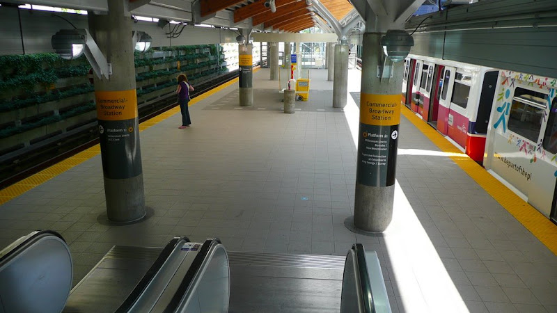
Well, here is what Commercial portion of Commercial-Broadway looks like now:
Photography by Deasine - Hosted on Picasa Web Albums - Creative Commons Protected
Photography by Deasine - Hosted on Picasa Web Albums - Creative Commons Protected
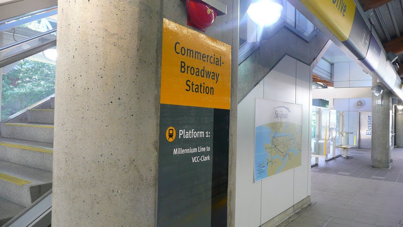
These "sticker" signs are quite similar to the ones used at Waterfront Stn. Have to say, it's quite ugly and incomplete looking, especially if you actually follow around at the ends of the sign.
First of all, Platform 1 signs displays the train terminus, whereas Platform 2 signs display the cities. Yes, displaying the cities are nice, but it should really say "Waterfront via Columbia" instead. While I prefer inidicating platforms as numbers, now, we have an inconsistency with the Canada Line, where they use inbound/outbound. There's also a lack of signs coming down the stairs to the platforms.
Well, at least they have something.





 Prev
Prev


 Linear Mode
