HomeDiagramsDatabaseMapsForum About
     

Go Back   SkyscraperPage Forum > Regional Sections > Canada > Alberta & British Columbia > Vancouver > Transportation & Infrastructure


Closed Thread

 
Thread Tools Display Modes
     
     
  #2281  
Old Posted Dec 15, 2007, 8:35 AM
mr.x's Avatar
mr.x mr.x is offline
Registered User
 
Join Date: Dec 2003
Location: Stockholm
Posts: 12,805
Quote:
So you're Chinese Mr.X2? Me too.
lol, well my point is me being Chinese pretty much eliminates most of you.....Willy Wonka's golden ticket was not up for grabs.


Quote:
Originally Posted by deasine View Post
Now here is what I'm confused: if they are changing the Canada Line colours to Blue/Green, does that mean the colour of the line is green and not red? Wonder what will happen with the Evergreen Line, a different shade of green?! I still don't like the colour of the trains... the blue is VERY SHARP and sigh... Would have liked it if it was all nice and white like our Mark IIs OR Make it look like our buses, dark grey, blue yellow lines (or in this case blue/green).

I like how the voice and chimes are exactly the same as the current SkyTrain system.
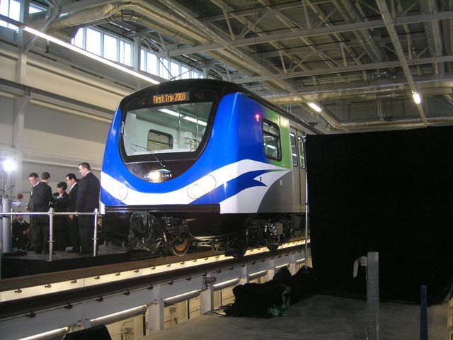
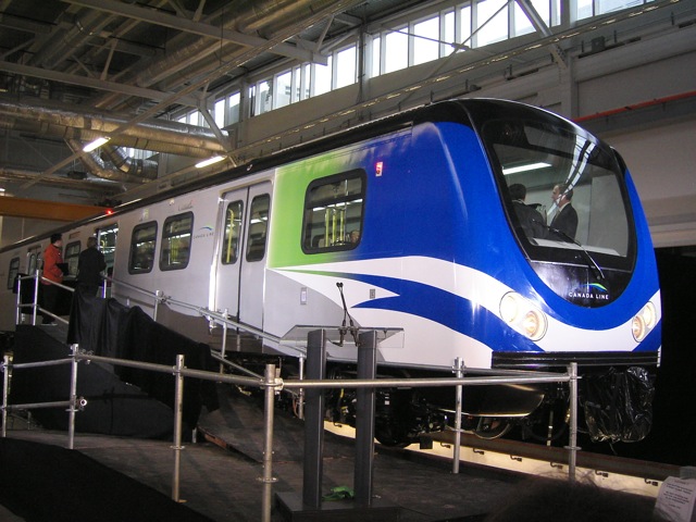
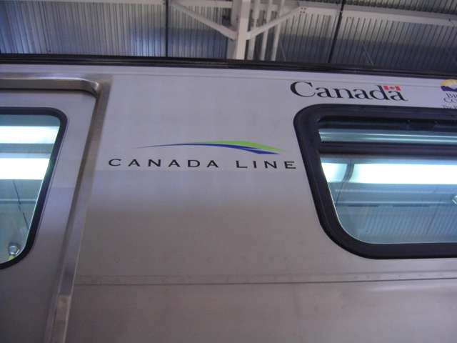
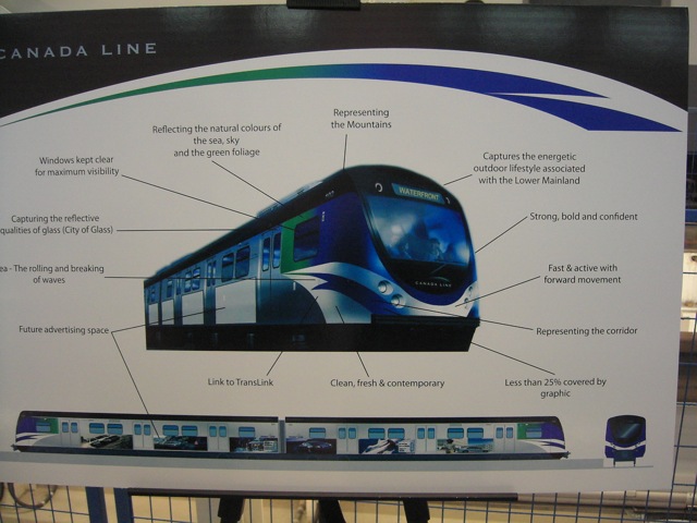
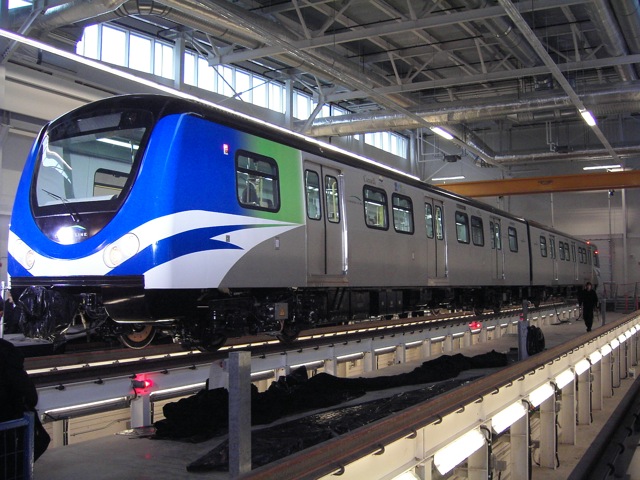
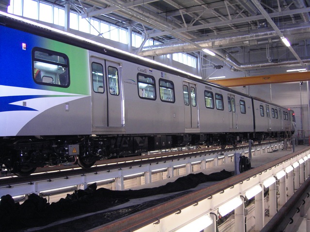
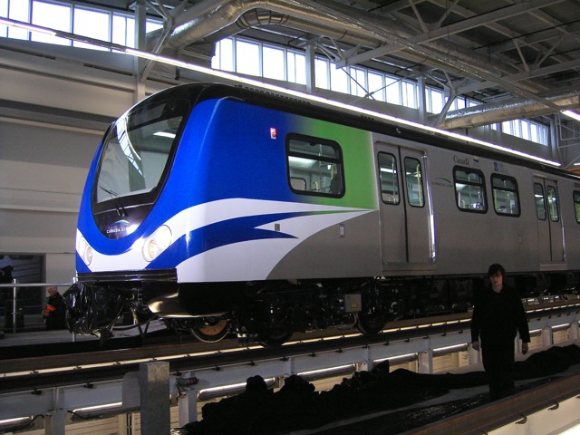
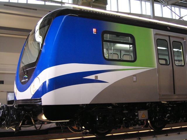
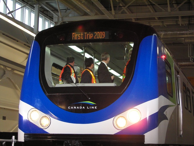
Yup, the Canada Line brand has changed from red/blue/yellow to blue/green (and coincidentally, that's also the brand of city hall, 2010, the Canucks, etc....not that it's a bad thing, i quite like it).

With regards to the Evergreen Line, i would think it would use a more earthly green tone like this.

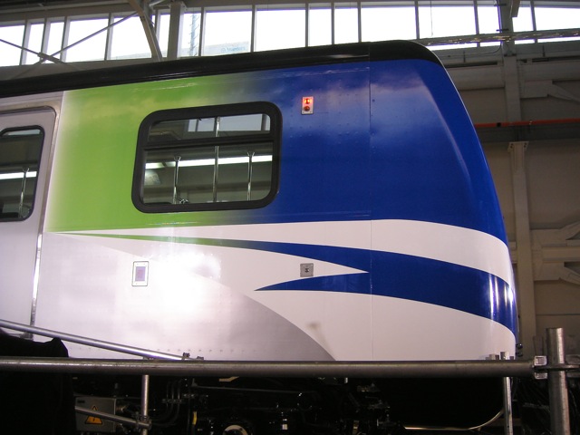
I would have much preferred if they had painted it entirely or maybe have it partially painted all along the sides (not just the front) with some sort of continuation from the tail livery design. But what they have now is actually surprisingly not that bad. And it's not like we can't repaint it with a new livery over the next few decades....afterall, that's what is happening with the Mark I's (replacing the Expo blue/red stripes with the new generation blue/yellow swooshes), even though it seems like it's taking Translink forever to do it.


I wonder whose voice that really is, and how much she gets paid for doing this lol.

     
     
  #2282  
Old Posted Dec 15, 2007, 9:17 AM
mr.x's Avatar
mr.x mr.x is offline
Registered User
 
Join Date: Dec 2003
Location: Stockholm
Posts: 12,805
Canada Line Discussion: Vehicles | Operational in August | Use Canada Line Thread


  #2283  
Old Posted Dec 15, 2007, 9:18 AM
mr.x's Avatar
mr.x mr.x is offline
Registered User
 
Join Date: Dec 2003
Location: Stockholm
Posts: 12,805
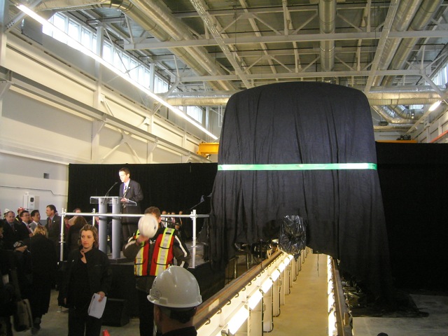
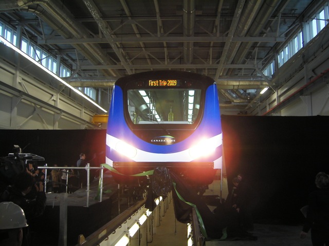
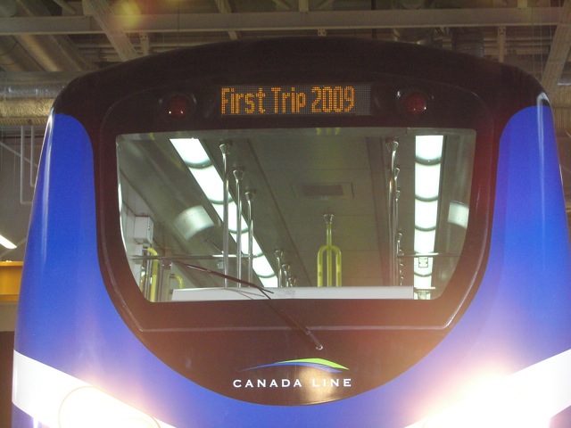
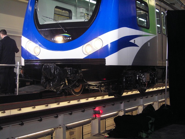
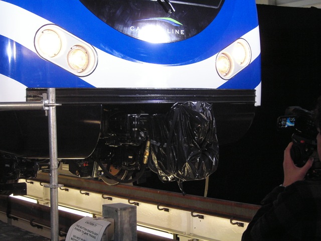
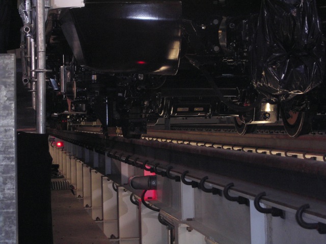
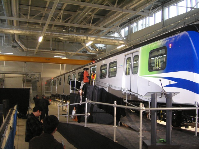
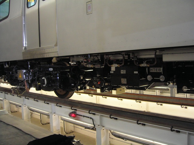
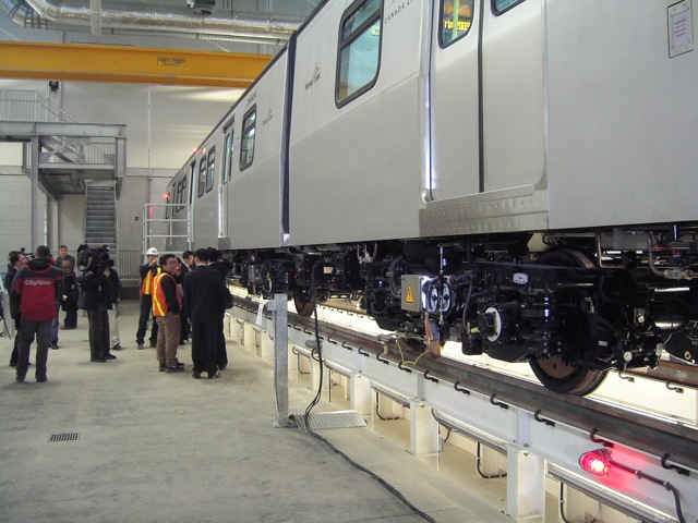
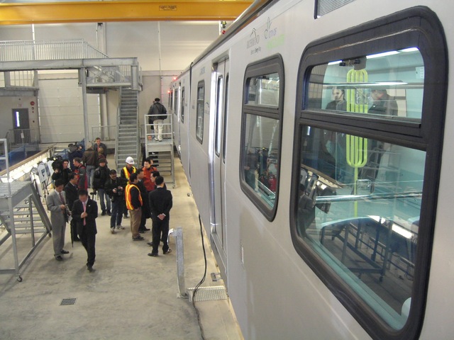
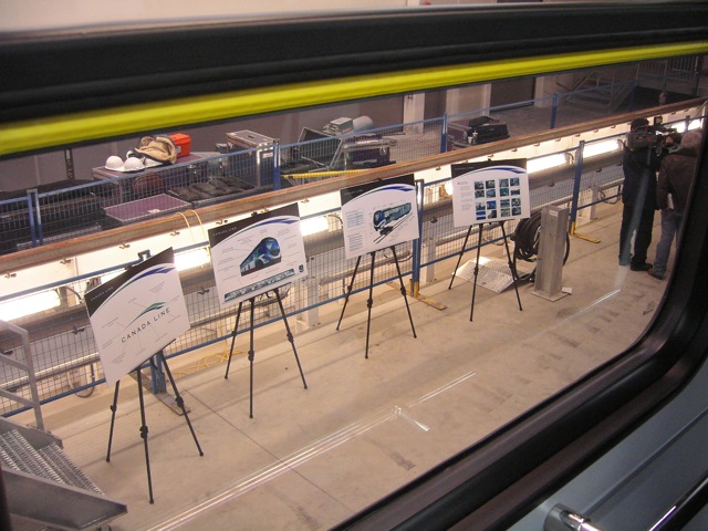
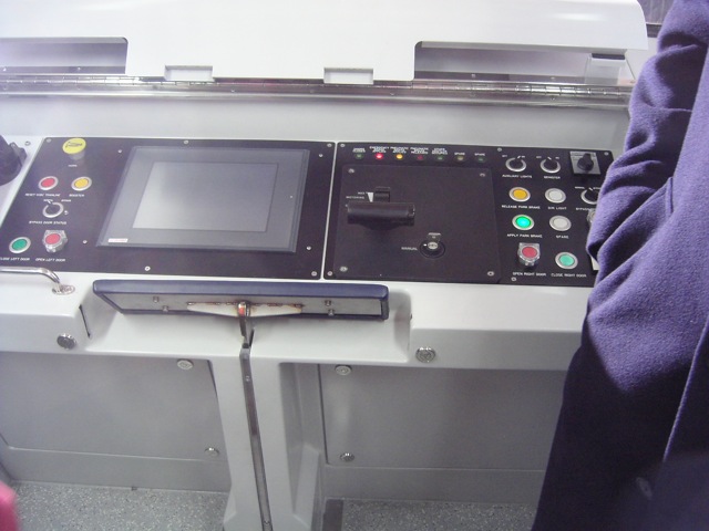
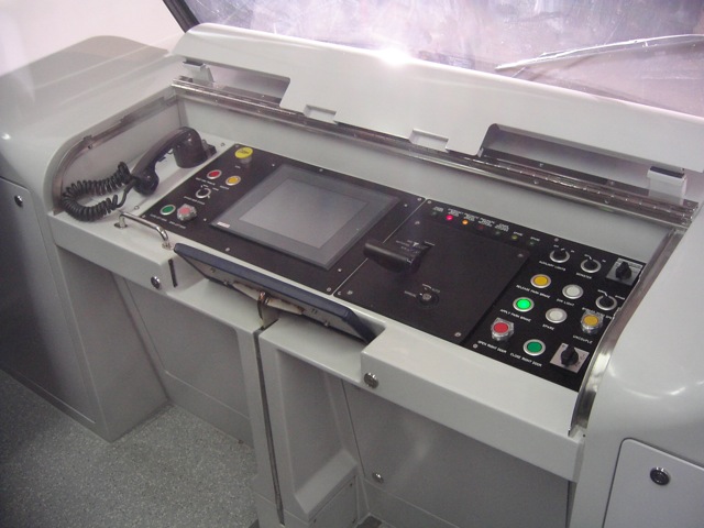
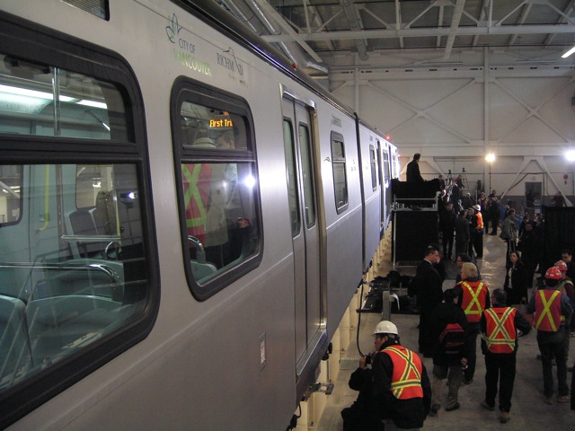
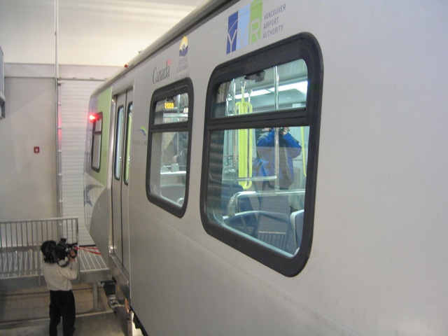
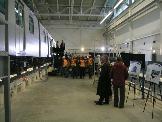
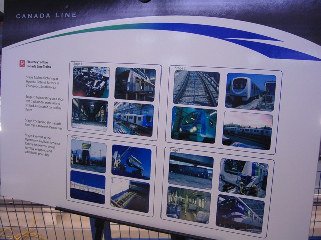
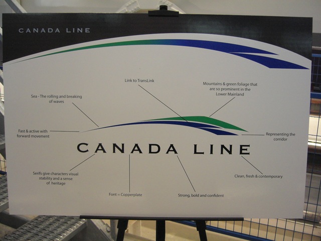
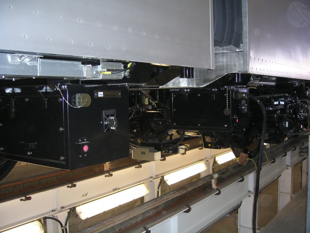
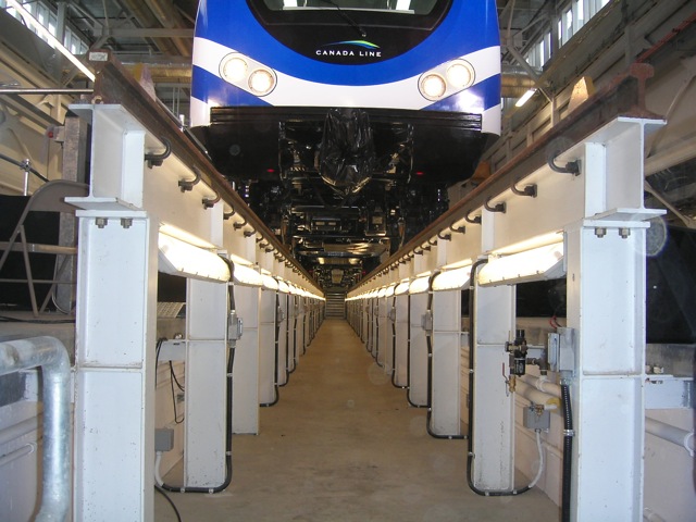
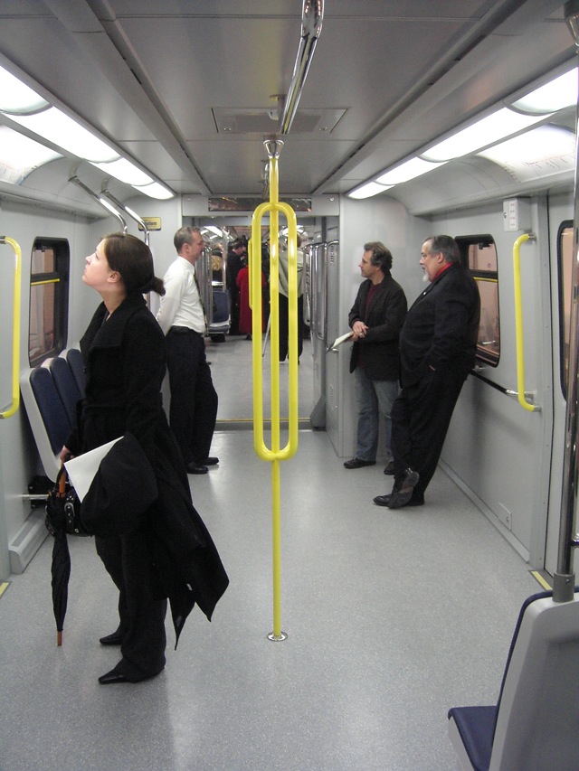
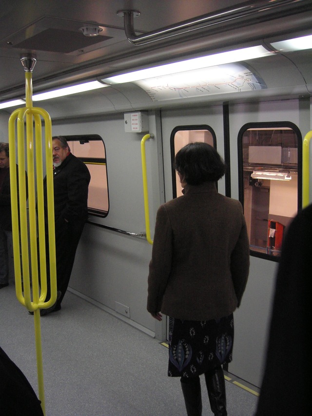
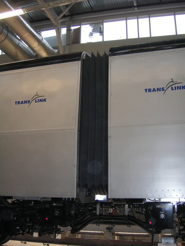
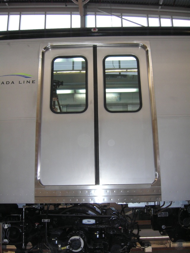
CANADA LINE TRAIN UNVEILING PICTURES by TAFRYN...i'm beginning to think he's a InTransitBC employee.
http://canadalinephotos.blogspot.com/


Looks like the reason why the train isn't fully painted is because they will be putting ads on it....lots of them.


  #2284  
Old Posted Dec 15, 2007, 10:08 AM
clooless clooless is offline
Registered Luser
 
Join Date: Nov 2006
Location: Calgary, Alberta
Posts: 424
Quote:
Originally Posted by bils View Post
umm, what's the difference between this and the leaked rendering???
Nobody has answered this question yet. I also see very little difference between the leaked design and the final version, and I don't like either, to be honest.

I would have preferred if they had just painted the entire car white, but given that advertising is going to cover the lower half of the sides of the trains (unsurprisingly), I suppose that would be a waste of paint.
     
     
  #2285  
Old Posted Dec 15, 2007, 10:36 AM
squeezied's Avatar
squeezied squeezied is offline
Registered User
 
Join Date: Jul 2006
Location: Vancouver, BC
Posts: 1,625
Quote:
Originally Posted by mr.x2 View Post
[B][SIZE="3"]


oh please...
     
     
  #2286  
Old Posted Dec 15, 2007, 11:00 AM
excel excel is offline
Registered User
 
Join Date: Oct 2005
Location: Calgary
Posts: 3,484
Looks good.
     
     
  #2287  
Old Posted Dec 15, 2007, 7:28 PM
mezzanine's Avatar
mezzanine mezzanine is offline
Registered User
 
Join Date: Aug 2002
Posts: 2,011
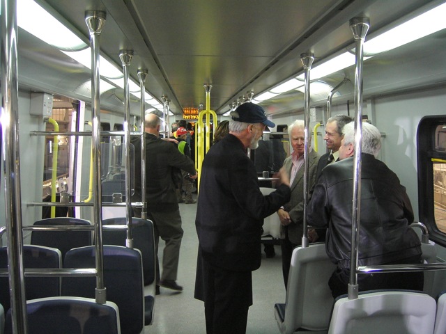
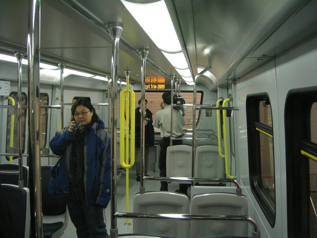
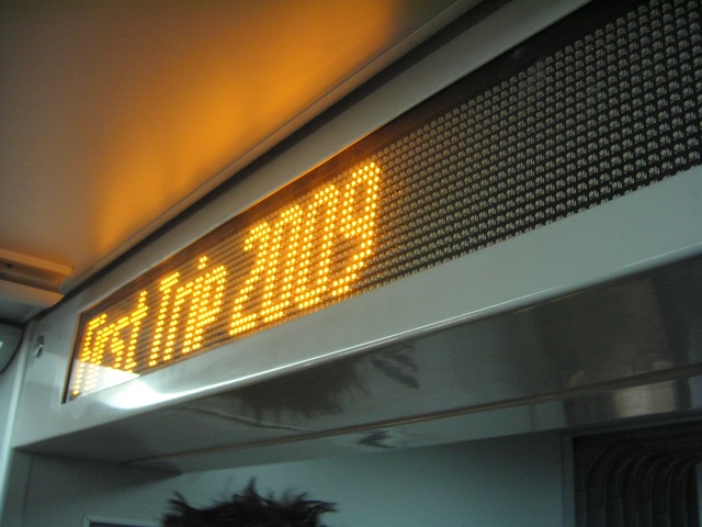
-I like the interior electronic signs, i wonder why they weren't built into the MK2 trains.

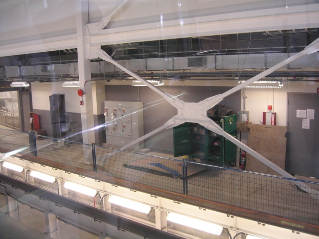
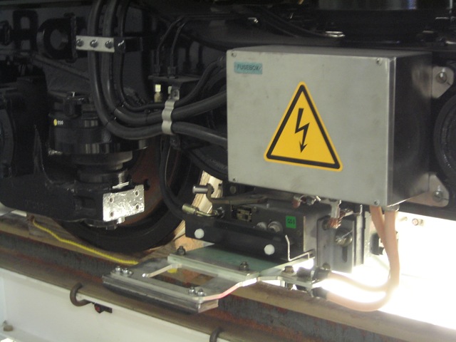
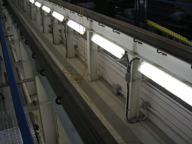
-if that's the OMC, it looks pretty posh, yet functional (eg. being able to light up the under carriage with the special track). maybe because everything is still clean and new...

-the branding scheme looks quite good. I was worried about intransit wanting to stand apart from translink, but it looks quite polished, yet harmonious with the translink logo (translink's yellow always looked odd...)

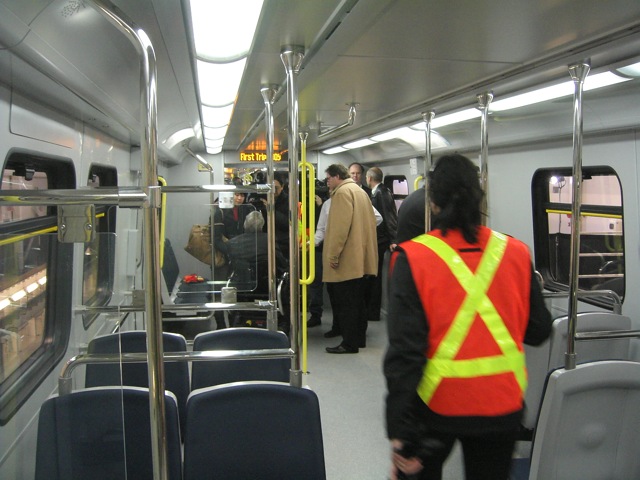
-interior lighting of the cars looks industrial, in a bad way. I always admired the treatments in the MK2 cars with their interior lighting (i.e. the recessed celing lights along with fluorecents.)

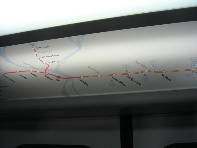
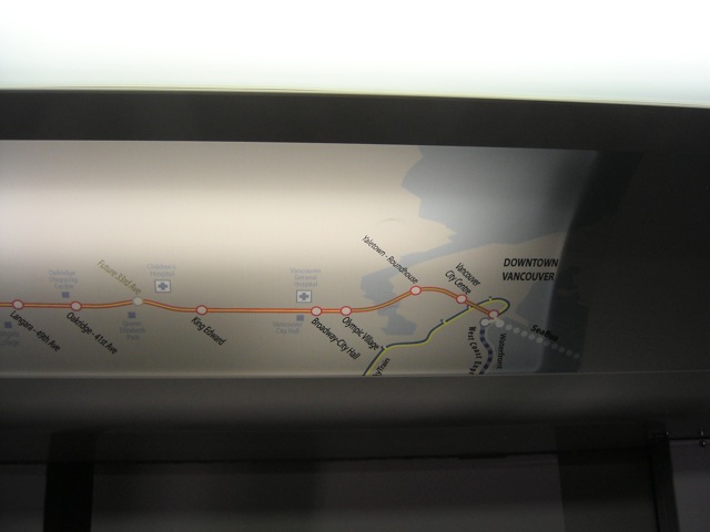
The route map is also growing on me. it highlights important sites by stations (like VGH). It would be nice to include M and E line, but it would have to shink the map down. Some real-time info, like LEDs on the map that light up stations on the way would also be cool, and possible with a C-line-only map.
     
     
  #2288  
Old Posted Dec 15, 2007, 11:29 PM
cc85 cc85 is offline
Registered User
 
Join Date: Apr 2006
Location: Island City
Posts: 451
yea the colours of the logo was the first thing that caught my attention, very different from the red. interiors are ugly and noticeably short.
     
     
  #2289  
Old Posted Dec 16, 2007, 1:11 AM
lightrail lightrail is offline
Registered User
 
Join Date: Oct 2007
Posts: 809
My first impressions - and thanks for posting

1. I don't like the colours - come on Translink, get some uniformity in your transit system. I don't mind the colours being different from Skytrain - but what has blue got to do with the Red Canada Line?

2. The route map is okay - could be better, more compact and include the entire system - provided there are maps of the entire system somewhere - I'll live with it.

3. Advertising on the outside - makes sense for trains running mainly underground. Don't let London transport know about this - they'd make killing with external advertising on the deep level tube trains.

4. Translink printed on the outside - shouldn't that be "Kevin Falcon's Transit System" now?

5. The internal arrangement looks good - seems like it will handle a large number of people and I like the LEDs bothing inside and out.
     
     
  #2290  
Old Posted Dec 16, 2007, 4:50 AM
mr.x's Avatar
mr.x mr.x is offline
Registered User
 
Join Date: Dec 2003
Location: Stockholm
Posts: 12,805
Quote:
1. I don't like the colours - come on Translink, get some uniformity in your transit system. I don't mind the colours being different from Skytrain - but what has blue got to do with the Red Canada Line?
You mean InTransitBC.


Quote:
2. The route map is okay - could be better, more compact and include the entire system - provided there are maps of the entire system somewhere - I'll live with it.
The route map is temporary, it's actually the exact same one on the website.
     
     
  #2291  
Old Posted Dec 16, 2007, 5:22 AM
mr.x's Avatar
mr.x mr.x is offline
Registered User
 
Join Date: Dec 2003
Location: Stockholm
Posts: 12,805
Personally, i think this would've been a much better livery:


The entire train would be painted, no grey metal exterior would be showing.

It also works well with the ads (against the white paint).
     
     
  #2292  
Old Posted Dec 16, 2007, 5:48 AM
SpongeG's Avatar
SpongeG SpongeG is offline
Registered User
 
Join Date: Jun 2006
Location: Coquitlam
Posts: 40,129
maybe they kept it uncoloured cause its underground for the most part?

it might get dirty in the tunnels or something?
     
     
  #2293  
Old Posted Dec 16, 2007, 5:56 AM
deasine deasine is offline
Vancouver Moderator
 
Join Date: Mar 2007
Posts: 5,747
^exactly!

As with the lighthing thing (mezzainaine talked about it), and I have stated in the past, that it is too dark and cold. It's similar to the buses we have right now. And because most of the route is underground, the trains wouldn't be pretty bright... I think we need more yellow halogen lights.
     
     
  #2294  
Old Posted Dec 16, 2007, 5:57 AM
deasine deasine is offline
Vancouver Moderator
 
Join Date: Mar 2007
Posts: 5,747
and blue/green just doesn't cut it. I hope they have an Airport Line and a Canada Line but I doubt it. I wouldn't mind the green to be the Airport Line and the red for the Canada Line though.
     
     
  #2295  
Old Posted Dec 16, 2007, 6:56 AM
mr.x's Avatar
mr.x mr.x is offline
Registered User
 
Join Date: Dec 2003
Location: Stockholm
Posts: 12,805
Looking at the station design element descriptions from the second public consultation open house boards, i think the downtown stations might look something like this:


These are pictures from the Montreal underground, from Flickr.
     
     
  #2296  
Old Posted Dec 16, 2007, 6:58 AM
deasine deasine is offline
Vancouver Moderator
 
Join Date: Mar 2007
Posts: 5,747
wow.... looks amazing. HAHA I do hope it looks like that. we'll know when they give us the final renderings of the station designs.
     
     
  #2297  
Old Posted Dec 16, 2007, 8:08 AM
agrant's Avatar
agrant agrant is offline
Cheers!
 
Join Date: Sep 2006
Location: Vancouver, BC
Posts: 1,869
Anything but bare concrete.
     
     
  #2298  
Old Posted Dec 16, 2007, 8:20 AM
Canadian Mind's Avatar
Canadian Mind Canadian Mind is offline
Registered User
 
Join Date: Aug 2006
Posts: 3,907
Quote:
Originally Posted by squeezied View Post
im chinese too!! haha who's next?
Dude, you are still here??? Never see you around anymore. Where ya been?
     
     
  #2299  
Old Posted Dec 16, 2007, 10:19 AM
mr.x's Avatar
mr.x mr.x is offline
Registered User
 
Join Date: Dec 2003
Location: Stockholm
Posts: 12,805
With regards to the new Canada Line logo, if anyone remembers the M-Line also has its own logo too apart from the SkyTrain logo. It was on the rapid transit project 2000 website, and it's on the glass of the stations. It's a blue/yellow scribble of "Millennium Line".
     
     
  #2300  
Old Posted Dec 16, 2007, 6:14 PM
Bert Bert is offline
Registered User
 
Join Date: Mar 2005
Posts: 411
Quote:
Originally Posted by mr.x2 View Post
Personally, i think this would've been a much better livery:


The entire train would be painted, no grey metal exterior would be showing.

It also works well with the ads (against the white paint).
You mean something like this?


I also think the train currently looks really cheap with so much bare metal in the middle.

But considering where the ads will be placed I think it would be a little cheaper and still half-decent looking to just add some simple, square livery decalling (I'm guessing the livery is done by decals not paint, but I could be wrong) to the upper-half of the cars, like such:
     
     
This discussion thread continues

Use the page links to the lower-right to go to the next page for additional posts
 
 
Closed Thread

Go Back   SkyscraperPage Forum > Regional Sections > Canada > Alberta & British Columbia > Vancouver > Transportation & Infrastructure
Forum Jump


Forum Jump


All times are GMT. The time now is 8:05 AM.


Powered by vBulletin® Version 3.8.7
Copyright ©2000 - 2026, vBulletin Solutions, Inc.