Quote:
Originally Posted by TheHonestMaple

oh i'm certainly not suggesting modern condo buildings have superior architectural features compared to buildings from the 19th and 20th century. I hope you don't think that.
I'm just saying this particularly building, from the renders at least, looks to be of a higher quality than some of the other developments that have recently gone up.
|
I am VERY glad you clarified that, as that is what it sounds like, and that is another discussion entirely.
Also one shouldn't compare a sub par quality as being better because worse things have gone up beforehand. It sets a bad precedent. I'd rather compare it to the best and see how it stands up.
William thomas building (and yes yes i get it, without the need to HAVE to keep the historical facade this probably woulda been boring and generic too, but sue me), pigott building, sun life building, federal court building (one of the most beautiful examples imo of a fusion of ld and new)
and I get it - these people are the wal-marts of the building world - big, glassy, cheap (relatively speaking of course) - actual details cost money and skilled people, and its not like dynasty families are building luxury buildings anymore (look at the giant mistake of acclamation - even family inspired buildings these days don't even add up)
as a society many here want height - and that looks great from far away, but in the process they are sacrificing soul., which looks good from close up - who cares what it looks like from far away - that's for others to judge - all that matters is what looks good and functions well for those who actually live in the city.
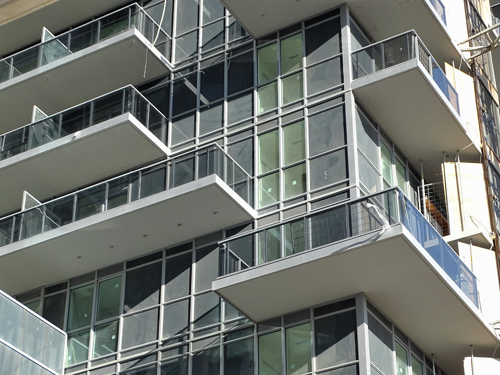
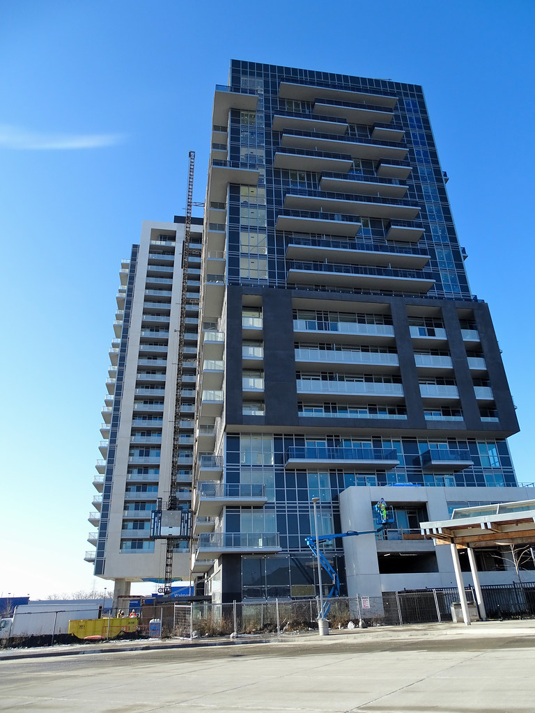
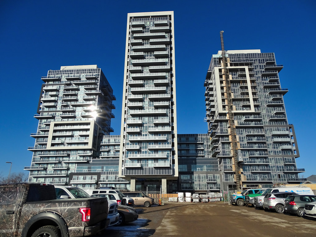
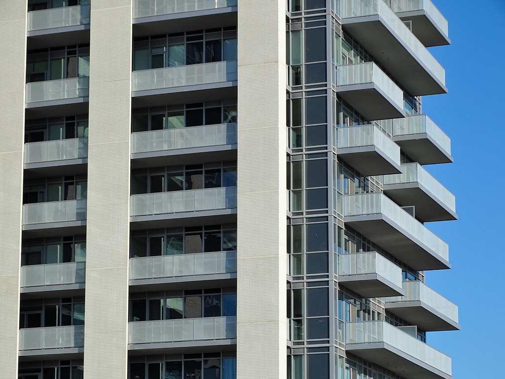
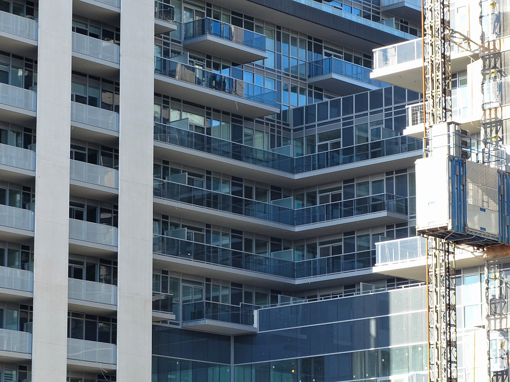
As for this one - the condo tower part is meh - hell each render shows a different generic geometric pattern - that part is never really the interesting part - only so much you can do with a rectangular design and balconies - no for me what makes these stand out is their podium - and from the renders - the podium falls very much short of expectation -esp. considering there is the right house on the left, and the newly restored historical building on the right. The generic ellen faircloudesque render they got for the current podium design just stinks of unoriginality. In fact it was SO bad that many users here, myself included actually tried to photoshop it to LOOK better, and that's never a good sign.
Here are some renders for what they have proposed:


YAWN.

The ones on the back I didn't feel were TOO bad - but still, it's a mishmash - the whole thing is just an awkward mishmash.. and why does the back look better than the front..?
Also whose bright idea was it to put a WHITE facade on the side of the street which already had proven instances of rampant graffiti back when it was the old building with the pale brick?


 Prev
Prev


 though I would certainly prefer it


 Linear Mode
