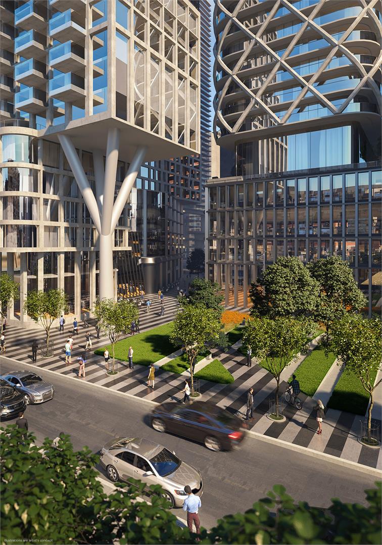
Urgh maybe it's just me but I find that this has too much going on. With the horizontal fins and the criss-cross on the other building and then support beams on the bottom, it's just kind of a mess.
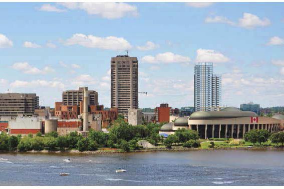
Approved in Hull, Québec. 3 tower addition to Sheraton Four Points 30, 25 and 17 floors. 145 new hotel rooms (for a total of 346), 245 residential units and 700 square meters of commercial space.
Quote:
Originally Posted by Soi-Fon
The city of Gatineau has approved Sheraton's four points expension proposal consisting of three buildings of 17,25 and 30 floors in downtown Gatineau, in front of the Canadian museum of history.
Paradise is a suburban town that is basically 17,000 of the same houses your city was building in the 1980s, and a big box main street that doesn't even have sidewalks.
I've been to all your cities, even the shitty parts of them, and Paradise puts them all to shame. You could revive Newfoundland's economy simply by bringing planners and architects from all the world's universities to Paradise to see what not to do.
And they're planning to do this...
Quote:
Originally Posted by jeddy1989
Looks very interesting! probably wont feel as 'in the woods' as the projections but very cool. Also, because it's in Paradise, it'll probably get through, that council seems to be more interested in getting things built in the town than the architecture/stuff that causes things to be viciously shot down in St. John's itself.
The corporate campus concept, BTW, is old here, by decades (I know it is where you are too, lol, just pointing out we're not THAT far behind, calm down). And some of the older ones are quite nice today.
My fave is Tower, in the Waterford Valley.
__________________ Note to self: "The plural of anecdote is not evidence."
I see your point. Individually, I think these are fantastic designs, but I'm not sure it works together.
I agree they don't seem to work together, at least the tower portions. If these were two seperate proposals most would say they love one and the other is ok or boring. I'm going to treat this like two separate proposals so I can just focus on the cool criss cross pattern one. The street level looks great though.
__________________
"Less is more" – Ludwig Mies van der Rohe
To me, street level is where the concept falls apart and the design becomes busy. The office podium looks like an afterthought. Overall, it's not bad considering how these projects with a little more of that generic artistic flair usually plays out in Toronto. It just needs that little bit of refinement to bring it all together like a number of other H+P designs.
The level of finish looks optimistic/preliminary. Not a fan of the fruit net around that one tower, which looks neither structural nor of any use for sun shading.
The level of finish looks optimistic/preliminary. Not a fan of the fruit net around that one tower, which looks neither structural nor of any use for sun shading.
Why does it need to be either? If it turns out like tge render it will be a show stopper. I know your a fan of the metal grates on the Woodworth tower and they provide neither structural support or shade from the sun. Sometimes elements are just for done purely for design alone. Did maybe you slept through that class.
__________________
"Less is more" – Ludwig Mies van der Rohe
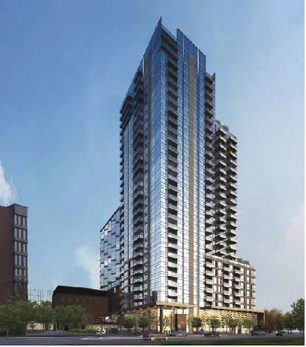
I revised my drawing last week: http://skyscraperpage.com/cities/?buildingID=108394
I'm guessing the 3 storey building is a heritage structure?
Originally I thought this would never be seen, being dwarfed by taller/bigger towers at Yonge & Bloor, but from the Northeast it will really stand out...
Wow, not tall enough, impressive. Go Canada. Ya the podium does look boring but it will look less dull when it's animated with people and however they decide to interior design the space. You kind of need it to be dull when it's fused to a heritage structure.
__________________
"Less is more" – Ludwig Mies van der Rohe


 Prev
Prev


 Linear Mode
