The design really started with the idea of creating a Barcelona Block type arrangement to provide an urban oasis in the centre with strong edges along the sidewalks. Really to create a new type of urban living in downtown Winnipeg. Something not seen anywhere else in the city. Underground parking is really expensive in downtown because the shoring to hold back the streets from collapsing as you dig down is a giant sunk cost. I have used the half-up-half-down idea a few times now, including on the new Osborne building. This is just a giant version. Not being under the building itself makes it much more cost effective and flexible for planning. The parking is completely hidden from the street and creates an opportunity for a raised and secure greenspace. Being one level up provides more access to sunlight and creates nice connectivity to the office space and other building functions at the second level. Imagine what a great daycare space that will be. There was some desire to have a public plaza that connects to the street, so a piece of the block was opened up directly across from the new Elgin Street plaza created at Red River College. There is a hope that a crosswalk will be added to connect them. I think of it as a type of pocket park. Not too big, but enough to create some life on the sidewalk and a nice space to connect to the surroundings. The office entry and tower entry are into the courtyard so hopefully it will have life. It would be nice if a coffee shop or something filled the ground floor of the tower and used the plaza as a patio. The lower building residential entrance is on the southeast corner to connect to the phase one building and Old Market Square.
We tried to maximize the density of the site but still be economical. Half of the units are in a six-storey that wraps around the block. Not being high-rise significantly lowers cost and creates a strong edge at the sidewalk. The idea for the façade is to create a modern relationship with the exchange district context. Yellow brick and a six-storey massing creates a street edge that relates to the historic buildings. My client who is so amazing had the idea of breaking up the façade with a mural from a great artist he works with. There will be art on the creative hub of the phase one building, so it seemed like a nice way to tie them together. Instead of being a typical rectangular mural on the building, I thought it would be interesting to embed it into the architecture itself to help break up the long masing of the building. Instead of doing something like creating the appearance of smaller facades, it’s broken up by this artwork that eats away and grows across the façade almost like an organic vine. The mural creates an opportunity for Indigenous placemaking and gives the building a unique expression. Typically, a mural on a building is a symbol of decline, but the hope is that by being part of the architecture in a prominent building, it will elevate their stature in the inner city. Usually, a client would never go for this because it will have to be replaced at some point, but he really embraced the idea and thought that in ten years when it needs to be re-done, it will create an entirely new expression for the building. Which I think is such an enlightened attitude. Few clients would see it that way.
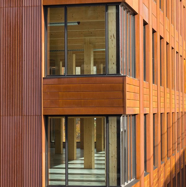
The tower piece was located at the northwest corner to maximize density and ensure that the Chinese garden isn’t cast into shadow. The taller building also has a relationship with other tall buildings across the street and beside. I didn’t want to have a tower closer to the exchange district itself. The idea for the corten cladding also kind of came from my client who was really attracted to materials that patina and age, believing that it made a nice connection to the 110-year-old exchange district buildings in the area. They are worn, crooked and filled with visual texture and expression. Corten was an affordable way to achieve this. It weathers and ages in different ways, depending on the patterns of the wind and sun. It becomes part of the site and has a life to it that you can’t get with painted metal or whatever else. It gives the building an age and character that can’t be achieved with many new materials. It also has an industrial feel that connects to the character of the warehouse district. The idea is that it is almost like a Brooklyn loft building. A nod to a commercial/industrial building that has been repurposed into residential. One that maybe looks like it has always been there, just like the old warehouses do. A shiny tower didn’t seem right in this place. The massing was kept very simple because the cladding will have so much life and texture. Extremely regular windows (which was hard to achieve in planning) intentionally gives the building a bit of a commercial expression, adding to the idea that it might feel like an historic commercial building transformed into an urban loft.
I said to the client right at the start. The public safety building was polarizing. People loved it and people hated it. But nobody was indifferent to it. That was my goal for this project. No indifference, but it’s ok if you don’t like it. Corten steel has that same effect on people. Some love some hate. Again, an amazing client that would embrace that idea. The artwork sprawling across the façade is the same. Her work is bold and polarizing. I love it because of that. Some will hate it some will love it but nobody will be indifferent. My mantra from the start was that indifference is the enemy. It might be the most prominent building I ever design, and I wanted to leave a lasting impression.
The building is also affordable mixed-income and net zero carbon. It’s such an amazing opportunity.
The corten siding is inspired by a building I saw in Minneapolis. I hope it looks this warm.


 Prev
Prev


 Linear Mode
