ATLANTA | Development Thread V


Status
Not open for further replies.
TECH SQUARE -Holy Shiiiiiiitttttt!!!!

http://www.bizjournals.com/atlanta/real_talk/2015/05/georgia-tech-portman-seek-economic-incentives-for.html
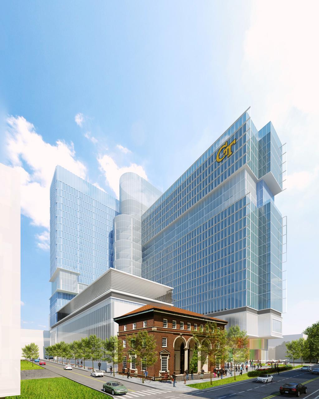
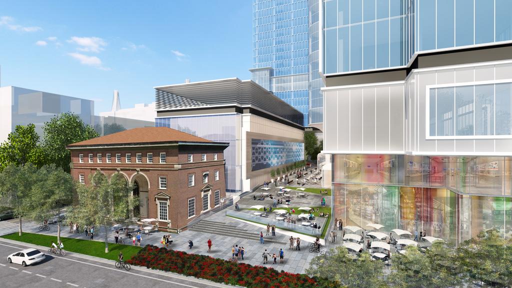
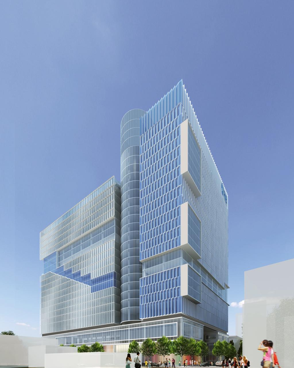
this-is-tech-square-1.jpg


tech-3.jpg


this-is-tech-square-3.jpg

No parking deck :cheers:
 
I was not happy to hear that Portman would be designing this project and now I see why. The tower is dull (that GT logo looks pretty jarring as well) and the side of the smaller tower is a pretty awful imitation of the New School University Center in New York (designed by SOM). I do like the plaza though and the way it meets the street.

new-school-student-center.png
 
I was not happy to hear that Portman would be designing this project and now I see why. The tower is dull (that GT logo looks pretty jarring as well) and the side of the smaller tower is a pretty awful imitation of the New School University Center in New York (designed by SOM). I do like the plaza though and the way it meets the street.


I 100% agree. I am also disappointed that much of the pedestrian activity is isolated from the street. In typical Portman fashion, pedestrians will be discouraged from using the sidewalk and instead will be removed from the street with the exception of 1 small patio. Tech Square's beauty is that it actively engages the sidewalks. I would hate to see this ruined.
 
I would have to think (and hope) that Tech, home to a top 20 architecture school, will not be thrilled with this proposal as is.
 
I would have to think (and hope) that Tech, home to a top 20 architecture school, will not be thrilled with this proposal as is.

I think its one of the better things Portman has done lately-- I agree about the lack of pedestrian street frontage however-- Midtown zoning will have something to say about that since this is a foundation project and subject to local zoning--
Its certainly bold--
 
I'm not that fond of the design either but I'm sure they'll force them to change the ground level up some. Add a fountain/water feature, something... lol
 
Everything above the base of it I can live with, I mean it's not spectacular but it is at least trying to be a little different than everything else at Tech Square. I can even live with that GT logo on it.

However, that base is typical Portman insular design. It completely lacks any interaction with Armstead Place and doesn't engage or relate to the Crum & Foster building in any way, shape or form. That Spring Street plaza between the parking deck and main tower even has a low wall or some type of barrier separating it from the street. Nothing says 'stay out' like a nice wall.
 
Brought to you by John "never met a random extrusion he didn't like" Portman.

I'm a little offended that someone said this was even an imitation (however poor) of New School.
 
Given there is 46,000 sq ft of retail I'm going to reserve judgement till floor plans of base are available because I want to believe the retail will be fronting most of the streets and not a insular retail experience like ATT Midtowncenter
 
I actually like it. It does relate to the Crum building - the parking is aligned perfectly with it and the other parts of the towers are 'set off' from it. Except for the side street (Armstead Place?) it looks like there's lots going on for pedestrians. Aren't those tables with umbrella's - lots of them - along w ptree? I'm excited about something different. And the more I look at it, the more I like it. It's unusual. Atl needs some unusual architect imo.... it looks like something you'd see in Berlin or Frankfurt.
 
Last edited:
Given there is 46,000 sq ft of retail I'm going to reserve judgement till floor plans of base are available because I want to believe the retail will be fronting most of the streets and not a insular retail experience like ATT Midtowncenter

I'm interested to see what West Peachtree frontage looks like.
 
Awful building

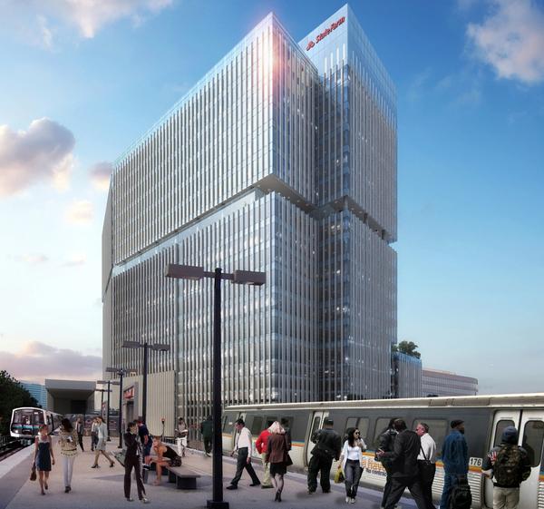
That first rendering reminds me a lot of the recent State Farm building:

state-farm-atlanta-hq-rendering.jpg


The building looks like a mish-mash of designs. Nothing coherent, very poor IMO. I'm sure some people will like it, but then again, some people will like anything.
 
Some of you are hilarious! This board is so full of people who can't think for themselves. Whatever has Portman's name behind it, or is Buckhead related, the attitude is we dislike! Honestly, most people would consider this building to look 10 times better than lets say GT's University House. This building has somewhat of a WOW factor.
 
Some of you are hilarious! This board is so full of people who can't think for themselves. Whatever has Portman's name behind it, or is Buckhead related, the attitude is we dislike! Honestly, most people would consider this building to look 10 times better than lets say GT's University House. This building has somewhat of a WOW factor.

Oh please. I dislike this building because it's a mash-up of about 4 different architectural ideas, none of which emerge from any obvious function or unique situation of the building. A curvy atrium in the middle? Sure! Some random punch outs, sort of diagonal but sort of rectangular? All right! Blobs cantilevering out for no discernible reason? OK! Two giant (different) logos? This is fun!

Frankly I'm not sure why anyone on a forum dedicated to skyscrapers and urban development would ever come to the defense of John Portman. The damage he inflicted on the city fabric of Atlanta is unforgivable, even if he did have the occasional flash of brilliance with a tower.
 
Honestly, it's not a bad looking building...if it just addressed the street better, I'd be fine with it.

Like someone else pointed out, with that much retail I'm sure it will have a lot more at street level than those images show. They read like early comps to me so they're probably missing a ton of detail. In fact it looks like they're showing street-level retail as badly-pasted images on the windows.

As for the overall design, I don't feel too strongly either way. It's not a bad start but it could use some refinement. I think the odd perspective of the images makes it look weirder than it really is--it's wider at the top for some reason :shrug:
 
Looks OK however agree with gttx that those "Blobs cantilevering out" make the W Ptree facade a bit busy. And the GT logo should be smaller but I suppose they want it seen from the connector.
 
Status
Not open for further replies.


Back
Top