I've noticed that, over the past several years, many of the stylized logos I see for cities, provinces and other jurisdictions are becoming increasingly attractive.
What do yours look like?
At the bottom of this Facebook profile picture is the current City of St. John's logo. It's how it appears (minus the photoshopped picture) on signs throughout the city, municipal documents, and so on:

I'm not entirely sure what the symbolism means. It could be waves, rays of light from a lighthouse, whatever... but it does seem appropriately nautical to me.
Since St. John's is not amalgamated with suburban and neighbouring communities, there are also many other logos in different parts of what is really one large, urban area. These include the City of Mount Pearl, with an unattractive logo of typical design nothingness:

As well as the overdone but still attractive Town of Paradise:

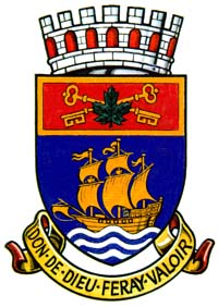
And the absolutely bizarre logo for Conception Bay South, an amalgamation of a half dozen or more coastal communities that, by population, is the second largest community in the province:

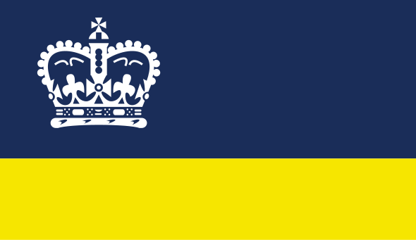
And then there's Logy Bay-Middle Cove-Outer Cove:

Portugal Cove-St. Philip's (Does this symbolism represent Portugal Cove as the left arm, St. Philip's as the right, and Bell Island as the circle? Seriously, WTF does it mean?):

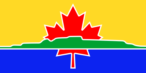
Torbay (One of the oldest of these communities, I believe 450 this year? But the logo.... wave and seagull. It looks kind of like that game when you stack things on drunks who pass out):

And this is Newfoundland and Labrador's logo:

The symbolism in this is more clear. They chose a stylized font that tips its hat to the Vikings, the first Europeans to settle in Newfoundland 1,000 years ago.
The plant is the Pitcher Plant, the official flower of Newfoundland and Labrador. It's an unattractive, carnivorous plant that eats insects. But it does represent us well:
It has a beauty all its own
rare and unusual flower fair -
comparing not to rose or daisy
it holds its beauty close within
The Pitcher draws outsiders in
and once inside, exit is rare -
such is the Newfoundland I know
to leave is pain beyond compare
and so the Pitcher Plant is chosen
as her flower - wild and rare
the choice is made and so remains
the perfect flower of Newfoundland
So visit her - but do beware
you will be coaxed by beauty fair
and when the time may come to leave -
your captured heart will still be there


 Prev
Prev


 Linear Mode
