Here's my 2 minute
mcmansion hell-esque take (kudos to Kate Wagner)
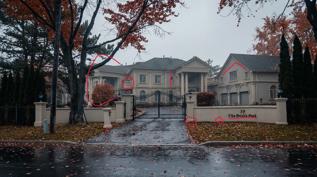
1. The entrance stucco and wall appears to be coming apart. Does not say "wealth" or "long lasting"
- the gate buzzer appears to be on a funky angle which looks like poor installation/workmanship
2. Everyone knows the house is on
The Bridle Path arguably Canada's most expensive street in Toronto. The signage is fitting for a typical suburban mass produced large home and looks so tacky on this particular street.
3. The extra portico looks dumb
4. The useless curved balcony adds nothing
5. The rounded window is not centred with the window below on the front
6. Oversized garage is competing for attention with main house
Tiny windows at the sides on garage second floor look foolish
7. TorontoDrew summation
"
If you need to use a cheaper material on your home to make the design work in your budget, maybe it's time to scale back a bit and use quality materials instead. This would have looked way less offensive if done in brick or stone. Like most stucco,
it's not aging well."
This home is fitting in many areas of the GTA but not on an uber expensive street like The Bridle Path.
And this is the problem with The Bridle Path. Prestigious parts of Toronto like Rosedale will always look classy. The Bridle Path is getting devalued in class and taste with every gargantuan stucco palace or awful design by comparison


 Prev
Prev


 Linear Mode
