Here's a couple of screengrabs:
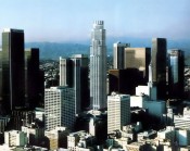
Two thoughts on this building:
1. The US Bank logo is atrocious. Borderline reprehensible.
2. I like this building, but don't love it by any means. It has a nice shape, but there aren't enough contrasting colors to make the form spring to life. The combination of the punched-facade windows (lacking both verticality and horizontality) along with the absence of any dark colors (the windows seem to have their shades drawn more often than not) kind of leaves the building looking whitewashed, and in the process destroys the drama of the setbacks and all. If only the architects used some kind of accent color in the stone that you could actually notice from more than a quarter mile away (those light grey squares don't count!), they would've done this tower a huge service.


 Prev
Prev


 Linear Mode
