HomeDiagramsDatabaseMapsForum About
     

Go Back   SkyscraperPage Forum > Regional Sections > Canada > Alberta & British Columbia > Vancouver > Downtown & City of Vancouver


    One Burrard Place in the SkyscraperPage Database

Building Data Page   • Comparison Diagram   • Vancouver Skyscraper Diagram

Map Location

Reply

 
Thread Tools Display Modes
     
     
  #341  
Old Posted Jun 23, 2011, 4:03 AM
SpongeG's Avatar
SpongeG SpongeG is offline
Registered User
 
Join Date: Jun 2006
Location: Coquitlam
Posts: 40,037
i like it too
__________________
belowitall
Reply With Quote
     
     
  #342  
Old Posted Jun 23, 2011, 4:20 AM
BodomReaper BodomReaper is offline
Registered User
 
Join Date: Jul 2010
Location: Metro Vancouver
Posts: 987
I must say I can't understand all the hate this project is getting. My main problem with the initial proposal was that the two residential towers were mere clones of each other. Now that it's been rectified; I see a dense, unique, bold, attractive, mixed-use project - which is exactly what these boards are agitating for most of the time!
Reply With Quote
     
     
  #343  
Old Posted Jun 23, 2011, 5:13 AM
vanman's Avatar
vanman vanman is offline
Registered User
 
Join Date: Sep 2006
Location: Vancouver BC
Posts: 6,485
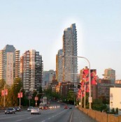
I think BG is still way too busy, and I'm disappointed in the "flagship" Toyota dealership. Overall the buildings are definitely different, and will stand out in Vancouver's skyline. As well there are some awesome angles that actually scream big city like this one:
Quote:
Originally Posted by Built Form View Post


Reply With Quote
     
     
  #344  
Old Posted Jun 23, 2011, 6:06 AM
dreambrother808 dreambrother808 is offline
Registered User
 
Join Date: Jan 2008
Location: Vancouver
Posts: 4,428
Agreed. That's a nice streetwall.

I find this design to be much less offensive than the previous one but also more boring. It may have greater appeal in its built form.
Reply With Quote
     
     
  #345  
Old Posted Jun 23, 2011, 7:53 AM
urbandreamer's Avatar
urbandreamer urbandreamer is offline
recession proof
 
Join Date: Apr 2007
Posts: 4,656
Love it!

Very Vancouver remixed--fussy funky fusion. It works.
Reply With Quote
     
     
  #346  
Old Posted Jun 23, 2011, 11:33 AM
Spoolmak Spoolmak is offline
Registered User
 
Join Date: Jul 2009
Location: British Columbia
Posts: 692
Awesome..the message you have entered is too short blah blah blah
Reply With Quote
     
     
  #347  
Old Posted Jun 23, 2011, 1:30 PM
LeftCoaster's Avatar
LeftCoaster LeftCoaster is offline
Moderator
 
Join Date: Nov 2005
Location: Toroncouver
Posts: 13,131
Looks ok, still not a big fan of it. Not going to throw a tantrum and say its a travesty or something dramatic like that tough.
Reply With Quote
     
     
  #348  
Old Posted Jun 23, 2011, 4:33 PM
Chikinlittle Chikinlittle is offline
Registered User
 
Join Date: Sep 2008
Posts: 264
Quote:
Originally Posted by BodomReaper View Post
I must say I can't understand all the hate this project is getting. My main problem with the initial proposal was that the two residential towers were mere clones of each other. Now that it's been rectified; I see a dense, unique, bold, attractive, mixed-use project - which is exactly what these boards are agitating for most of the time!
Definitely agree! Tower cloning drives me nuts. I quite like the project now. Not saying it couldn't still be better - there is always room for improvement - but it does incorporate a lot of unique design elements not replicated from other buildings in the city.
Reply With Quote
     
     
  #349  
Old Posted Jun 24, 2011, 7:21 AM
Sprawl Sprawl is offline
Registered User
 
Join Date: Jan 2011
Posts: 84
I like all the improvements bar two:

1. Too much choppy green spandrel, it would have been nice to see it simplified and mixed up a bit.

2. Whatever the hell this is:

Why did they get rid of the prow???


Very glad to see the mini-me tower has been removed!

Reply With Quote
     
     
  #350  
Old Posted Jun 24, 2011, 6:41 PM
officedweller officedweller is offline
Registered User
 
Join Date: Jul 2001
Location: Vancouver
Posts: 41,614
The main problem I see with the complex now is the green spandrel and fins on the shorter tower - the green spandrel even looks better on Marine Gateway than this tower.

The short "mini-me" tower has gone from being as distinctive as the taller tower to being a muddled background tower. Add white checkboarding from window blinds and it'll be even more muddled.

And instead of refining the distinctive prows, they have been tossed in favour of simple (cheaper) boxes to hide the mechanical equipment. Even the older Wall Centre towers have double height ceilings in their "prow" penthouses.
Reply With Quote
     
     
  #351  
Old Posted Jun 24, 2011, 6:46 PM
Metro-One's Avatar
Metro-One Metro-One is offline
Registered User
 
Join Date: Sep 2008
Location: Japan
Posts: 17,946
Overall, I enjoy this rendition far more than the previous, happy they kept the white lattice, but I have the exact same complaints as officedweller.

Hate the green spandrel. I would be so happy if they even went with a different colour!
__________________
Bridging the Gap
Check out my Flickr: https://www.flickr.com/photos/30634635@N03/with/29495547810/ and Youtube channel https://www.youtube.com/channel/UCV0_0h9qKlhxXFxuAey_q6Q
Reply With Quote
     
     
  #352  
Old Posted Jun 30, 2011, 12:22 PM
trofirhen trofirhen is offline
Registered User
 
Join Date: Oct 2008
Posts: 9,045
Quote:
Originally Posted by Metro-One View Post
Overall, I enjoy this rendition far more than the previous, happy they kept the white lattice, but I have the exact same complaints as officedweller.

Hate the green spandrel. I would be so happy if they even went with a different colour!

Ugh, you got that right! How about an off-white, with a soupçon of a preferred tint in it? (lots of colours in the spectrum to choose from, folks, so step right up, and ..........)
Reply With Quote
     
     
  #353  
Old Posted Jun 30, 2011, 5:15 PM
natelox's Avatar
natelox natelox is offline
Registered User
 
Join Date: Aug 2005
Location: Toronto
Posts: 343
Where is the green spandrel?
Reply With Quote
     
     
  #354  
Old Posted Jun 30, 2011, 8:03 PM
officedweller officedweller is offline
Registered User
 
Join Date: Jul 2001
Location: Vancouver
Posts: 41,614
Pretty much the entire south and east facades of the shorter tower.

Built Form's pic:

Reply With Quote
     
     
  #355  
Old Posted Jun 30, 2011, 10:13 PM
natelox's Avatar
natelox natelox is offline
Registered User
 
Join Date: Aug 2005
Location: Toronto
Posts: 343
To me they look more like sunshades or very expressive mullion caps. They seem to project clear from the face of the building. It is also telling by looking at that photo at the top of the tower, where it appears that the green fins continue in front of the balconies.
Reply With Quote
     
     
  #356  
Old Posted Jun 30, 2011, 10:37 PM
officedweller officedweller is offline
Registered User
 
Join Date: Jul 2001
Location: Vancouver
Posts: 41,614
It looks like a combination of fins and spandrels.
But even if the spandrels were actually aluminum panel painted green - that would still be a [Mr.] "yuck".

Here's another of Built Form's shots where you can differnetiate between fins and "flat" panels.

Quote:
Reply With Quote
     
     
  #357  
Old Posted Jul 4, 2011, 12:01 PM
PROSTSHOCKER's Avatar
PROSTSHOCKER PROSTSHOCKER is offline
Registered User
 
Join Date: Apr 2009
Posts: 191
I love it. I was skeptical, but now I'm a solid supporter. It looks nice, distinct and considering the context of the surrounding buildings in the city, it's iconic. This is what this city needs. Not just something perfect but just different and compelling. This will fit right in with the city and the green accents are a good choice as well.
Reply With Quote
     
     
  #358  
Old Posted Jul 4, 2011, 1:42 PM
trofirhen trofirhen is offline
Registered User
 
Join Date: Oct 2008
Posts: 9,045
Quote:
Originally Posted by PROSTSHOCKER View Post
I love it. I was skeptical, but now I'm a solid supporter. It looks nice, distinct and considering the context of the surrounding buildings in the city, it's iconic. This is what this city needs. Not just something perfect but just different and compelling. This will fit right in with the city and the green accents are a good choice as well.

à chacun son goût .......
Reply With Quote
     
     
  #359  
Old Posted Jul 4, 2011, 8:02 PM
Canadian Mind's Avatar
Canadian Mind Canadian Mind is offline
Registered User
 
Join Date: Aug 2006
Posts: 3,907
I'm not a fan of the white framework at all, but nothing is perfect. Overall I like the building.
__________________
"you're eating chicken periods" - Vid
"I love eggs, especially the ones with runny yolks" - Me
"EWWWWWWWWWWWWWWWWWWWWWW, you're disgusting!" - Vid
Reply With Quote
     
     
  #360  
Old Posted Jul 5, 2011, 4:19 AM
rbostyle rbostyle is offline
Registered User
 
Join Date: May 2009
Location: Vancouver
Posts: 60
Quote:
Originally Posted by PROSTSHOCKER View Post
I love it. I was skeptical, but now I'm a solid supporter. It looks nice, distinct and considering the context of the surrounding buildings in the city, it's iconic. This is what this city needs. Not just something perfect but just different and compelling. This will fit right in with the city and the green accents are a good choice as well.
Agreed! I'm such a fan of the revised design, particularly the rear of the towers - it's rare for an alley facade to be more interesting than a street-facing facade, but that adds to the appeal in my books!
Reply With Quote
     
     
This discussion thread continues

Use the page links to the lower-right to go to the next page for additional posts
 
 
Reply

Go Back   SkyscraperPage Forum > Regional Sections > Canada > Alberta & British Columbia > Vancouver > Downtown & City of Vancouver
Forum Jump


Forum Jump


All times are GMT. The time now is 3:36 PM.


Powered by vBulletin® Version 3.8.7
Copyright ©2000 - 2026, vBulletin Solutions, Inc.