Thanks for the pics -
I liked the relationship between the towers better before rather than with the current design.
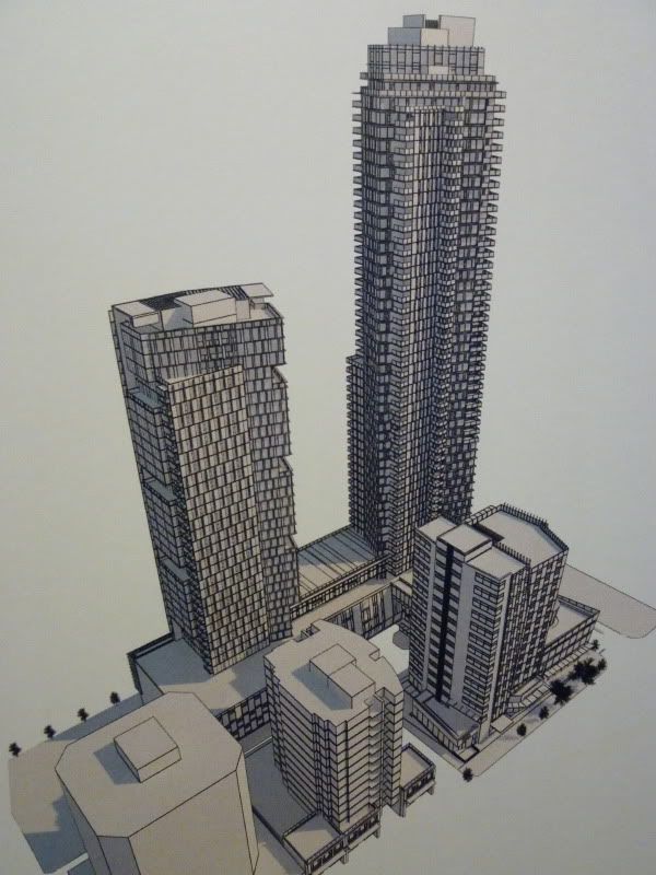
Note that the angled rooflines are both gone from the residential towers.
Any notion of an iconic "prow" viewed from Burrard Bridge is now gone.
The angled Hornby lowrise facade reminds me of West Pender Place. The Hornby elevation looks OK overall.
North Tower:
Not keen on the reworked lattice on the north residential tower.
The green doesn't have enough contrast with the glass and it's hard to read the lattice form.
I think this is a "cheapening" - instead of a cast concrete lattice, you have an array of green spandrel panels in the window wall.
The angularity of the towers south and west facades is completely lost in the busy-ness of the green spandrels and fins.
The north side looks like the Telus residential tower's east facade with the stacked blocks.
Another sign of the cheapening - the loss of zig-zag balconies on the north tower.
South Tower:
The zigzag balconies were more sculptural before - now they look more functional.
I like the way the lattice now hits the ground - before it terminated at the podium roof.
On the south side lattice, the model shows an awkward interface (a two-storey solid area) between
the grid of the lattice and the angled edge of the lattice. Hopefully that won't be as built.
The horizontal lattice above the south tower lobby on the corner looks out of place/busy - why not keep it open and airy - to contrast the lattice? It'll be in shadow from Salt and the condos across the street.
Office Tower:
I like the office tower much better now - except the north side.
Here are some of
SFUVancouver's shots of the OLD MODEL for comparison:
Quote:
Originally Posted by SFUVancouver

|





 Prev
Prev




 Linear Mode
