The Waterford

This one is definitely a sleeper. It never occurred to me to add this building despite always being a fan. I do some work off Kilborn from time to time and walking to Billings Bridge put this building back in my mind.

At first glance this building is a little bit ho-hum when it comes to the caliber of other structures seen in this thread. I think a lot of the upside of this building lies in the nuance that might not be obvious right away.
First off... the entrance to this building is a private cul-de-sac as opposed to its brethren down the road that are accessed from a very busy section of Bank st.
Second... the building is not aligned perpendicular to the street grid. This is something that is sorely lacking in Ottawa as a whole that I would like to turn into a thread on its own. This thing peers over its cul-de-sac and Bank st. and Billings simultaneously with the perfect angle.

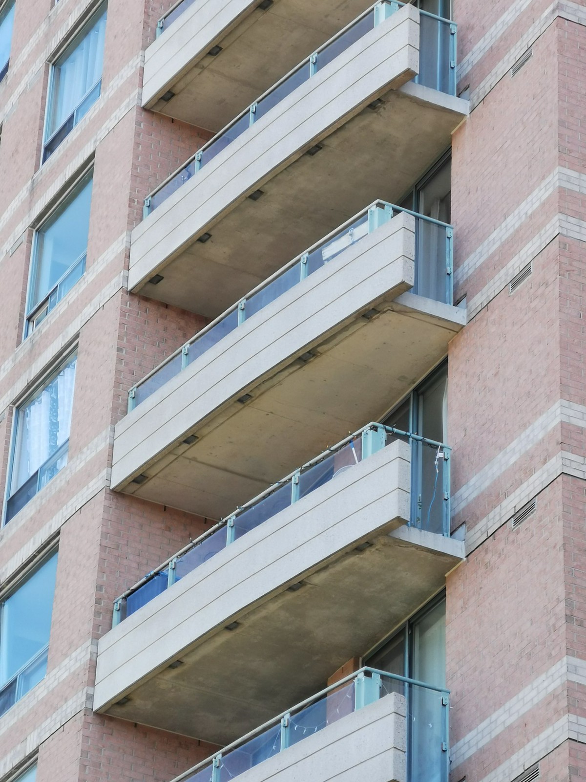
There are a lot of features here. You have the crown over the balconies obviously. Large windows. Curved balconies out front with slab coverage? oh lordy. The balconies also have the knee wall with a glass top. The balcony ends also switch to full glass. The double horizontal banding that switches to single on the end wall is a nice touch. The horizontal banding on the precast balcony slabs compliment this as well.

I absolutely love how the curved portion exceeds the building envelop. The notch backs between that and the beef of the tower are also nice. The continuous vertical windows are a nice variation and section off the end walls of the building.

Love the portal windows and the thick bands keeping it from being too busy.

The Bank st. facing side has a pretty neat feature of this brook. The bottom floor might have one of the most unique features for an apartment tower in the city. Aside from weirdos snapping photos its very private and secluded. I would imagine the noise of Bank st. down there would be somewhat minimized with trees in full bloom.

The balconies are so cool.

It's prominence on Bank st. is pretty impressive. The building looks taller than it is due to elevation but it's like the building was specifically set at this angle to look its best from the Bank/Riverside direction.
It's not quite an award winner and it's showing its age a little bit but when you take all of the smaller points I mentioned, I think you end up with a fine building.
I think my biggest complaint would be the color palette. Talk about a product of its time. The window and railing trims are some sort darker pastel muted green. Peach brick. That pairing looks like something you would find in a suburban strip mall. I've always called this pairing "Peaches 'N Green". Without looking anything up I want to say this building was built 1992/1994 based on the colors alone.
I've lived in the east end my whole life so this building is quite familiar to me. Glad I was on foot recently and stopped for photos.


