Quote:
Originally Posted by zahav

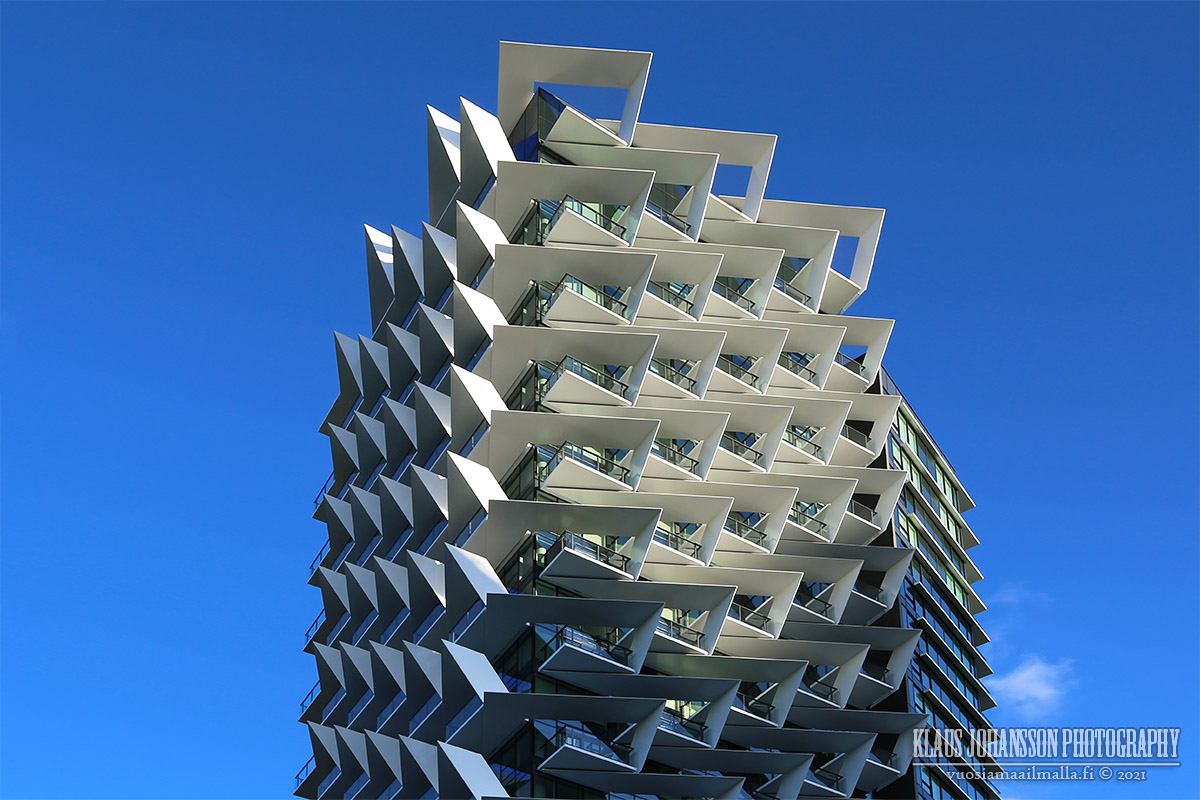
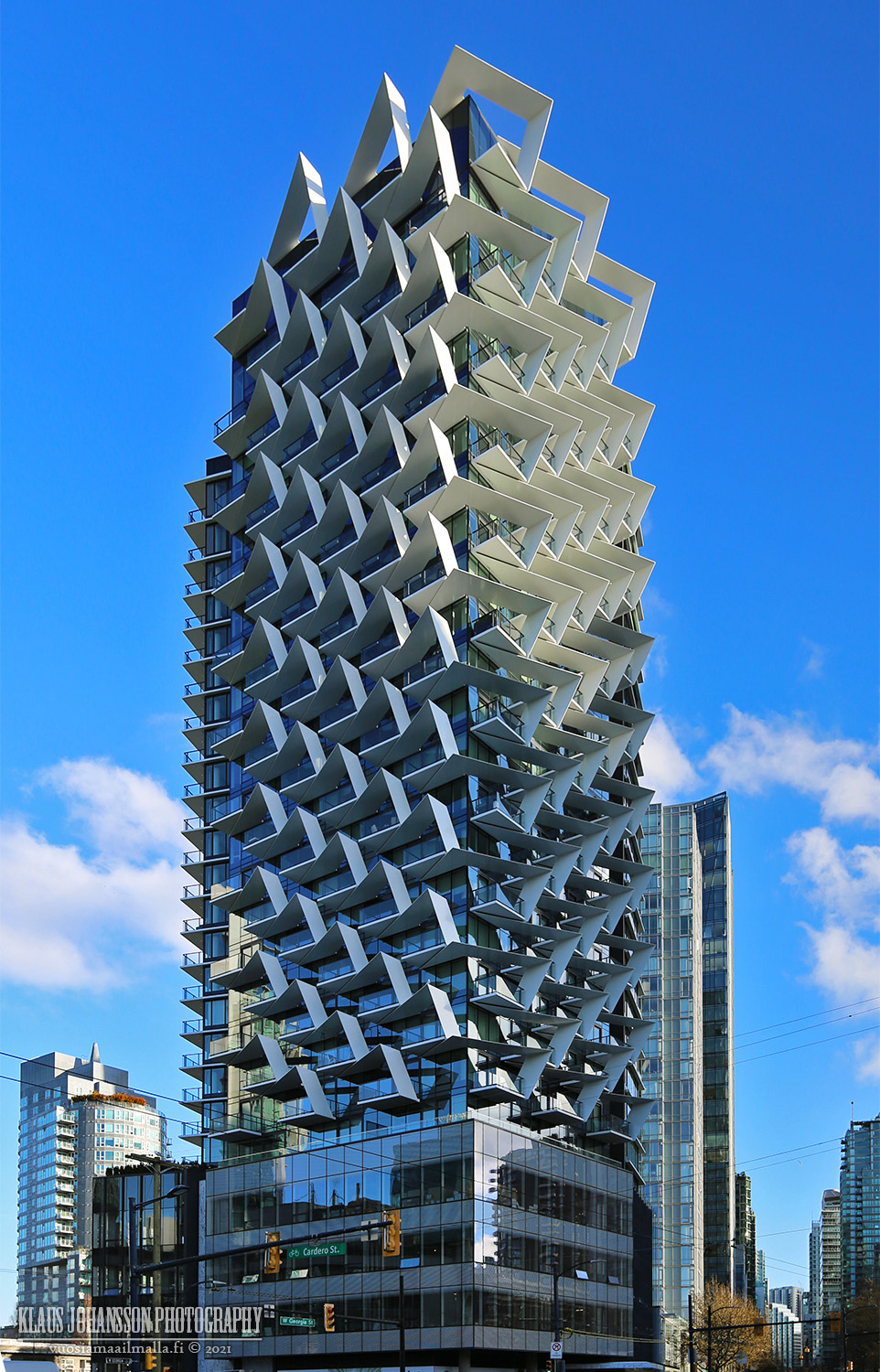
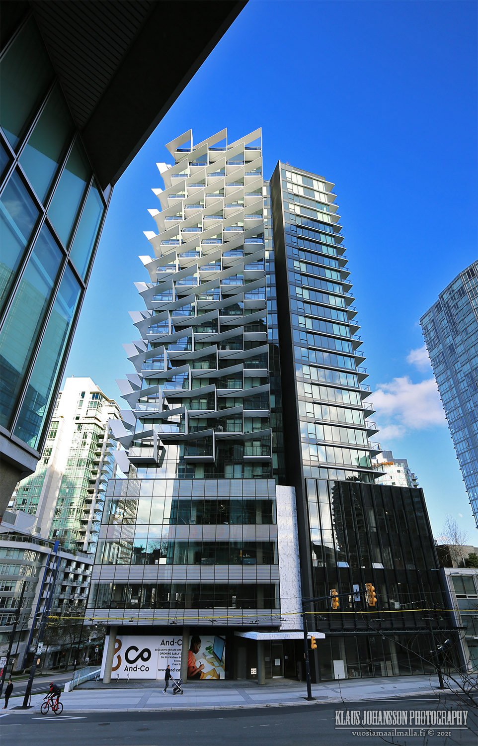
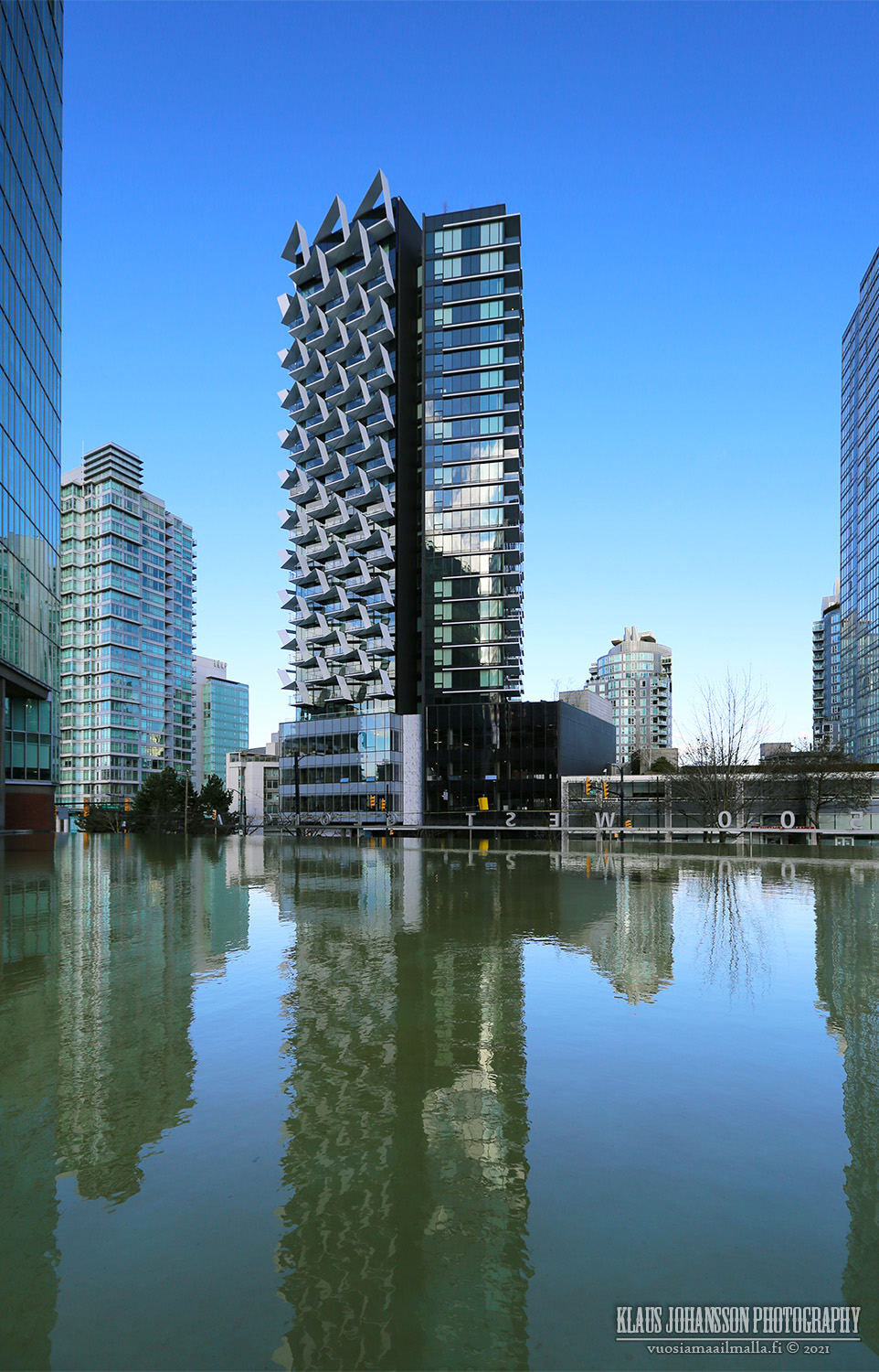
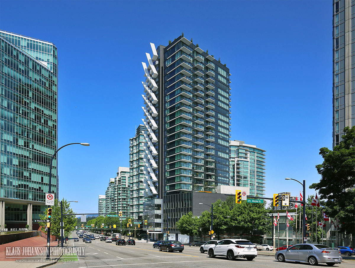
I was fairly surprised by this, I didn't think the building was anything great. Especially to be in the same breath as Vancouver House. The photos in the article made it look a lot nicer than it does in person. I don't hate it or anything, just fairly surprised to see it ranked so highly in a competition like this. To me it was just good infull but not noteworthy
|
I think it was the over-the-top balconies/fins that really made this tower appeal to them? Just they wait until the Butterfly and the 1550 Alberni come online

.
I also have noticed recently that the more recent proposals are trying to go with a "whiter" colour scheme. 1550 Alberni (to an extent), Butterfly Vancouver, and the Vancouver House are all examples of this new style trend. Maybe The Cardero really spoke to the council on ushering in that trend?
Don't get me wrong, as much as I like the trending colour scheme, it is one colour-code character away from being lost in the sea of seafoam glass; and I am aware that a lot of a building's colour depends on the glass that ultimately gets installed.


 Prev
Prev


 Linear Mode
