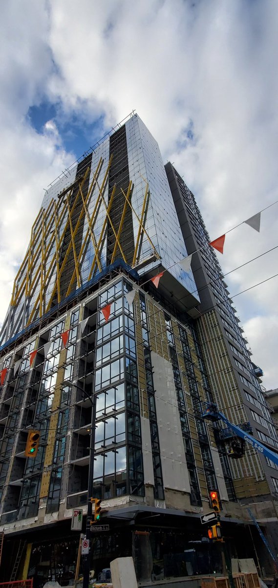
I really think this is a missed opportunity with the color of the 'X-0skeleton' if you will. Why did they not go with the bright and vibrant lime green like the connected Jubilee project next to it? It would have tied in perfectly instead of what looks to me to be a very generic, boring grey that will only add to Vancouver's greyness as it is. I mean it may take on a more white appearance on a bright sunny day....... rare. But I think they missed the mark for such a smart looking building. Anyone?
Officedweller, that's a fantastic shot! Thank you very much. The combination of old Yaletown and the ongoing building of downtown south yields some of the best (probably the best) urban texture in Vancouver. Couldn't be more pleased, too, with how Vancouver House turned out and how it adds to the city skyline. 8X sure turned out well from this perspective, too. While the yellow would have been a nice permanent colour for the exterior Xs, the contrast of silver against the darker blue glazing does make it pop.
I suppose the ugly side of this building isn't documented as much as the much nicer criss-cross side. Just too bad people are forced to look at the ugly side more, especially coming down from Granville Bridge.




 Prev




 Linear Mode

