Just one more thing about signage. I think people forget when they argue on the internet that a highway sign has to convey information to motorists that are blowing by the sign at 120 km/h. There is a very finite amount of information that can be conveyed to a motorist who is traveling at that speed. Highway designers have to be really cognizant about what information they actually give to drivers. It's really really easy to put far too much information on a sign, and overload .
For example, this is a terrible sign assembly:
https://www.google.ca/maps/@36.1680177,-...CBA!2e0!5s20150301T000000!7i13312!8i6656
There is way too much information conveyed on that sign for a driver to read all of it and still pay attention to the road in front of them.
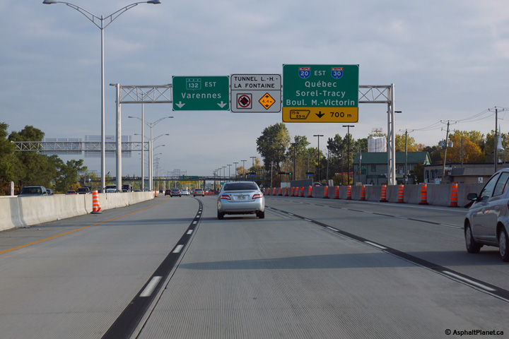
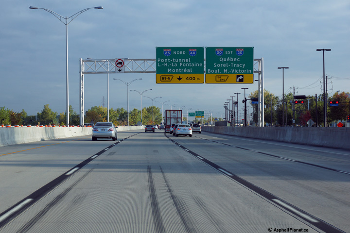
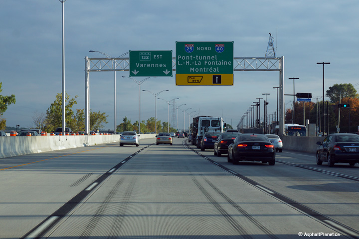
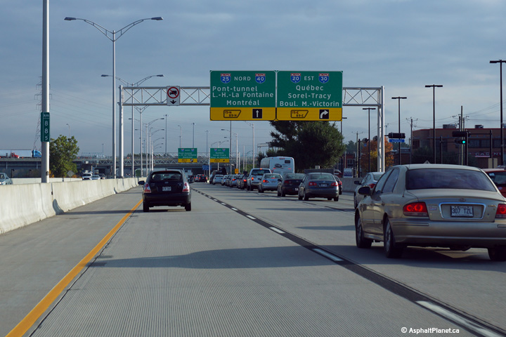
Just as another example, it's common in Quebec for lane assignment signage (signs with downward pointing arrows over lanes) to be split up across several different overhead gantries. Long street and community names are common in Quebec, so for example, on A-20 approaching the A-25 interchange, the MTQ has chosen not to try to sign all of the lanes at once. You can see what I mean below:
Sign 1, left two lanes and right lane:
Sign 2, two right lanes:
Sign 3, left three lanes:
Sign 4, two right lanes:
Sign 5, two right lanes:
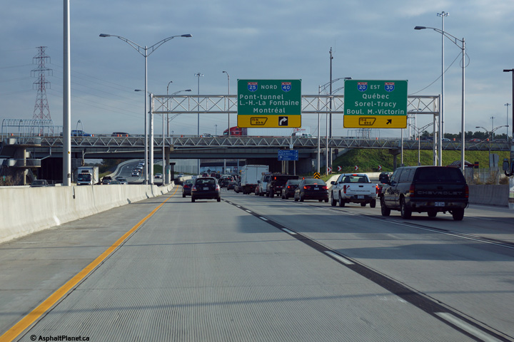
There's a sixth sign as well, but I don't have a photo of it handy, but you get my drift. That's a solution to information overload, but it's flawed in of itself, it would probably be more clear to try and sign at least four lanes at least once, but I'm not sure it was practical in this application.





 Prev
Prev


 Linear Mode
