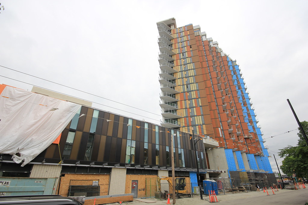
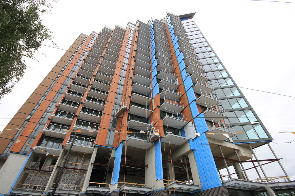
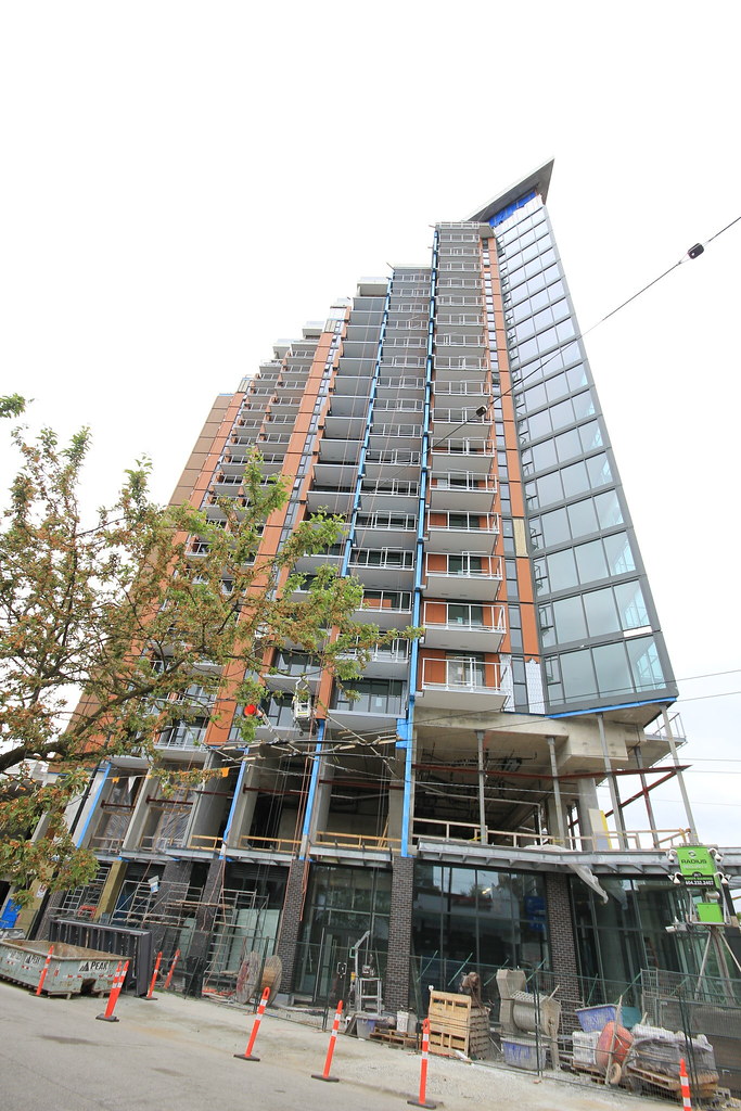
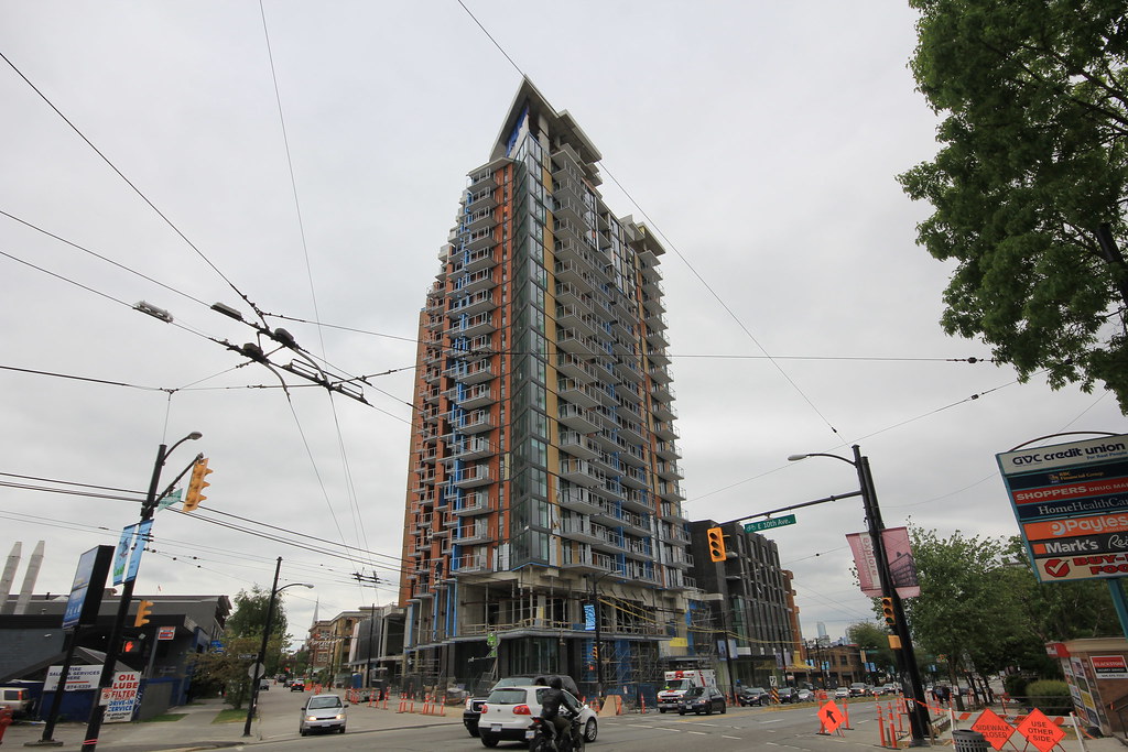
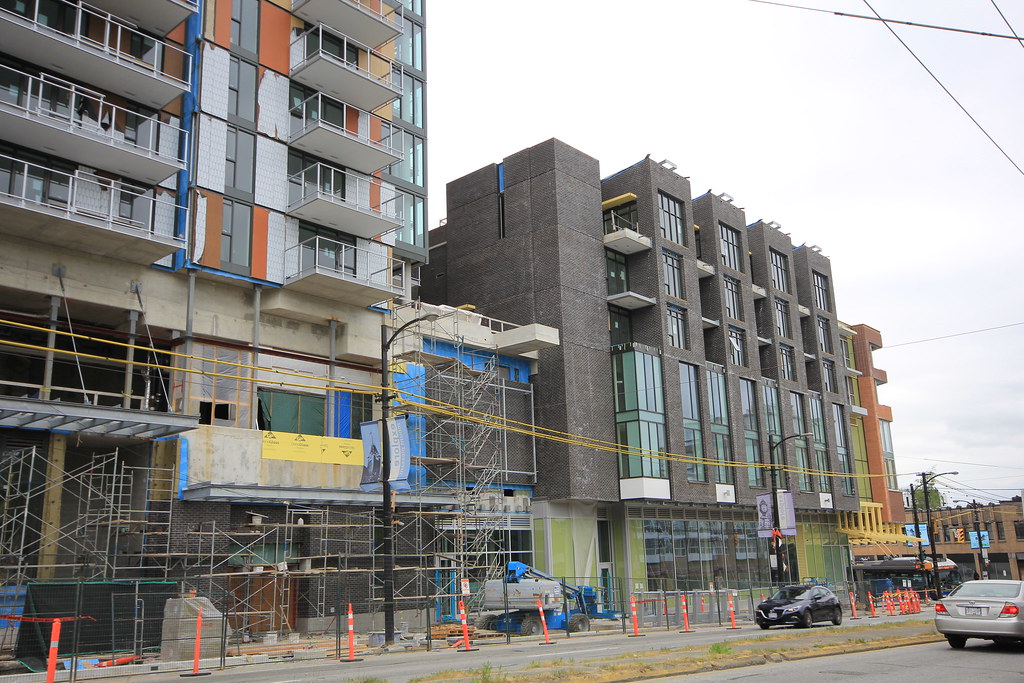
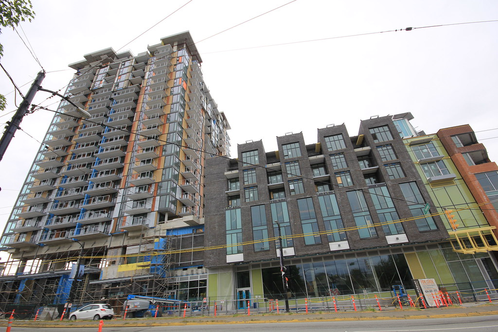
Gah!!! By the photos alone, that's unfortunate. The grey and white bricks look okay atleast....although the jumbled arrangement of them is a really weird decision by the architect. The red brick looks good in some sections, but it looks horrible or suburban in others.
I do like the tower's jagged design. Sometimes there are some bad executions of the jagged face for a tower....but this building definitely has a strong identity with it's form. I wish the panelling on the tower was a single colour of brick.....sometimes the panels look okay (the rusty coloured ones), but others look weird because of the colour choice.
This project has so many elements to it.....good grief.







 Prev
Prev








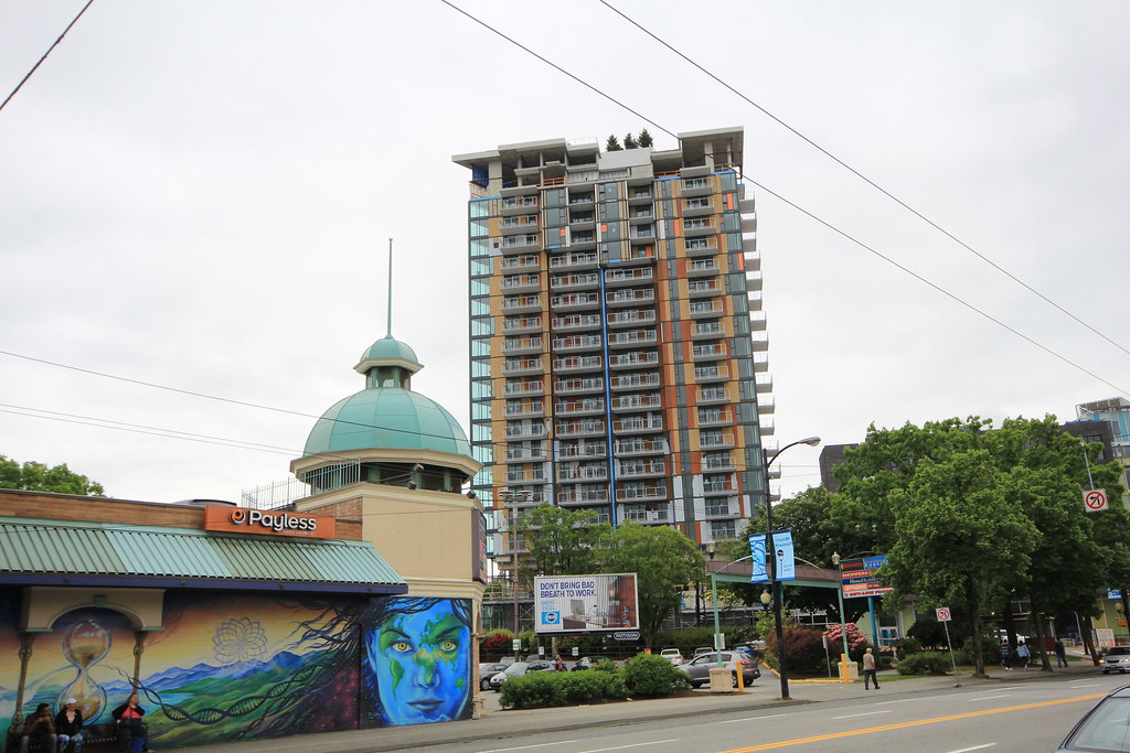 IMG_9795
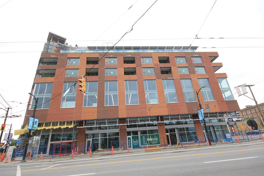 IMG_9798
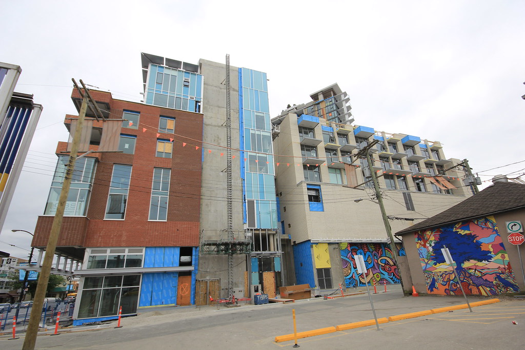 IMG_9800
 IMG_9804
 IMG_9806

 IMG_9807
 IMG_9809
 IMG_9811
 IMG_9814


 Linear Mode
