Quote:
Originally Posted by officedweller

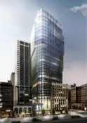
Looks pretty ordinary - not sure why they have the glazed corner facing pender - just make it uniform like the lane elevation.
It's clear it doesn't "match" or blend with either of its neighbours, so why the asymmetry (
which visually pushes it closer to the brick-banded building on the corner with which it does not match)?
|
Lack of taste; lack of 'savoir-faire.' Excuse the snobby-sounding response, but a lot of these people don't travel and/or do it the cheapest way possible without a thought to the aesthetics.






 Threaded Mode