HomeDiagramsDatabaseMapsForum About
     

Go Back   SkyscraperPage Forum > Regional Sections > Canada


Reply

 
Thread Tools Display Modes
     
     
  #121  
Old Posted Jun 29, 2017, 8:50 PM
esquire's Avatar
esquire esquire is offline
 
Join Date: Oct 2001
Posts: 37,480
Quote:
Originally Posted by SignalHillHiker View Post
I absolutely hate our provincial flag, not just for political reasons. It's just disgusting to me, awful. I hate it. So of course I inevitably hate all of the thousands of logos here that feature it.
Disagree... the politics of it is one thing, but from a design standpoint it's one of the better flags in North America.

Reply With Quote
     
     
  #122  
Old Posted Jun 29, 2017, 8:51 PM
SignalHillHiker's Avatar
SignalHillHiker SignalHillHiker is online now
 
Join Date: Jul 2012
Posts: 36,353
Ugh, I hate it. It's like a four-year-old's attempt to better the Union flag with no understanding of what symbolism went into the Union flag.

I mean... a golden arrow pointing the way to prosperity? I'm surprised "NEWFOUNDLAND" isn't literally written somewhere on it.
Reply With Quote
     
     
  #123  
Old Posted Jun 29, 2017, 8:56 PM
esquire's Avatar
esquire esquire is offline
 
Join Date: Oct 2001
Posts: 37,480
Quote:
Originally Posted by SignalHillHiker View Post
I mean... a golden arrow pointing the way to prosperity? I'm surprised "NEWFOUNDLAND" isn't literally written somewhere on it.


Fair enough, those are valid points! I still think it's pretty nice, though.
Reply With Quote
     
     
  #124  
Old Posted Jun 29, 2017, 8:57 PM
kwoldtimer kwoldtimer is offline
 
Join Date: Jan 2008
Posts: 26,252
Agree. It's a great flag, instantly recognizable and with good symbolism.
Reply With Quote
     
     
  #125  
Old Posted Jun 29, 2017, 8:59 PM
Acajack's Avatar
Acajack Acajack is offline
 
Join Date: Aug 2006
Posts: 72,949
Add me to the fans of the NL flag.
Reply With Quote
     
     
  #126  
Old Posted Jun 29, 2017, 9:01 PM
MolsonExport's Avatar
MolsonExport MolsonExport is online now
 
Join Date: Oct 2003
Posts: 51,820
Reply With Quote
     
     
  #127  
Old Posted Jun 29, 2017, 9:02 PM
O-tacular's Avatar
O-tacular O-tacular is online now
 
Join Date: Jul 2008
Posts: 26,322
Quote:
Originally Posted by molsonexport View Post
o-m-g!!!
Reply With Quote
     
     
  #128  
Old Posted Jun 29, 2017, 9:03 PM
O-tacular's Avatar
O-tacular O-tacular is online now
 
Join Date: Jul 2008
Posts: 26,322
This might be venturing into mascot territory but does anyone remember Louie the Lightbulb from those 80's commercials?

Reply With Quote
     
     
  #129  
Old Posted Jun 29, 2017, 9:05 PM
The Chemist's Avatar
The Chemist The Chemist is offline
 
Join Date: Aug 2001
Posts: 8,875
Quote:
Originally Posted by O-tacular View Post
This might be venturing into mascot territory but does anyone remember Louie the Lightbulb from those 80's commercials?

I sure do. Were those for Transalta or someone else?
Reply With Quote
     
     
  #130  
Old Posted Jun 29, 2017, 9:06 PM
SignalHillHiker's Avatar
SignalHillHiker SignalHillHiker is online now
 
Join Date: Jul 2012
Posts: 36,353
Sure do.

• Video Link
Reply With Quote
     
     
  #131  
Old Posted Jun 29, 2017, 9:07 PM
O-tacular's Avatar
O-tacular O-tacular is online now
 
Join Date: Jul 2008
Posts: 26,322
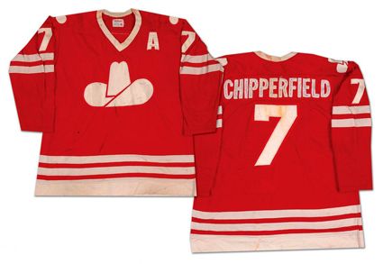
Calgary's horrible flag!

Reply With Quote
     
     
  #132  
Old Posted Jun 29, 2017, 9:10 PM
O-tacular's Avatar
O-tacular O-tacular is online now
 
Join Date: Jul 2008
Posts: 26,322
Quote:
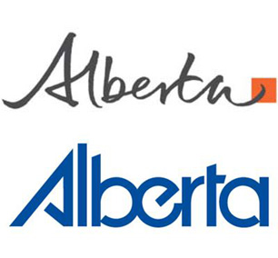
Originally Posted by speedog View Post
Alberta, the new and the old logo (bottom) - I still prefer the old...

Yes the old one was much better!
Reply With Quote
     
     
  #133  
Old Posted Jun 29, 2017, 9:14 PM
esquire's Avatar
esquire esquire is offline
 
Join Date: Oct 2001
Posts: 37,480
Quote:
Originally Posted by O-tacular View Post
Calgary's horrible flag!

Reminds me of the old WHA Calgary Cowboys uniforms


I wonder which came first?
Reply With Quote
     
     
  #134  
Old Posted Jun 29, 2017, 10:20 PM
GeneralLea's Avatar
GeneralLea GeneralLea is offline
 
Join Date: Aug 2015
Posts: 5,984
Uh...all I see is Arby's stupid logo in that Calgary flag. I never even had Arby's....bleugh.

I can see why they'd use red and appreciate that...but it's far too simple and it seems to be generalizing Calgary as a "cow-tippin' town" or something.
Reply With Quote
     
     
  #135  
Old Posted Jun 29, 2017, 10:24 PM
O-tacular's Avatar
O-tacular O-tacular is online now
 
Join Date: Jul 2008
Posts: 26,322
Quote:
Originally Posted by GeneralLeeTPHLS View Post
Uh...all I see is Arby's stupid logo in that Calgary flag. I never even had Arby's....bleugh.

I can see why they'd use red and appreciate that...but it's far too simple and it seems to be generalizing Calgary as a "cow-tippin' town" or something.
Yes it's horrendous. We only recently got updated welcome to Calgary signs at the city limits without Heidi and Howdy (Olympics mascots) or 90's cowboy hat squiggles.

Here's the old logo vs the new one:



Here's a new welcome sign being installed:

Reply With Quote
     
     
  #136  
Old Posted Jun 29, 2017, 11:56 PM
Andy6's Avatar
Andy6 Andy6 is offline
 
Join Date: Mar 2002
Posts: 9,764
Quote:
Originally Posted by MolsonExport View Post
As a kid, I always had a hard time making out the "B" in the above logo. it just looked like some weird ribbon shape to me, closer to an M than to a B.

Yes, of course, I can see the B but it is really strange and not immediately apparent.
Yes I had the same experience. I thought it was quite nice but it never really looked like a "B".

Great Canadian logos include:
  1. CN - the first and still greatest modern-style logo
  2. TTC
  3. The "Montreal" wordmark/logo
  4. The "Alberta" wordmark - probably don't use it anymore, but it was simple, unique, legible and memorable.
  5. Hockey Night in Canada
  6. CBC's original exploding doughnut
  7. Parti Québécois
  8. VIA
  9. The Great-West Life GWL "key"
  10. Montreal Canadiens
Reply With Quote
     
     
  #137  
Old Posted Jun 30, 2017, 2:51 AM
MolsonExport's Avatar
MolsonExport MolsonExport is online now
 
Join Date: Oct 2003
Posts: 51,820
Quote:
Originally Posted by Andy6 View Post
Yes I had the same experience. I thought it was quite nice but it never really looked like a "B".

Great Canadian logos include:
  1. CN - the first and still greatest modern-style logo
  2. TTC
  3. The "Montreal" wordmark/logo
  4. The "Alberta" wordmark - probably don't use it anymore, but it was simple, unique, legible and memorable.
  5. Hockey Night in Canada
  6. CBC's original exploding doughnut
  7. Parti Québécois
  8. VIA
  9. The Great-West Life GWL "key"
  10. Montreal Canadiens

good list
Reply With Quote
     
     
  #138  
Old Posted Jun 30, 2017, 4:58 AM
Loco101's Avatar
Loco101 Loco101 is offline
 
Join Date: May 2013
Posts: 9,036
Ontario's air ambulance company/agency:
Reply With Quote
     
     
  #139  
Old Posted Jun 30, 2017, 4:59 AM
Loco101's Avatar
Loco101 Loco101 is offline
 
Join Date: May 2013
Posts: 9,036
Ontario Provincial Police (OPP)
Reply With Quote
     
     
  #140  
Old Posted Jun 30, 2017, 5:11 AM
Loco101's Avatar
Loco101 Loco101 is offline
 
Join Date: May 2013
Posts: 9,036
Reply With Quote
     
     
This discussion thread continues

Use the page links to the lower-right to go to the next page for additional posts
   
Reply

Go Back   SkyscraperPage Forum > Regional Sections > Canada
Forum Jump


Forum Jump


All times are GMT. The time now is 6:06 PM.


Powered by vBulletin® Version 3.8.7
Copyright ©2000 - 2026, vBulletin Solutions, Inc.