HomeDiagramsDatabaseMapsForum About
     

Go Back   SkyscraperPage Forum > Regional Sections > Canada > Alberta & British Columbia > Vancouver > Downtown & City of Vancouver


    The Stack in the SkyscraperPage Database

Building Data Page   • Comparison Diagram   • Vancouver Skyscraper Diagram

Map Location

Reply

 
Thread Tools Display Modes
     
     
  #121  
Old Posted May 24, 2017, 1:38 AM
retro_orange retro_orange is offline
retro_orange
 
Join Date: Sep 2014
Location: East Van
Posts: 2,029
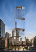
Bit more constructive


https://changingcitybook.com/2017/05/23/1133-melville-street/

I like it much better. Has a formalist look to the podium which is nice too.
Reply With Quote
     
     
  #122  
Old Posted May 24, 2017, 1:41 AM
osirisboy's Avatar
osirisboy osirisboy is online now
Registered User
 
Join Date: Mar 2006
Location: Vancouver BC
Posts: 6,429
100,000 sqft less than the original proposal, that's unfortunate. And 550,000 sqft will make it the largest office building here? Ugh that's kinda sad lol

And if anyone knows, why did the UDP not support the earlier proposal?
Reply With Quote
     
     
  #123  
Old Posted May 24, 2017, 2:01 AM
Aroundtheworld Aroundtheworld is offline
Registered User
 
Join Date: Oct 2013
Posts: 623
Quote:
Originally Posted by logan5 View Post
Clear glass. Can't tell if there are the (now) usual vertical fins. Funny looking thing.

Wow, this looks incredibly mediocre.
Reply With Quote
     
     
  #124  
Old Posted May 24, 2017, 2:46 AM
Cypherus's Avatar
Cypherus Cypherus is offline
Registered User
 
Join Date: Jan 2007
Location: Surrey
Posts: 1,759
Kind of reminds me of the 2 World Trade Centre redesign into stacked boxes. People are going to either love it or hate it.
Reply With Quote
     
     
  #125  
Old Posted May 24, 2017, 4:13 AM
officedweller officedweller is offline
Registered User
 
Join Date: Jul 2001
Location: Vancouver
Posts: 41,558
Great massing!

But I think the glazing is too subtle.
The boxes need to have defined stripes to highlight the offsets.
(otherwise it'll be like Carmana Plaza, which is colour blocked in green, blue, white and gray, but the colours are too subtle to be noticeable).

I think I see a double height sky lobby in the middle of the tower, and roof deck "bands" with different glazing.
Reply With Quote
     
     
  #126  
Old Posted May 24, 2017, 4:45 AM
Klazu's Avatar
Klazu Klazu is offline
Registered User
 
Join Date: Apr 2012
Location: Above Metro Vancouver clouds
Posts: 10,401
All I needed to read was James. God Damn. Cheng. He sure knows how to make a mediocre design fly in this city.

It could potentially look decent if executed with quality, but I highly doubt. That's not James' trademark.
Reply With Quote
     
     
  #127  
Old Posted May 24, 2017, 5:54 AM
Feathered Friend Feathered Friend is offline
Registered User
 
Join Date: Jun 2016
Posts: 2,518
First Impressions

Is it appropriate to change the information in the thread title now, or should we wait and see if it passes UDP first?

I feel that the materials will really make or break this proposal. I'm on the fence with the top of the tower, after the twist. Part of me worries it's going to feel top heavy / like it was an after thought (by no means am I saying the tower should be shorter).
Thanks for posting the picture Changing City!
Reply With Quote
     
     
  #128  
Old Posted May 24, 2017, 6:15 AM
Vin Vin is offline
Registered User
 
Join Date: Sep 2013
Posts: 8,736
Another rendition of the art gallery. Really ugly. Of all the designs one can imagine, this one has to end up.on the drawing board........speechless.
Reply With Quote
     
     
  #129  
Old Posted May 24, 2017, 7:07 AM
trofirhen trofirhen is offline
Registered User
 
Join Date: Oct 2008
Posts: 9,045
Question "The tower that survived the quake" .... or what?
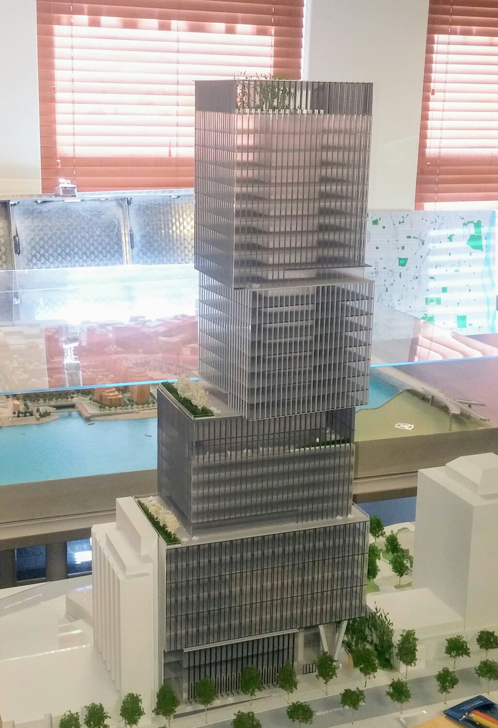
Not nice. Not pretty. Not smart.
IMO, it looks like kids' toy blocks all piled hodge-podge un top of each other. And to add to that, they look as if they're going to slide horizontally, and crash.
The "asymmetrical" aspect, I suppose, is supposed to make it look avant-garde, but for me, all it is is a jumble of boxes in a dreary grey color.
Reply With Quote
     
     
  #130  
Old Posted May 24, 2017, 10:29 AM
officedweller officedweller is offline
Registered User
 
Join Date: Jul 2001
Location: Vancouver
Posts: 41,558
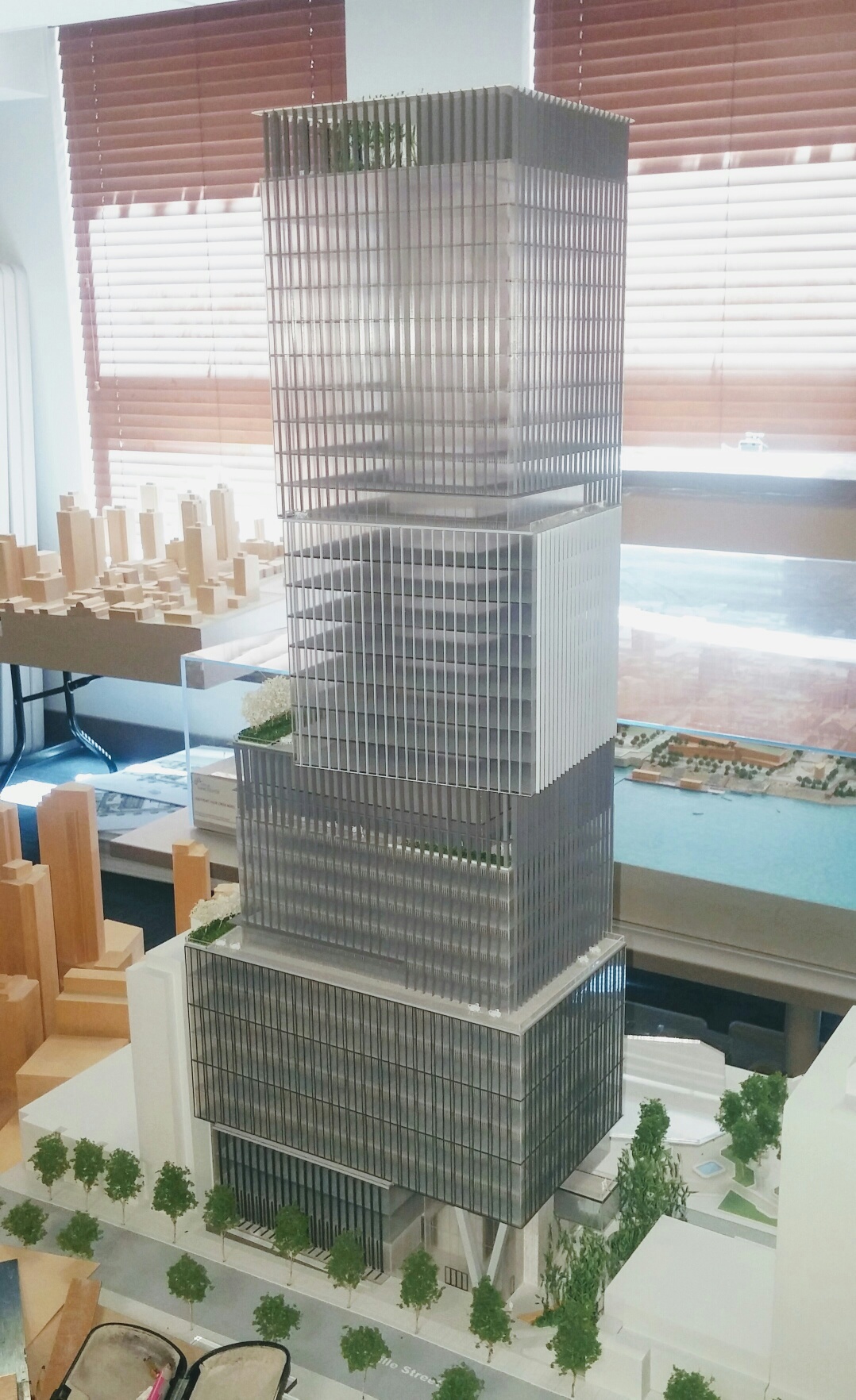
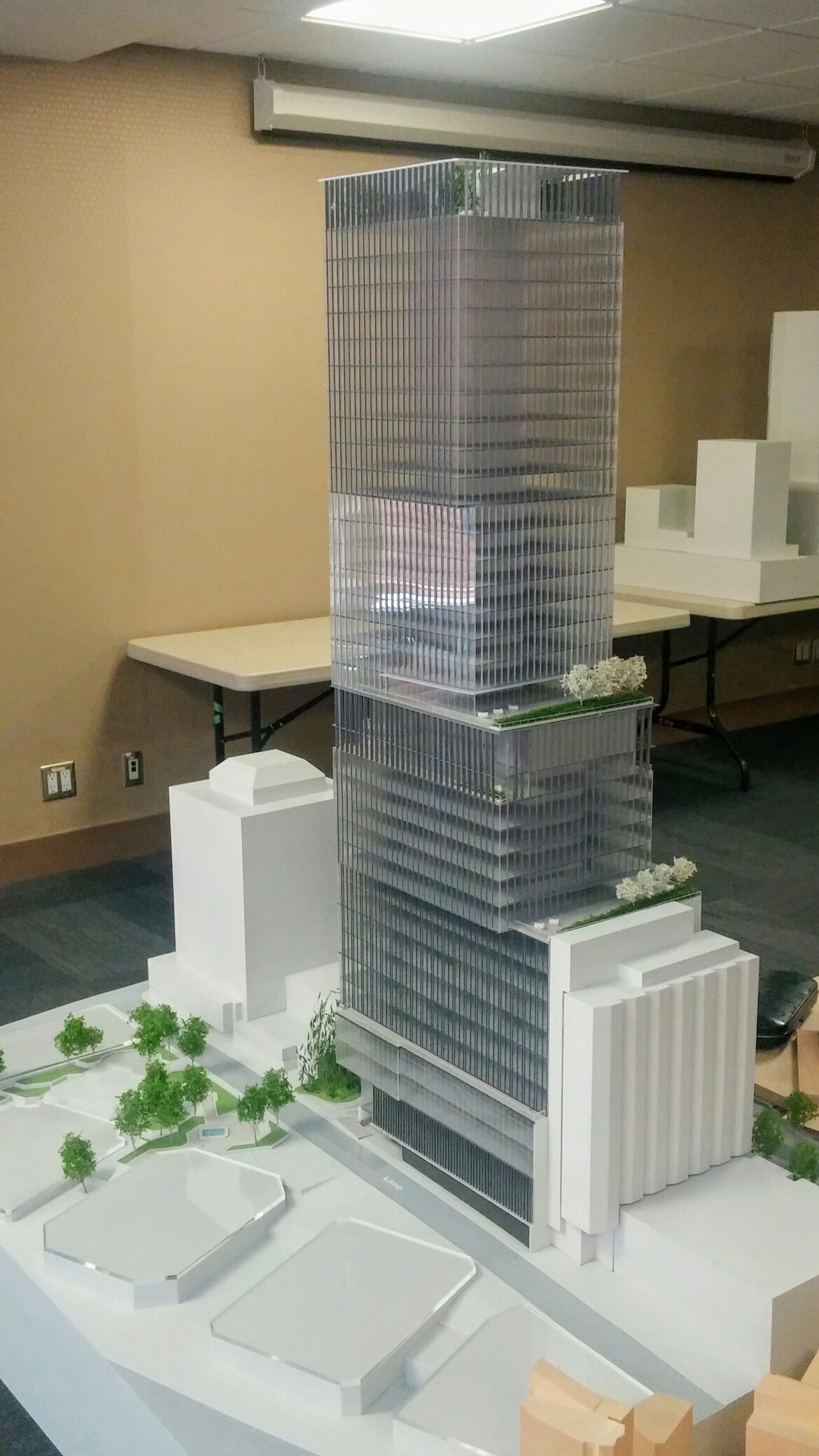
More model pics from VancouverMarket.ca.

If the 3rd cube was in a contrasting colour (red or white) or feature louvres (diagonals or Xs), that would make the design "pop".

Quote:
The new design by James Cheng, features a much more interesting building massing. The revision includes stacked box design with the third box twisted from the street grid. There is a slight increase in height from 33 to 34-storeys. Details include:
◾a building height of 550 ft.
◾a total floor area of 555,047 SF
◾a total density of 18.20 FSR (down from 22.46 FSR)
◾four floorplate sizes, multiple decks including a rooftop deck
◾floor to ceiling windows
◾six levels of underground parking (231 vehicle spaces and 221 bicycle spaces)
http://www.vancouvermarket.ca/2017/05/23/new-look-for-1133-melville-street-proposal/


http://www.vancouvermarket.ca/2017/05/23/new-look-for-1133-melville-street-proposal/


http://www.vancouvermarket.ca/2017/05/23/new-look-for-1133-melville-street-proposal/


http://www.vancouvermarket.ca/2017/05/23/new-look-for-1133-melville-street-proposal/

Last edited by officedweller; May 24, 2017 at 10:53 AM.
Reply With Quote
     
     
  #131  
Old Posted May 24, 2017, 10:49 AM
officedweller officedweller is offline
Registered User
 
Join Date: Jul 2001
Location: Vancouver
Posts: 41,558
Compare:

Buildings That Look Like Stacked Boxes
http://www.amusingplanet.com/2016/01/buildings-that-look-like-stacked-boxes.html

Irregularly stacked boxes https://www.dezeen.com/tag/irregularly-stacked-boxes/

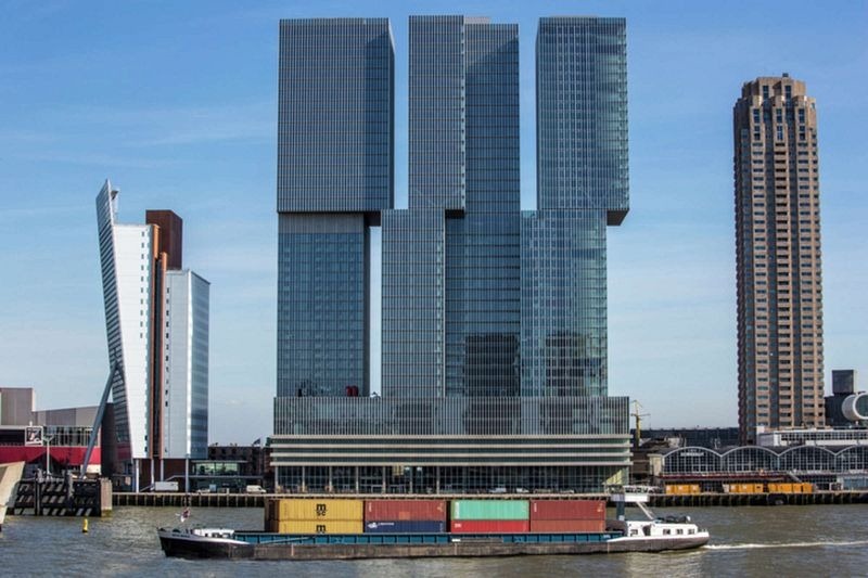
If you look at the Rotterdam office block by OMA, the glazing is similar on the various masses, which blend together.


De Rotterdam complex on the south bank of the Maas river, designed by OMA.
Photo credit: Ryan Koopmans/Rem Koolhaas/OMA

http://www.amusingplanet.com/2016/01/buildings-that-look-like-stacked-boxes.html

Compare to Torre Américas 1500 in Guadalajara on which louvres change orientation on each cube.

https://www.dezeen.com/2017/05/02/angled...-guadalajara-sordo-madelano-arquitectos/


http://www.ctbuh.org/News/GlobalTallNews...ricas-1500-Completes-in-Guadalajara.aspx

Last edited by officedweller; May 24, 2017 at 9:16 PM.
Reply With Quote
     
     
  #132  
Old Posted May 24, 2017, 1:41 PM
Metro-One's Avatar
Metro-One Metro-One is offline
Registered User
 
Join Date: Sep 2008
Location: Japan
Posts: 17,928
Call me crazy, but I like it!

While there are many towers proposed / existing around the world that used the stacked box design, there is no building similar to this in Vancouver, and I like having it add to the variety of our office tower forms.

I do hope it is at least a little reflective though. And I agree with offciedweller's suggestions.

Also hope that there is some for of lighting for the crown...
__________________
Bridging the Gap
Check out my Flickr: https://www.flickr.com/photos/30634635@N03/with/29495547810/ and Youtube channel https://www.youtube.com/channel/UCV0_0h9qKlhxXFxuAey_q6Q
Reply With Quote
     
     
  #133  
Old Posted May 24, 2017, 2:49 PM
Vin Vin is offline
Registered User
 
Join Date: Sep 2013
Posts: 8,736
Quote:
Originally Posted by Klazu View Post
Okay, let me begin the thread for this one since nobody else seems to be doing it.


All photos by Oxford Properties via Vancitybuzz.
Like the previous design if it were more slender, taller, and having less facets, especially when viewed from the water.
Reply With Quote
     
     
  #134  
Old Posted May 24, 2017, 2:56 PM
Metro-One's Avatar
Metro-One Metro-One is offline
Registered User
 
Join Date: Sep 2008
Location: Japan
Posts: 17,928
Given that the more bulky lower 2 segments will be completely obscured in regards to the skyline, I think it will look much more appropriate than the original proposal. The top 2 segments seem appropriately sized to me, and it is almost 7 meters taller
__________________
Bridging the Gap
Check out my Flickr: https://www.flickr.com/photos/30634635@N03/with/29495547810/ and Youtube channel https://www.youtube.com/channel/UCV0_0h9qKlhxXFxuAey_q6Q
Reply With Quote
     
     
  #135  
Old Posted May 24, 2017, 5:31 PM
Vin Vin is offline
Registered User
 
Join Date: Sep 2013
Posts: 8,736
I don't mind the new height, but think the design has been watered down a whole lot .
Reply With Quote
     
     
  #136  
Old Posted May 25, 2017, 4:29 AM
BodomReaper BodomReaper is offline
Registered User
 
Join Date: Jul 2010
Location: Metro Vancouver
Posts: 987
Count me as a big fan of the new design. It has serious presence - the 5 distinct chunks make it look taller than it is. And as someone else noted, there's a great new formalist vibe to the podium.

I hope the UDP doesn't force uniformity with the glazing, the variety works nicely with each segment getting lighter.
Reply With Quote
     
     
  #137  
Old Posted May 25, 2017, 5:56 AM
jlousa's Avatar
jlousa jlousa is offline
Ferris Wheel Hater
 
Join Date: Jun 2006
Posts: 8,371
Put me in the camp that likes this one better then the original proposal. Looks smart and will age well.
Reply With Quote
     
     
  #138  
Old Posted May 25, 2017, 6:22 AM
retro_orange retro_orange is offline
retro_orange
 
Join Date: Sep 2014
Location: East Van
Posts: 2,029
Quote:
Originally Posted by Vin View Post
I don't mind the new height, but think the design has been watered down a whole lot .
The previous iteration was kinda boring IMO, especially viewing from street level it would just look like a big box, the interesting bit at the top you would never see. The new one makes a far better attempt to animate the street presence however the quality of the materials will be key... please no spandrel, please no spandrel, please no spandrel...
Reply With Quote
     
     
  #139  
Old Posted May 27, 2017, 6:59 AM
EdinVan EdinVan is offline
EdInVan
 
Join Date: May 2008
Location: Sodom and Gomorrah
Posts: 785
Quote:
Originally Posted by trofirhen View Post
Not nice. Not pretty. Not smart.
IMO, it looks like kids' toy blocks all piled hodge-podge un top of each other.
Looks amateurish.
Reply With Quote
     
     
  #140  
Old Posted May 27, 2017, 12:16 PM
trofirhen trofirhen is offline
Registered User
 
Join Date: Oct 2008
Posts: 9,045
Quote:
Originally Posted by EdinVan View Post
Looks amateurish.
That's the exact word! Thanks!
Reply With Quote
     
     
This discussion thread continues

Use the page links to the lower-right to go to the next page for additional posts
 
 
Reply

Go Back   SkyscraperPage Forum > Regional Sections > Canada > Alberta & British Columbia > Vancouver > Downtown & City of Vancouver
Forum Jump


Forum Jump


All times are GMT. The time now is 2:37 PM.

     
SkyscraperPage.com - Privacy Statement - Top

Powered by vBulletin® Version 3.8.7
Copyright ©2000 - 2026, vBulletin Solutions, Inc.