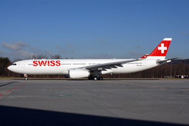
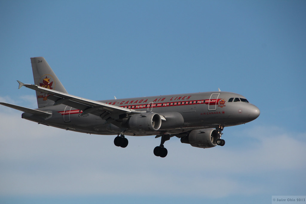
The Austrian one isn't bad. The shadow under the logo on the front and tail seems to work but that could go tacky. The Swiss one is great, but boring. The 70s one is the best out of that Air Canada lot (wow, they've had a lot of awful ones), but I do prefer the new one better.
Our provincial airline (literally called Provincial Airlines) also has a provincial livery.

They're just too... early 2000s small chain coffee house.

"Provincial Airlines Airlines", via FB. Did someone try to draw a dick on that tail? How do airplanes end up anywhere they could get graffitied?





 Prev
Prev





(Tko)%20VIE%20(GHD)(46)-M.jpg)





 Linear Mode
