HomeDiagramsDatabaseMapsForum About
     

Go Back   SkyscraperPage Forum > Regional Sections > Canada > Manitoba & Saskatchewan


Reply

 
Thread Tools Display Modes
     
     
  #641  
Old Posted Apr 20, 2016, 1:05 PM
Urban recluse Urban recluse is offline
BANNED
 
Join Date: Oct 2015
Posts: 4,797
The problem is Canad.
Reply With Quote
     
     
  #643  
Old Posted Apr 20, 2016, 1:44 PM
Biff's Avatar
Biff Biff is offline
What could go wrong?
 
Join Date: Jun 2004
Location: Winnipeg
Posts: 9,932
While I am not a fan of the Brutalist Style I do actually like the Radisson Building. As others have said before, restoring it would go a long way to making it look better. The exposed parking ramps with the light bulbs hanging down look like 🞵🞵🞵🞵 and getting the facade lighting working again would go a long way to changing peoples opinions.

.....I do not like the PSB at all, never have. I understand the arguments for saving it but I have to place my vote for complete demolition.
__________________
"But a city can be smothered by too much reverence for its past. The skyline must keep acquiring new peaks, because the day we consider it complete and untouchable is the day the city begins to die." - Justin Davidson - May 2010 Issue of New York
Reply With Quote
     
     
  #644  
Old Posted Apr 20, 2016, 1:46 PM
BigG's Avatar
BigG BigG is offline
Ignore these four words.
 
Join Date: Mar 2004
Location: Fort Garryish
Posts: 1,110
It's like beating a dead horse - but, the Radisson really needs a facelift. And in this case, I agree with Urban Recluse, more glass would be excellent. Just leave the Richardson alone. How's that for compromise?
Reply With Quote
     
     
  #645  
Old Posted Apr 20, 2016, 2:18 PM
Urban recluse Urban recluse is offline
BANNED
 
Join Date: Oct 2015
Posts: 4,797
Lol. Looking at the Richardson as is is not as painful as looking at the Radisson. However, If the family reclads the Richardson building, I will be elated.
Reply With Quote
     
     
  #646  
Old Posted Apr 20, 2016, 4:48 PM
Biff's Avatar
Biff Biff is offline
What could go wrong?
 
Join Date: Jun 2004
Location: Winnipeg
Posts: 9,932

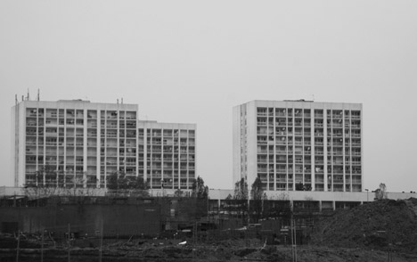
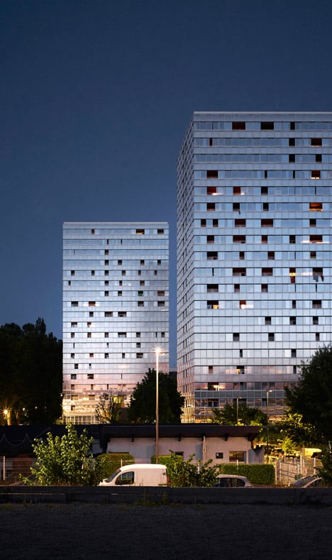
No offense, but these images look like boring slab residential blocks and boring slab buildings covered with glass. Either way dull and boring.
__________________
"But a city can be smothered by too much reverence for its past. The skyline must keep acquiring new peaks, because the day we consider it complete and untouchable is the day the city begins to die." - Justin Davidson - May 2010 Issue of New York
Reply With Quote
     
     
  #647  
Old Posted Apr 20, 2016, 4:50 PM
Urban recluse Urban recluse is offline
BANNED
 
Join Date: Oct 2015
Posts: 4,797
Which is what the Richardson building is. At least there is sparkle to the recladded slabs.
Reply With Quote
     
     
  #648  
Old Posted Apr 20, 2016, 5:14 PM
BigG's Avatar
BigG BigG is offline
Ignore these four words.
 
Join Date: Mar 2004
Location: Fort Garryish
Posts: 1,110
Wasn't something similar done to that apartment block at 33 Hargrave? However, the glass was tinted and the concrete wasn't glassed over. IMO, an improvement.

https://www.google.ca/maps/@49.8854926,-...YNk4Pj2khGKR1dA!2e0!7i13312!8i6656?hl=en
Reply With Quote
     
     
  #649  
Old Posted Apr 20, 2016, 5:34 PM
Urban recluse Urban recluse is offline
BANNED
 
Join Date: Oct 2015
Posts: 4,797
Yes, as well as the former Sheraton.
Reply With Quote
     
     
  #650  
Old Posted Apr 20, 2016, 5:41 PM
BigG's Avatar
BigG BigG is offline
Ignore these four words.
 
Join Date: Mar 2004
Location: Fort Garryish
Posts: 1,110
Right. Depending from where you approach the old Sheraton, it's ok. This is one of the better views.

https://www.google.ca/maps/@49.8892948,-...tVh-W67Yc_TRGmg!2e0!7i13312!8i6656?hl=en
Reply With Quote
     
     
  #651  
Old Posted Apr 20, 2016, 6:05 PM
drew's Avatar
drew drew is offline
the first stamp is free
 
Join Date: Feb 2004
Location: Hippyville, Winnipeg
Posts: 8,926
Quote:
Originally Posted by BigG View Post
Right. Depending from where you approach the old Sheraton, it's ok. This is one of the better views.

https://www.google.ca/maps/@49.8892948,-...tVh-W67Yc_TRGmg!2e0!7i13312!8i6656?hl=en
I have never liked that re-clad sheraton. It just doesn't seem "right" - or it looks too forced. I certainly don't think I would consider it an attractive building.
Reply With Quote
     
     
  #652  
Old Posted Apr 20, 2016, 6:20 PM
esquire's Avatar
esquire esquire is offline
Registered User
 
Join Date: Oct 2001
Posts: 37,480
^ Agreed. It's OK but not great.
Reply With Quote
     
     
  #653  
Old Posted Apr 20, 2016, 6:24 PM
Hecate's Avatar
Hecate Hecate is offline
Registered User
 
Join Date: Apr 2016
Posts: 2,437
Hello everyone! First time poster, long time lurker... Leave the Richardson alone... It's a beautiful building. Better lighting, updated R and the removal of the portage and main blockades, Would go a long way to improving its presence on the corner without any flashy shiny upgrades...
Reply With Quote
     
     
  #654  
Old Posted Apr 20, 2016, 6:26 PM
BigG's Avatar
BigG BigG is offline
Ignore these four words.
 
Join Date: Mar 2004
Location: Fort Garryish
Posts: 1,110
^^Welcome to the forum, Hecate.
Reply With Quote
     
     
  #655  
Old Posted Apr 20, 2016, 6:29 PM
Hecate's Avatar
Hecate Hecate is offline
Registered User
 
Join Date: Apr 2016
Posts: 2,437
Thanks BigG
Reply With Quote
     
     
  #656  
Old Posted Apr 20, 2016, 7:08 PM
esquire's Avatar
esquire esquire is offline
Registered User
 
Join Date: Oct 2001
Posts: 37,480
^ Just on that "R" at the top of the building, I'm sure it will stay the same for as long as Richardson keeps using that logo

http://www.jrsl.ca/

Otherwise, I agree fully.

and PS, welcome to the forum Hecate!
Reply With Quote
     
     
  #657  
Old Posted Apr 20, 2016, 7:17 PM
BigG's Avatar
BigG BigG is offline
Ignore these four words.
 
Join Date: Mar 2004
Location: Fort Garryish
Posts: 1,110
Now that you've mentioned it, the Richardson logo needs a redesign. Something more appropriate for the Millenium. Possibly more colour too - moreso than the building itself. I know I'm gonna get slack from UR now.
Reply With Quote
     
     
  #658  
Old Posted Apr 20, 2016, 7:21 PM
esquire's Avatar
esquire esquire is offline
Registered User
 
Join Date: Oct 2001
Posts: 37,480
^ Richardson is a pretty conservative outfit, I doubt they'd be in any rush to update their logo to the latest and greatest trend in graphic design. Besides, what's wrong with their logo?

Reply With Quote
     
     
  #659  
Old Posted Apr 20, 2016, 7:29 PM
Cyro's Avatar
Cyro Cyro is offline
Registered User
 
Join Date: Jan 2013
Posts: 5,197
Quote:
Originally Posted by Hecate View Post
Hello everyone! First time poster, long time lurker...

Leave the Richardson alone....
Go crazy...lol..

Well put, simple and to the point...Agree
Reply With Quote
     
     
  #660  
Old Posted Apr 20, 2016, 7:30 PM
BigG's Avatar
BigG BigG is offline
Ignore these four words.
 
Join Date: Mar 2004
Location: Fort Garryish
Posts: 1,110
I just think it looks a bit dated. It's simple, but can be more elegant with just some minor tweaks. Maybe change the font.
Reply With Quote
     
     
This discussion thread continues

Use the page links to the lower-right to go to the next page for additional posts
 
 
Reply

Go Back   SkyscraperPage Forum > Regional Sections > Canada > Manitoba & Saskatchewan
Forum Jump


Forum Jump


All times are GMT. The time now is 7:04 AM.


Powered by vBulletin® Version 3.8.7
Copyright ©2000 - 2026, vBulletin Solutions, Inc.