So I started talking about what I feel is the poor quality of work on the main street skytrain station renovations in the telus building thread (for some reason). Anyhow it prompted me to see if I could find and pictures illustrating what I recall seeing many months ago. I dont live in town otherwise I would just go take some pictures myself.
Anyhow I did find some examples nothing which really captures the fact that it is the entire project that is crooked, miss aligned and out of whack.

Credit to mcminsen for photo. This picture you can see how out of kilter the grey panels are below the glass, but it doesnt really show how messed up the rectangular glass panels are as well.
This straight on view of the glass panels you begin to get an idea (in my opinion) how wonky things are. When I look at this picture in full screen it honestly makes me feel almost sea sick. Some of them are leanin left some are leaning right the horizontal metal bands dont meet up. Keep in mind this is a straight on view if you look down these lines (and I have) from a side view it looks terrible. (credit to "wayne" on flickr for picture)
[IMG]
 Waiting For The Train
 by
Wayne, on Flickr[/IMG]
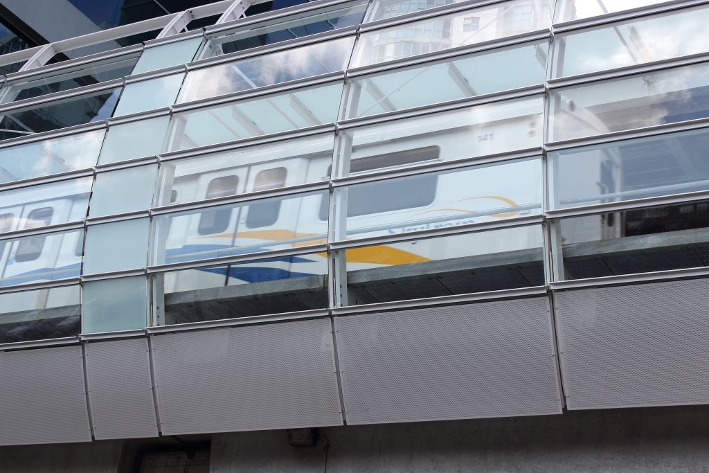
This picture here is the closest I could find to a side view and I think it shows you how much that slight change in perspective worsens the appearance. Honestly this is still not even close to a complete side view though. Keep in mind the entire place is like this, these are not just isolated bad areas.
[IMG]
 Main Street/Science World skytrain station reflections
 by
Hugh Knechtel, on Flickr[/IMG]
I am open to the fact that I'm being an overly critical nit picker or whatever, but this work is not acceptable in my opinion (I know its just a skytrain station) When things are out of whack by what looks to be an inch (if not more) in some cases....well I am bit surprised that this poor quality of work was allowed to pass if I am to be honest. (credit to Hugh Knechtel" for last photo)





 Prev
Prev


 I never knew Vancouver even had a transit system until 2009. I think I heard about the new tiles in a press release somewhere so that's why I got mixed up.





 Linear Mode
