HomeDiagramsDatabaseMapsForum About
     

Go Back   SkyscraperPage Forum > Regional Sections > Canada > Alberta & British Columbia > Vancouver > Downtown & City of Vancouver


Reply

 
Thread Tools Display Modes
     
     
  #2201  
Old Posted Sep 2, 2015, 6:44 PM
officedweller officedweller is offline
Registered User
 
Join Date: Jul 2001
Location: Vancouver
Posts: 41,699
Underwhelming.

Pic by me today:

Reply With Quote
     
     
  #2202  
Old Posted Sep 2, 2015, 6:59 PM
connect2source's Avatar
connect2source connect2source is offline
life in the present
 
Join Date: Mar 2011
Location: Halifax
Posts: 1,879
It's not only underwhelming but it's a new font for Pacific Centre without the PC logo but instead CF's logo. The current PC logo is fairly recent, plastered everywhere else and looks great IMO.

current font :
source : www.burnkit.com
__________________
source | energy
Reply With Quote
     
     
  #2203  
Old Posted Sep 2, 2015, 7:03 PM
officedweller officedweller is offline
Registered User
 
Join Date: Jul 2001
Location: Vancouver
Posts: 41,699
Weird.
It also looks to be too high quality to be temporary.
Reply With Quote
     
     
  #2204  
Old Posted Sep 2, 2015, 7:13 PM
connect2source's Avatar
connect2source connect2source is offline
life in the present
 
Join Date: Mar 2011
Location: Halifax
Posts: 1,879
Do they really plan on changing it all again?

source : www.imperialsign.com
__________________
source | energy
Reply With Quote
     
     
  #2205  
Old Posted Sep 2, 2015, 7:18 PM
nickbeaulieu nickbeaulieu is offline
Registered User
 
Join Date: Dec 2013
Posts: 257
ummm.. WTF!? That sign not only doesn't match the rest of the branding of the mall, but it doesn't match the facade either. It doesn't belong at all. Why the hell is Cadillac Fairview using their logo in it? That's just weird to me.

This whole project has been one giant clusterf**k
Reply With Quote
     
     
  #2206  
Old Posted Sep 2, 2015, 10:15 PM
SpongeG's Avatar
SpongeG SpongeG is offline
Registered User
 
Join Date: Jun 2006
Location: Coquitlam
Posts: 40,068
maybe they are trying to be like westfield - they call all their malls "westfield *insert shopping mall name here*"

it will be "Cadillac Fairview Pacific Centre"
__________________
belowitall
Reply With Quote
     
     
  #2207  
Old Posted Sep 3, 2015, 2:39 AM
jsbertram jsbertram is offline
Registered User
 
Join Date: Sep 2009
Posts: 3,245
Quote:
Originally Posted by officedweller View Post
I do think it's a bit "lame" to "give up" because it's a difficult environment to design.
The same could be said for many alleyways, which are being improved.

The sign next to the door is probably for the Nordstrom restaurant.
I think there'll be after hours elevator access via that door (at least according to the plans).

Did anyone notice the ONLY element on the renovated Nordstrom building to reference the original design?
It's in this McMinsen pic:


It's the chocolate brown (there's actually a name for the colour but I've forgotten it) on the rectangular pillars at the emergency exits.
That's the same colour as the former EATON'S and the TD Tower curtain wall mullions.

and PS - note how they don't match the lighter gray round columns on the west side of the building.


Pic by me today - wrap unwrapping - looks like sheet rock underneath.\

[img]<snip>[/img][/url]
I'm guessing these pillars and emergency doors weren't touched (yet) because there was nothing about them that needed changing.

A quick goat of grey paint to match the other doors can fix that.
Reply With Quote
     
     
  #2208  
Old Posted Sep 3, 2015, 4:38 AM
trofirhen trofirhen is offline
Registered User
 
Join Date: Oct 2008
Posts: 9,047
Quote:
Originally Posted by nickbeaulieu View Post
ummm.. WTF!? That sign not only doesn't match the rest of the branding of the mall, but it doesn't match the facade either. It doesn't belong at all. Why the hell is Cadillac Fairview using their logo in it? That's just weird to me.

This whole project has been one giant clusterf**k
Agreed. A disappointing mish-mash. I just hope they leave the nice clean pacific centre sign alone and don't start flaunting the Cadillac Fairview logo all over the place.
Reply With Quote
     
     
  #2209  
Old Posted Sep 3, 2015, 4:49 AM
mcminsen's Avatar
mcminsen mcminsen is online now
Registered User
 
Join Date: Sep 2007
Location: Downtown Vancouver
Posts: 9,979
I was really hoping for something bright, jazzy and animated for that corner. It's not done yet but…


Sept.2 '15, my pics


Reply With Quote
     
     
  #2210  
Old Posted Sep 3, 2015, 5:09 AM
mcminsen's Avatar
mcminsen mcminsen is online now
Registered User
 
Join Date: Sep 2007
Location: Downtown Vancouver
Posts: 9,979
Quote:
Originally Posted by mcminsen View Post
I wonder what kind of sign might be going in to the left of those doors near the corner.

Aug.18 '15, my pics


Quote:
Originally Posted by connect2source View Post
'Another rather lame attempt by James Cheng'


Nope, just something rather utilitarian, like the rest of that whole side of the building.


Sept.2 '15, my pics


Reply With Quote
     
     
  #2211  
Old Posted Sep 3, 2015, 3:00 PM
nickbeaulieu nickbeaulieu is offline
Registered User
 
Join Date: Dec 2013
Posts: 257
Quote:
Originally Posted by mcminsen View Post
I was really hoping for something bright, jazzy and animated for that corner. It's not done yet but…
OMG, this looks dumb. I'm sure we'll never know, but why did they go with a completely different font over the official font? and why black? There's no black anywhere else in this design. Wow. It's like some exec walked into a design meeting and said "We're doing this" and then walked out without having any idea of what the design was.
Reply With Quote
     
     
  #2212  
Old Posted Sep 3, 2015, 4:36 PM
Klazu's Avatar
Klazu Klazu is offline
Registered User
 
Join Date: Apr 2012
Location: Above Metro Vancouver clouds
Posts: 10,407
Damn, they just keep under-delivering with this building! That sign looks poor.
Reply With Quote
     
     
  #2213  
Old Posted Sep 3, 2015, 5:57 PM
osirisboy's Avatar
osirisboy osirisboy is offline
Registered User
 
Join Date: Mar 2006
Location: Vancouver BC
Posts: 6,429
The sign looks bad. Bland and dreary. I would think it would be a great place for a wrap around screen where Cadillac could sell add time for the various stores in the mall
Reply With Quote
     
     
  #2214  
Old Posted Sep 3, 2015, 6:02 PM
s211 s211 is offline
Registered User
 
Join Date: Oct 2008
Location: The People's Glorious Republic of ... Sigh...
Posts: 8,513
This feels like CF has an inflated sense of self-importance. As if the CF brand has any relevance to the general public... I don't think so.
__________________
If it seems I'm ignoring what you may have written in response to something I have written, it's very likely that you're on my Ignore List. Please do not take it personally.
Reply With Quote
     
     
  #2215  
Old Posted Sep 3, 2015, 8:55 PM
nickbeaulieu nickbeaulieu is offline
Registered User
 
Join Date: Dec 2013
Posts: 257
Quote:
Originally Posted by s211 View Post
This feels like CF has an inflated sense of self-importance. As if the CF brand has any relevance to the general public... I don't think so.
exactly. The public will be looking at this sign going "wtf does the CF stand for??"
Reply With Quote
     
     
  #2216  
Old Posted Sep 3, 2015, 9:05 PM
officedweller officedweller is offline
Registered User
 
Join Date: Jul 2001
Location: Vancouver
Posts: 41,699
Quote:
Originally Posted by jsbertram View Post
I'm guessing these pillars and emergency doors weren't touched (yet) because there was nothing about them that needed changing.
Nope - they are new.
They were round bare concrete columns before they were clad.

Quote:
Originally Posted by mcminsen View Post
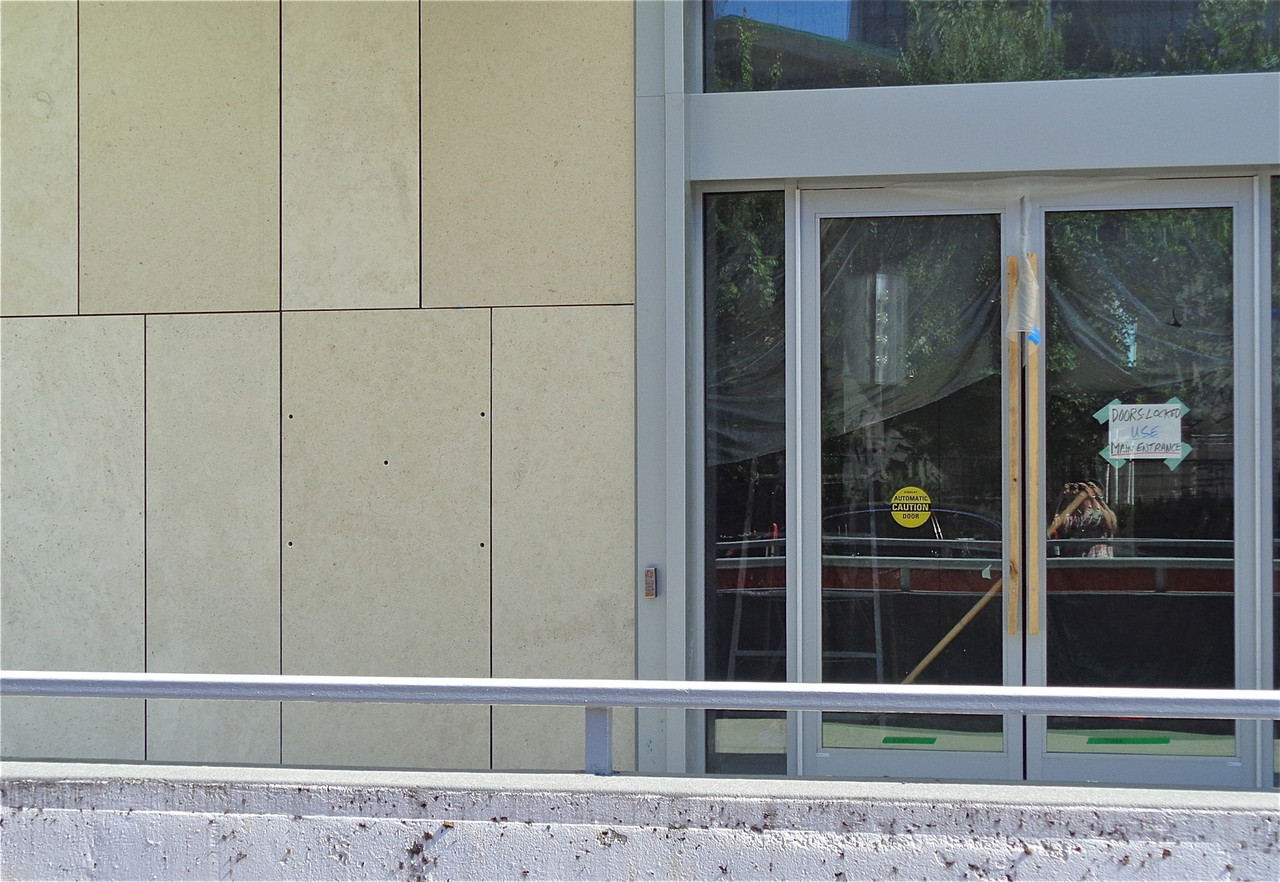
Looks like a holder for the restaurant's menu.

They were installing the signs that say "NORDSTROM" on the doorframes above the entrance doors today.


Last edited by officedweller; Sep 3, 2015 at 9:24 PM.
Reply With Quote
     
     
  #2217  
Old Posted Sep 3, 2015, 9:22 PM
officedweller officedweller is offline
Registered User
 
Join Date: Jul 2001
Location: Vancouver
Posts: 41,699
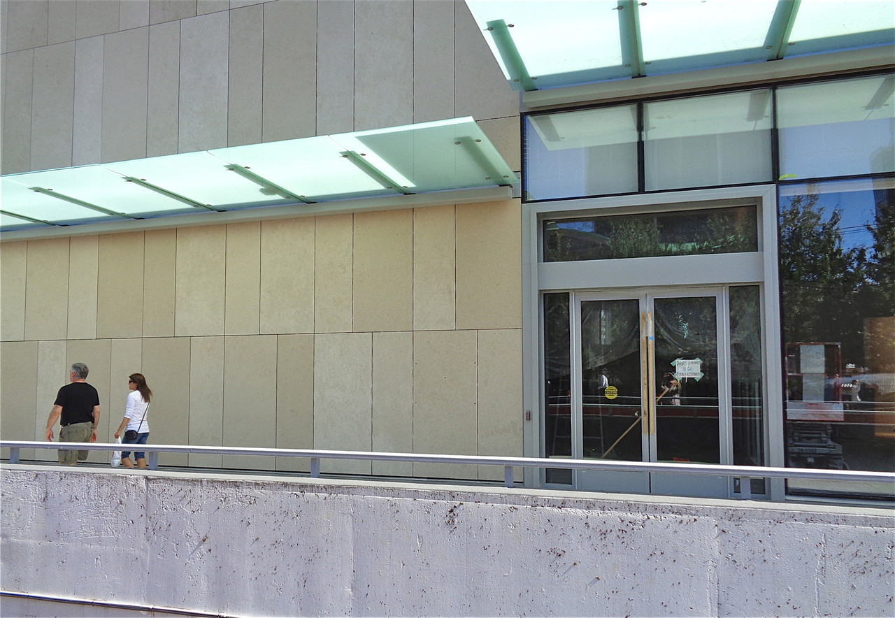
Pic by me today:

They need a big PC logo on the glass above the doors on the corner.


Last edited by officedweller; Sep 3, 2015 at 9:44 PM.
Reply With Quote
     
     
  #2218  
Old Posted Sep 3, 2015, 10:23 PM
nickbeaulieu nickbeaulieu is offline
Registered User
 
Join Date: Dec 2013
Posts: 257
Well... it is pretty consistent with the inconsistent design elements. I mean if you look up "crazy mess of crap" in the dictionary, this building might show up.

or I guess that would be on wikipedia... do dictionaries even exist anymore?
Reply With Quote
     
     
  #2219  
Old Posted Sep 3, 2015, 10:28 PM
nickbeaulieu nickbeaulieu is offline
Registered User
 
Join Date: Dec 2013
Posts: 257
so now the question is are those horizontal ribs hiding strips of LEDs behind them so it's all lit up at night, or is it just really ugly for the sake of being ugly?
Reply With Quote
     
     
  #2220  
Old Posted Sep 3, 2015, 10:35 PM
Denscity Denscity is offline
Registered User
 
Join Date: Jun 2008
Location: Laramidia
Posts: 12,781
^^^ Ya it still looks unfinished.
__________________
Peak SSP:

28C is hotter than 42C
Vancouver is not on the ocean but Quebec City is.
Reply With Quote
     
     
This discussion thread continues

Use the page links to the lower-right to go to the next page for additional posts
 
 
Reply

Go Back   SkyscraperPage Forum > Regional Sections > Canada > Alberta & British Columbia > Vancouver > Downtown & City of Vancouver
Forum Jump


Forum Jump


All times are GMT. The time now is 10:52 PM.


Powered by vBulletin® Version 3.8.7
Copyright ©2000 - 2026, vBulletin Solutions, Inc.