I like it, but Gang (and a lot of architects) would be better off designing
home decor:
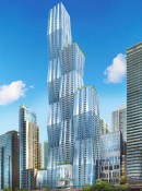
The basic shape is like seaweed and is arbitrary. Instead of a serious architectural look, it's more the look of a whimsical mantel decoration.
The base is loud, uninteresting... and a tribute to the frustums? Why? It's the only design scheme. They shouldn't hint back to it; it's too obvious. And we keep getting reminded of it on the walkways, benches, and honeycomb... it's not even worth celebrating, especially since it's toned down so much.
Both the seaweed shape and honeycomb pattern aren't serious enough to put on a skyscraper. It should not get the same design effort as Target furniture.

I like that it's
more serious like the IBM logo, but the checkered pattern isn't great and the shape is very two-dimensional from afar.
Juxtaposed with the Aon, 2Prudential, Trump, CrainsComm, and Hancock, it doesn't compliment them as much as it adds noise to the skyline. It's shape is different in an arbitrary way that Dubai would like to achieve, but not Chicago.
We have the opportunity to distinguish ourselves from other cities which will eventually clutter their skylines with abstract, wacky, attention-seeking towers. Shanghai looks like a pile of toys while Chicago looks really
mighty and noble. This look plus structurally driven designs need to be the guiding forces for us.
We know the frustums were decorative from the start because, originally, there was no low-E glass.

Instead of standing tall and dignified, Wacky Wanda seeks attention with no message, and yet, it's still fairly dull.
I'll be great because it's a huge, shiny building, but within that, architects have a job. Gang didn't do her job well by clinging to her doodle, which you know was the first random form she drew trying to be novel.


 Prev
Prev


 Linear Mode
