HomeDiagramsDatabaseMapsForum About
     

Go Back   SkyscraperPage Forum > Regional Sections > Canada > Alberta & British Columbia > Vancouver > Downtown & City of Vancouver


Closed Thread

 
Thread Tools Display Modes
     
     
  #11061  
Old Posted Jul 16, 2014, 2:59 AM
idunno idunno is offline
Registered User
 
Join Date: Feb 2010
Posts: 943
Clearly they just wanted the tower to blend into the architectural pukefest that is most of the west end. Why change right?
     
     
  #11062  
Old Posted Jul 16, 2014, 3:11 AM
Klazu's Avatar
Klazu Klazu is offline
Registered User
 
Join Date: Apr 2012
Location: Above Metro Vancouver clouds
Posts: 10,407
The dark blue ones are protective plastic and will be removed. I think the spandrel behind is black on all of them, bringing a bit more coherent looks once peeled off.
     
     
  #11063  
Old Posted Jul 16, 2014, 8:40 PM
officedweller officedweller is online now
Registered User
 
Join Date: Jul 2001
Location: Vancouver
Posts: 41,696
Quote:
Originally Posted by giallo View Post

I just don't understand the thought behind this design at all.
Quote:
Originally Posted by idunno View Post
Clearly they just wanted the tower to blend into the architectural pukefest that is most of the west end. Why change right?
Yeah, it's probably "referencing" - they've probably taken an element from each surrounding building.
     
     
  #11064  
Old Posted Jul 16, 2014, 11:44 PM
NewfBC NewfBC is offline
Registered User
 
Join Date: May 2007
Location: Vancouver, BC
Posts: 1,330
Quote:
Originally Posted by Klazu View Post
The dark blue ones are protective plastic and will be removed. I think the spandrel behind is black on all of them, bringing a bit more coherent looks once peeled off.
I think the ones left on are light coloured. You can see at least 1 peeling off. Those window frames are light as well.. where the black ones, the frames are black.

Ron.
     
     
  #11065  
Old Posted Jul 17, 2014, 7:56 PM
officedweller officedweller is online now
Registered User
 
Join Date: Jul 2001
Location: Vancouver
Posts: 41,696
That's what I thought too - like a checkerboard.
     
     
  #11066  
Old Posted Jul 18, 2014, 3:50 AM
Otis_Van Otis_Van is offline
Registered User
 
Join Date: Mar 2011
Location: Vancouver BC
Posts: 145
Quote:
Originally Posted by Klazu View Post
The dark blue ones are protective plastic and will be removed. I think the spandrel behind is black on all of them, bringing a bit more coherent looks once peeled off.
Here's where it gets truly tragic...

The white windows are covered in blue plastic, and the alternating dark windows are covered in black plastic. On the dark windows where the black plastic is peeling off, you can see that the window frame and spandrel is BROWN, not black.

I live right around the corner from this pile - trust me, I'm not hallucinating.
     
     
  #11067  
Old Posted Jul 18, 2014, 5:55 AM
EdinVan EdinVan is offline
EdInVan
 
Join Date: May 2008
Location: Sodom and Gomorrah
Posts: 785
Quote:
Originally Posted by Otis_Van View Post
Here's where it gets truly tragic...

On the dark windows where the black plastic is peeling off, you can see that the window frame and spandrel is BROWN, not black.
Architects must have been high on something when they designed this garbage. No doubt this will continue happening, what with the free-for-all that council has now permitted along the edges of the West End: http://www.bcbusiness.ca/real-estate/real-estate-boom-projected-for-vancouvers-west-end
     
     
  #11068  
Old Posted Jul 18, 2014, 5:58 AM
officedweller officedweller is online now
Registered User
 
Join Date: Jul 2001
Location: Vancouver
Posts: 41,696
Quote:
Originally Posted by Otis_Van View Post
Here's where it gets truly tragic...

The white windows are covered in blue plastic, and the alternating dark windows are covered in black plastic. On the dark windows where the black plastic is peeling off, you can see that the window frame and spandrel is BROWN, not black.

I live right around the corner from this pile - trust me, I'm not hallucinating.
Ughhh.

When will architects learn that gray and brown do not match/co-ordinate with each other?
References:
- TV Towers with their predominantly light gray colour scheme and they slap on a brownish mauve facade on the taller tower.
- H+H with a predominantly light gray colour scheme and reddish brick applied.

So this building will have white, light gray and dark brown mullions
- is that a first for the most variation?
     
     
  #11069  
Old Posted Jul 18, 2014, 7:36 PM
yogiderek yogiderek is offline
Registered User
 
Join Date: May 2003
Location: westend Vancouver
Posts: 497
So they seem to be moving quite fast on the new tower for the former LEGG House on Harwood street. Moving quite fast with the excavation for the new tower. This is the next new tower for the West End so we should look forward to more pix and updates.
     
     
  #11070  
Old Posted Jul 18, 2014, 9:44 PM
Delirium's Avatar
Delirium Delirium is offline
Registered User
 
Join Date: Jul 2001
Location: Earth
Posts: 3,227
RE: the Lauren. the round balconies are indeed odd because the original renderings suggested square balconies which obviously makes more sense.
the architects were trying too hard here - everything looks forced. surprising because it's a Westbank project.

btw, here's the 'art' component of the project called;

Triumph of the Technocrat
'The piece is to be constructed entirely from reclaimed wooden girders salvaged from the demolished St. John's Church that had once existed at the site. It would literally take the form of the "placeholder" sculpture depicted in the 3D model of the future development. This work would make physically tangible the relationship between ideation & fabrication as related to the production of art through a reversal of the roles of the artist & the art producer or fabricator. Making visible the unseen mechanistic process of development and land speculation impacting the surrounding community. The sculpture would self-reflexively critique its own development and process of creation, and draw parallels between the role and complicity of all players involved in the development process.'

can someone translate this crap for me because I don't get it.
honestly, it's 'two coins joined'. there you go.


www.thelauren.ca


www.thelauren.ca


www.thelauren.ca

some other updates. 564 beatty looks good

photo by Brian.d.campbell on Flickr https://farm3.staticflickr.com/2915/14681327654_e9f1f28ef9_b.jpg

Gumhead progress

photo by jblueafterglow on Flickr https://farm4.staticflickr.com/3906/14500213068_4f18ed0c67_c.jpg

__________________
My Flickr: www.flickr.com/oct2gon

Last edited by Delirium; Jul 18, 2014 at 10:48 PM.
     
     
  #11071  
Old Posted Jul 18, 2014, 11:19 PM
NewWester NewWester is offline
Registered User
 
Join Date: Nov 2011
Posts: 353
This is probably sacrilege, but I think I *LIKE* the Lauren. I mean, it's not elegant or sleek and is kind of tacky, BUT, it's tacky in the same 70s kitsch way the West End towers it's referencing are. It's like the worst excesses of the West End done with the worst excesses of modern Vancouver architecture. It is by no means good, but it's interesting and so I think I like it.
     
     
  #11072  
Old Posted Jul 18, 2014, 11:57 PM
SFUVancouver's Avatar
SFUVancouver SFUVancouver is offline
Registered User
 
Join Date: Dec 2006
Location: Hamilton
Posts: 6,694
Gum head is simultaneously disgusting and awesome.

564 Beatty looks great; a very successful project by all accounts. I still cannot believe it was a concrete vertical addition over a timber post and beam building. I've told some engineers I know about it and their eyes go wide in disbelief.
__________________
VANCOUVER | Beautiful, Multicultural | Canada's Pacific Metropolis
     
     
  #11073  
Old Posted Jul 19, 2014, 4:06 AM
Joat's Avatar
Joat Joat is offline
Registered User
 
Join Date: Jun 2010
Posts: 226
The head is temporary right? When and where is it going later? I think Id rather it stayed.
     
     
  #11074  
Old Posted Jul 19, 2014, 4:51 PM
whatnext whatnext is online now
Registered User
 
Join Date: Feb 2009
Location: Vancouver
Posts: 27,826
Quote:
Originally Posted by giallo View Post
....Seriously though, what happened? How does the UDP pass this? It looks like two already mismatched buildings were stitched together by a column of balconies. I don't want to get all hyperbolic in here, but....

Thanks for the pics.
That's exactly right, the two sides don't look like they belong on the same building!
     
     
  #11075  
Old Posted Jul 19, 2014, 6:19 PM
Locked In's Avatar
Locked In Locked In is offline
Registered User
 
Join Date: Aug 2008
Location: Vancouver
Posts: 1,977
Some of my photos from earlier this week of the Lauren:


__________________
My Flickr Photostream
     
     
  #11076  
Old Posted Jul 20, 2014, 2:20 AM
Locked In's Avatar
Locked In Locked In is offline
Registered User
 
Join Date: Aug 2008
Location: Vancouver
Posts: 1,977
Some more of my photos from today:


Anyone know what these are?


This side is a little bit better

__________________
My Flickr Photostream
     
     
  #11077  
Old Posted Jul 20, 2014, 2:31 AM
trofirhen trofirhen is offline
Registered User
 
Join Date: Oct 2008
Posts: 9,047
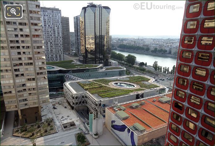
Some European highrises have a jarring design effect also; at least I find it so.
There may be buildings in this picture pleasing to some readers, but also, IMO, designs that would never go in Vancouver.


http://www.eutouring.com/paris_city_life_m13_DSC00285.JPG
     
     
  #11078  
Old Posted Jul 21, 2014, 11:39 AM
EdinVan EdinVan is offline
EdInVan
 
Join Date: May 2008
Location: Sodom and Gomorrah
Posts: 785
Quote:
Originally Posted by NewWester View Post
This is probably sacrilege, but I think I *LIKE* the Lauren. I mean, it's not elegant or sleek and is kind of tacky, BUT, it's tacky in the same 70s kitsch way the West End towers it's referencing are. It's like the worst excesses of the West End done with the worst excesses of modern Vancouver architecture. It is by no means good, but it's interesting and so I think I like it.
An interesting perspective, although I don't think the architects recognize how tacky this building is. They probably think it's somewhat elegant, hence the name they chose for it.
     
     
  #11079  
Old Posted Jul 21, 2014, 2:08 PM
Metro-One's Avatar
Metro-One Metro-One is offline
Registered User
 
Join Date: Sep 2008
Location: Japan
Posts: 17,975
Sooo, when will 564 Beatty be adding its ticker at the bottom??
__________________
Bridging the Gap
Check out my Flickr: https://www.flickr.com/photos/30634635@N03/with/29495547810/ and Youtube channel https://www.youtube.com/channel/UCV0_0h9qKlhxXFxuAey_q6Q
     
     
  #11080  
Old Posted Jul 21, 2014, 3:03 PM
Prometheus's Avatar
Prometheus Prometheus is offline
Reason and Freedom
 
Join Date: Jul 2009
Location: Vancouver/Toronto
Posts: 4,016
Quote:
Originally Posted by Metro-One View Post

Sooo, when will 564 Beatty be adding its ticker at the bottom??
When Georgia Residences adds the rain drop lighting effect down its side.
     
     
This discussion thread continues

Use the page links to the lower-right to go to the next page for additional posts
 
 
Closed Thread

Go Back   SkyscraperPage Forum > Regional Sections > Canada > Alberta & British Columbia > Vancouver > Downtown & City of Vancouver
Forum Jump


Forum Jump


All times are GMT. The time now is 5:19 AM.


Powered by vBulletin® Version 3.8.7
Copyright ©2000 - 2026, vBulletin Solutions, Inc.