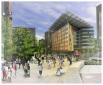
Given the description in the blog, I'd hardly call this design 'basic', though admittedly that can mean different things to different people. To me it looks refined, confident, and striking. Love the black brick. Also love the fact that they've clearly thought about context while designing something for the present. Underground parking. Street level looks interactive. Hope it happens. Wasn't the last proposal some sort of extended-stay hotel?
And yeah, excellent blog! Who is it? One of us?
From
Places Over Time:
Quote:
|
The scheme consists of 167,000 sq. ft. of offices and street level retail on top of a 3-story underground parking garage holding 153 spaces. The designers looked to compliment the existing urban fabric of century-old masonry warehouses with a dark brick facade perforated by evenly-spaced square window bays that feature oversized piers and spandrels reminiscent of traditional building techniques. The first three floors are designed to align with the neighboring historic building’s window lines and parapet, creating a smooth transition across the block. The remaining facade is proposed to change in pier and floor width as the building rises, slowly transitioning from thicker to thinner wythes of brick veneer giving the overall mass a sense of lightness toward the top and heaviness at the base.
|





 Prev
Prev




 Linear Mode
