PLEASE REMEMBER TO BREATHE, everyone.
If I may present my personal "reality check opinion" ... having lived in London where many many many stations were either named in commemoration of something or for less than significant parts of the areas they were in, I can't say that it hampered my ability to get around. With an LRT in place, most businesses, attractions, etc, will make a point of advertising and going by the station they are nearest to. Stations are important, and while wayfinding oriented names are useful for mobility, they have a way of defining an area and creating an identity as well. Pimisi does not currently have geographical meaning, but it will very quickly. Regardless, right now Lebreton, while historic, has no functional meaning either. It's not like there's a neighbourhood there! And besides, the station is there to serve a diverse area: Nanny Goat Hill, Chinatown, Little Italy, the War Museum, connections to Hull sector, and access to the river and eventually to the Chaudiere redevelopment area.
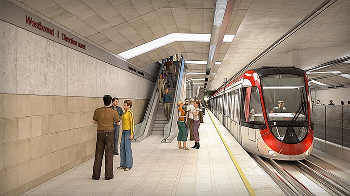
Can anyone, with a straight face, really say that the colour and pattern of exterior paint of any rail vehicle in another city you've visited or live in made a difference to your experience? Has anyone come back from Montreal raving about blue coloured Metros? of stainless steel subways in Toronto or New York? I whole heartedly reject that we were sold a bill of goods by earlier conceptual drawings of the LRT. They are, like the approved design, very basic. In fact, they were more basic! Here is one of the most used photos of the LRT proposal:

It is grey with red trim.
Here's another commonly used image. Grey. White and red trim. No writing, no symbols, no shapes other than square framed grey with white and red trim.

And here's what was chosen:

MY GOD, WHITE, with RED and GREY trim! and the City's transit logos and maple leaf branding on it!
It's perfectly fitting. We're building an LRT, it's a wonderful new piece of infrastructure, not the very soul of the nation.





 Prev
Prev





 Linear Mode
