HomeDiagramsDatabaseMapsForum About
     

Go Back   SkyscraperPage Forum > Regional Sections > Canada > Alberta & British Columbia > Vancouver > Downtown & City of Vancouver


    The Exchange in the SkyscraperPage Database

Building Data Page   • Comparison Diagram   • Vancouver Skyscraper Diagram

Map Location

Reply

 
Thread Tools Display Modes
     
     
  #301  
Old Posted Apr 3, 2013, 8:56 PM
s211 s211 is offline
Registered User
 
Join Date: Oct 2008
Location: The People's Glorious Republic of ... Sigh...
Posts: 8,501
I have heard they will pull the trigger with a pretty low pre-lease commitment.
Reply With Quote
     
     
  #302  
Old Posted Apr 3, 2013, 10:59 PM
phesto phesto is offline
Registered User
 
Join Date: Jan 2002
Location: yvr/bwi
Posts: 2,698
The sequence of events if this is to move forward will be an announcement of a pre-lease commitment, followed by announcement that the project is a go, followed by notice to the existing tenants to vacate (likely 3 to 6 months), followed by site prep...

Given that MNP tower is now fully spoken for (remaining top floors being kept over until completion), I give this one a small chance of landing a couple of tenants, but it is still a longshot to go by summer 2013.
Reply With Quote
     
     
  #303  
Old Posted Apr 3, 2013, 11:27 PM
spm2013 spm2013 is offline
More Towers
 
Join Date: Jan 2013
Posts: 2,312
Quote:
Originally Posted by officedweller View Post
They are retaining the Stock Exchange Building in its entirety, not just the facades.
Sorry, thought he was referring to the MNP Tower.. my mistake!
Reply With Quote
     
     
  #304  
Old Posted Apr 4, 2013, 2:09 AM
Hed Kandi's Avatar
Hed Kandi Hed Kandi is offline
+
 
Join Date: Feb 2006
Posts: 8,575
This tower needs to still go through the UDP, correct?
Reply With Quote
     
     
  #305  
Old Posted Apr 6, 2013, 6:27 PM
trofirhen trofirhen is offline
Registered User
 
Join Date: Oct 2008
Posts: 9,045
Quote:
Originally Posted by Built Form View Post
Screen captures (sorry for the poor quality) taken from CTV's broadcast on Feb 21st showing the altered design. The previous design was too disjointed and busy and am thankful for the removal of the slanted 'hat' which now results in a SHORTER tower. This is an improvement but overall a disappointment considering the architect is Harry Gugger. You can just see the corner facing the Jamieson angled and cut back. The displaced square footage has been cantilevered out on the Howe street facade.


OK, this is going to be it so it seems, so let's get used to it.
One question though. Does it have to be black?
Vancouver is a grey-sky town and already has a fair number of black buildings (Pacific Centre 1 and 2, spring to mind).
Is asking for another colour too much or politically incorrect?
Don't like the idea of bronze? Then what about a deep coppery green, or even nickel white like the CIBC at the foot of Burrard.
Enough sombre charcoal glass already, (though most will disagree or shrug, I am sure)

Reply With Quote
     
     
  #306  
Old Posted Apr 7, 2013, 12:46 AM
GeeCee's Avatar
GeeCee GeeCee is offline
Registered User
 
Join Date: Jan 2009
Location: Port Coquitlam, BC
Posts: 2,816
Quote:
Originally Posted by trofirhen View Post

OK, this is going to be it so it seems, so let's get used to it.
One question though. Does it have to be black?
Vancouver is a grey-sky town and already has a fair number of black buildings (Pacific Centre 1 and 2, spring to mind).
Is asking for another colour too much or politically incorrect?
Don't like the idea of bronze? Then what about a deep coppery green, or even nickel white like the CIBC at the foot of Burrard.
Enough sombre charcoal glass already, (though most will disagree or shrug, I am sure)

I'll take a black tower over seafoam green any day.
Reply With Quote
     
     
  #307  
Old Posted Apr 7, 2013, 1:57 AM
trofirhen trofirhen is offline
Registered User
 
Join Date: Oct 2008
Posts: 9,045
Quote:
Originally Posted by GeeCee View Post
I'll take a black tower over seafoam green any day.
Yuck! Seafoam green, agreed. But what about another colour totally? Something to bring out the colour of the original Stock Exchange building. Bronze? Green-copper? Nickel white? Creamy yellow gold? Deep brown grey? ................
Reply With Quote
     
     
  #308  
Old Posted Apr 18, 2013, 4:53 AM
smho smho is offline
Registered User
 
Join Date: Jul 2001
Posts: 215
The developer had a posting in the Vancouver Sun today on B8 (for congratulating the Rotary Club of Vancouver) and included a light coloured rendering of the tower, although the perspective wasn't good (from the corner of Pender/Howe looking straight up.) The posting also mentioned ground breaking this Fall.

There's a similar coloured rendering on their (revamped?) home page which shows overhangs on the west elevation. http://theexchangebuilding.ca
Reply With Quote
     
     
  #309  
Old Posted Apr 18, 2013, 4:59 AM
red-paladin red-paladin is offline
Vancouver Moderator
 
Join Date: Sep 2008
Location: Burnaby
Posts: 3,626
The site is indeed updated.
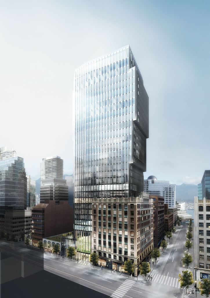
I like these renderings a lot better:


From: http://www.theexchangebuilding.ca/building/
Reply With Quote
     
     
  #310  
Old Posted Apr 18, 2013, 5:10 AM
Infrequent Poster Infrequent Poster is offline
Registered User
 
Join Date: Nov 2012
Posts: 613
Its quite squat.
Reply With Quote
     
     
  #311  
Old Posted Apr 18, 2013, 5:10 AM
jlousa's Avatar
jlousa jlousa is offline
Ferris Wheel Hater
 
Join Date: Jun 2006
Posts: 8,371
I still like it, hopefully the newest renders impress a few more people.
Reply With Quote
     
     
  #312  
Old Posted Apr 18, 2013, 5:16 AM
Infrequent Poster Infrequent Poster is offline
Registered User
 
Join Date: Nov 2012
Posts: 613
It was more of an observation then a judgment.
Reply With Quote
     
     
  #313  
Old Posted Apr 18, 2013, 6:17 AM
Prometheus's Avatar
Prometheus Prometheus is offline
Reason and Freedom
 
Join Date: Jul 2009
Location: Vancouver/Toronto
Posts: 4,016
Quote:
Originally Posted by jlousa View Post
I still like it, hopefully the newest renders impress a few more people.
The renders are better, but the building's design is no better. Those inverted terraces bulging out on the Howe Street side look just as incoherent as before and are obviously an inelegant compromise forced on the developer by the city's height restrictions and gratuitous concession to Jameson House residents.

Last edited by Prometheus; Apr 18, 2013 at 11:02 AM.
Reply With Quote
     
     
  #314  
Old Posted Apr 18, 2013, 7:07 AM
spm2013 spm2013 is offline
More Towers
 
Join Date: Jan 2013
Posts: 2,312
The overhangs just look stupid from the side and bottom.
Reply With Quote
     
     
  #315  
Old Posted Apr 18, 2013, 7:19 AM
trofirhen trofirhen is offline
Registered User
 
Join Date: Oct 2008
Posts: 9,045
Quote:
Originally Posted by Prometheus View Post
The renders are better, but the building's design is no better. The inverted, terraced bulge on the Howe Street side looks just as incoherent as before and is obviously an inelegant compromise forced on the developer by the city's height restrictions and gratuitous concession to Jameson House residents.
Quote:
Originally Posted by spm2013 View Post
The overhangs just look stupid from the side and bottom.
This is an example of mediocrity to mediocrity. There was a potential to do something dramatic here; to make a bold sleek, statement. Instead, we've got something "ho hum; it's ok." IMO the design rates about a 6 or 7 out of 10. We should have maximized the dramatic potential and had something that ranks higher.
With the original building being incorporated, the potential was there. We, er, uh, ... sort of "blew it."
A disappointment. Not a real disaster, but a disappointment for sure.
Reply With Quote
     
     
  #316  
Old Posted Apr 18, 2013, 7:08 PM
officedweller officedweller is offline
Registered User
 
Join Date: Jul 2001
Location: Vancouver
Posts: 41,553
I saw the advertisement too - they must be serious about building this sooner rather than later.

These renders are definitely better - at least it shows that the overhangs are more integrated into the tower (being on 2 sides) than we previously thought. Before it looked more "tacked on" one side.

It's interesting that the west side also has overhangs, rather than setbacks (which would create a stack of shifted blocks)
- but I guess the lease rate on the upper floors favours larger floorplates up top than down below.

Quote:
The new Exchange Building at Howe and Pender in downtown Vancouver is the first Harry Gugger Studio project in North America. Vancouver’s first LEED Platinum office building will rise to 31 storeys, defined by highly distinctive pinstripe mullions, punctuated by green atriums on three levels.
Not sure how the pinstripe mullions will be different from other closely spaced mullions on towers downtown. They do appear to taper at their ends, however.

Last edited by officedweller; Apr 18, 2013 at 7:30 PM.
Reply With Quote
     
     
  #317  
Old Posted Apr 18, 2013, 7:19 PM
Metro-One's Avatar
Metro-One Metro-One is offline
Registered User
 
Join Date: Sep 2008
Location: Japan
Posts: 17,922
The new renders do make it look better, on this tower I am in the more height boat, but it still works.

The west side looks better than the east side IMO.

I would not be surprised to see this tower get going soon, as I said I use to work in the old Stock Exchange, and the people there were very adamant at getting this tower u/c.
__________________
Bridging the Gap
Check out my Flickr: https://www.flickr.com/photos/30634635@N03/with/29495547810/ and Youtube channel https://www.youtube.com/channel/UCV0_0h9qKlhxXFxuAey_q6Q
Reply With Quote
     
     
  #318  
Old Posted Apr 18, 2013, 7:21 PM
Vancity's Avatar
Vancity Vancity is offline
Registered User
 
Join Date: Jan 2009
Location: Richmond, BC
Posts: 1,637
I think the building looks "ok"

I agree that there was opportunity here to do something better. but, gotta get used to this kind of archetitural design. I'm hoping that our achitects gets better over time. City's still young.
Reply With Quote
     
     
  #319  
Old Posted Apr 18, 2013, 7:36 PM
Klazu's Avatar
Klazu Klazu is offline
Registered User
 
Join Date: Apr 2012
Location: Above Metro Vancouver clouds
Posts: 10,401
Even with those great new renderings this is just too weird for my taste. I am happy that this is not going to be taller than 31 floors, so it will just become infill for the area. Shame about the original design.
Reply With Quote
     
     
  #320  
Old Posted Apr 18, 2013, 7:44 PM
officedweller officedweller is offline
Registered User
 
Join Date: Jul 2001
Location: Vancouver
Posts: 41,553
The more I look at it - the more the tower does have a gothic look to it.
The Stock Exchange Building is said to have been in a gothic style, and I think the closely spaced mullions,
the articulation of the facade and the tapering of the mullions suggest a "gothic-ness" to the tower.
Note these narrow mullioned overhanging bay windows:


https://environment7.uwe.ac.uk/resources/constructionsample/Conweb/walls/stone/print.htm
Reply With Quote
     
     
This discussion thread continues

Use the page links to the lower-right to go to the next page for additional posts
 
 
Reply

Go Back   SkyscraperPage Forum > Regional Sections > Canada > Alberta & British Columbia > Vancouver > Downtown & City of Vancouver
Forum Jump


Forum Jump


All times are GMT. The time now is 10:24 AM.

     
SkyscraperPage.com - Privacy Statement - Top

Powered by vBulletin® Version 3.8.7
Copyright ©2000 - 2026, vBulletin Solutions, Inc.