HomeDiagramsDatabaseMapsForum About
     

Go Back   SkyscraperPage Forum > Global Projects & Construction > City Compilations


Reply

 
Thread Tools Display Modes
     
     
  #1701  
Old Posted Sep 5, 2012, 3:01 AM
Captain Crash Captain Crash is offline
Registered User
 
Join Date: Feb 2011
Posts: 140
The new parking lots at the Civic Arena site open this week. This starts the clock on the 2 year deadline for the Penguins to begin development.

http://www.post-gazette.com/stories/loca...esday-at-former-civic-arena-site-651842/
Reply With Quote
     
     
  #1702  
Old Posted Sep 5, 2012, 5:58 AM
Austinlee's Avatar
Austinlee Austinlee is offline
Chillin' in The Burgh
 
Join Date: Nov 2004
Location: Spring Hill, Pittsburgh
Posts: 12,488
Quote:
Originally Posted by CubicalRebel View Post
I got some photos of it this weekend


I went and took a video of the Randy Pausch Memorial bridge lighting as well at CMU a few weeks back. It also is pretty cool and done by the same lighting designers.

More lighting schemes such as this will be seen more often such as the Rivervue condo Austin mentioned above as well. Color LED lighting fixtures are taking off and lowering in price substantially. This is why many HID exterior fixtures are being converted to LED cause they last so long and use far less wattage, so they pay for themselves through energy savings in a reasonable time frame. If you are doing a building like the Gulf tower then why not upgrade it's energy efficiency and go back to Color lighting well you are at it. Exterior architectural lighting will only get more interesting with LEDs. Some may be tacky.
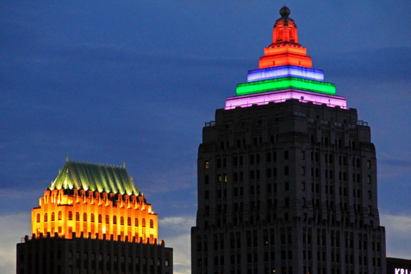
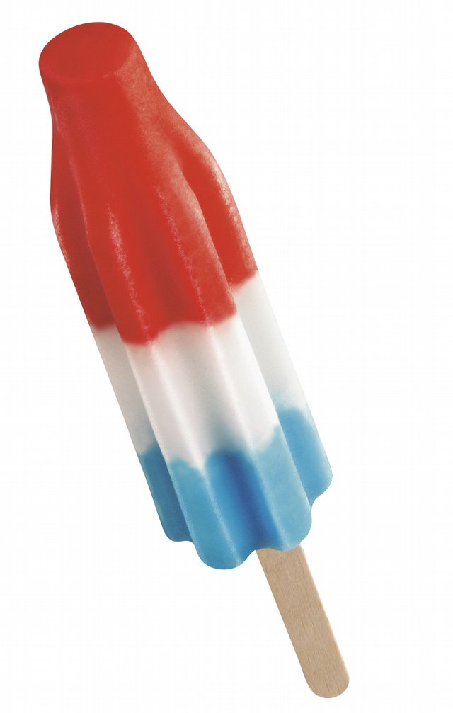
Yes, nice pic. The gulf tower looks like a ice cream pop now!


And yeah. Rivervue is very purple. It looks pretty cool.
__________________
Check out the latest developments in Pittsburgh:
Pittsburgh Rundown III
Reply With Quote
     
     
  #1703  
Old Posted Sep 5, 2012, 4:34 PM
Private Dick Private Dick is offline
BANNED
 
Join Date: Aug 2010
Location: D.C.
Posts: 3,058
Quote:
Originally Posted by CubicalRebel View Post
I got some photos of it this weekend

Definitely has a gay pride flag look to it with this color scheme.

Was driving through Pittsburgh last Thursday evening and it was lit up in a different way... don't know how to describe it really... some white ray-like things were flashing and it was all a lavender color... looked pretty cool. The rainbow flag look is a bit much, but whatever.

Also noticed the purple lights on the new apartments.

Lighting on buildings is cool overall... but on a small skyline, it's very easy to go overboard. With all the corporate lettering and neon lighting, Pittsburgh has kinda gone overboard, in my opinion. There's a fine line between what looks cool and what drives up the 1980s neon cheesiness quotient. Pittsburgh is flirting with both sides right now.

With the embarrassing BNY Mellon sign dancing across the top of the city in all its moving, multi-colored glory, I can only imagine what PNC has in store for us for the top of its new tower... maybe it will shoot out fireworks, dollar bills, and cotton candy from its logo or something...
Reply With Quote
     
     
  #1704  
Old Posted Sep 6, 2012, 1:16 AM
novaCJ novaCJ is offline
Stuck in the Suburbs
 
Join Date: Jan 2012
Location: Northern Virginia (DC Suburbs)
Posts: 347
Sorry, double post.
__________________
"The pessimist complains about the wind. The optimist expects it to change. The realist adjusts the sails."
-William A. Ward
Reply With Quote
     
     
  #1705  
Old Posted Sep 6, 2012, 1:18 AM
novaCJ novaCJ is offline
Stuck in the Suburbs
 
Join Date: Jan 2012
Location: Northern Virginia (DC Suburbs)
Posts: 347
Quote:
Originally Posted by Private Dick View Post
With the embarrassing BNY Mellon sign dancing across the top of the city in all its moving, multi-colored glory, I can only imagine what PNC has in store for us for the top of its new tower... maybe it will shoot out fireworks, dollar bills, and cotton candy from its logo or something...
Dollar bills? sounds nice...
__________________
"The pessimist complains about the wind. The optimist expects it to change. The realist adjusts the sails."
-William A. Ward
Reply With Quote
     
     
  #1706  
Old Posted Sep 6, 2012, 1:57 AM
ShooFlyPie ShooFlyPie is offline
Registered User
 
Join Date: Mar 2012
Location: Pittsburgh
Posts: 321
Quote:
Originally Posted by Private Dick View Post
Definitely has a gay pride flag look to it with this color scheme.

Was driving through Pittsburgh last Thursday evening and it was lit up in a different way... don't know how to describe it really... some white ray-like things were flashing and it was all a lavender color... looked pretty cool. The rainbow flag look is a bit much, but whatever.

Also noticed the purple lights on the new apartments.

Lighting on buildings is cool overall... but on a small skyline, it's very easy to go overboard. With all the corporate lettering and neon lighting, Pittsburgh has kinda gone overboard, in my opinion. There's a fine line between what looks cool and what drives up the 1980s neon cheesiness quotient. Pittsburgh is flirting with both sides right now.

With the embarrassing BNY Mellon sign dancing across the top of the city in all its moving, multi-colored glory, I can only imagine what PNC has in store for us for the top of its new tower... maybe it will shoot out fireworks, dollar bills, and cotton candy from its logo or something...

I agree with your post more than you probably think. I absolutely loathe all the damn signs on Pittsburgh's Skyline!

Here was a article in NPR about it a few years ago. Well, about Seattle, but Pittsburgh is mentioned as a bad example. I also read another article about the extreme use of signs on the Pittsburgh skyline but can't find that.

http://www.npr.org/2010/12/21/132225124/Signless-In-Seattle-Urban-Designers-Hope-So

I have mixed opinion about exterior lighting and use of color LEDs. A proper lighting designer should have studied the art of light and how to integrate it in with the architecture. Color LEDs will be come more popular. I think the Randy Pausch Bridge is cool. But start making everything look like a rave party on E then it goes to far. I do like the Gulf tower. I like how it goes back to using color coding signals on the top now that LEDs are available. Up to then the only real efficient exterior lighting is High Pressure Sodium and Metal Halide, and maybe induction (which is new as well). But now with LEDs I would expect more use of them throughout cities and even towns(empire state building and many more). Hopefully most will be white though.

I notice Pittsburgh started converting street lights to LEDs as well throughout the city like Schenely park. Only I would notice a boring street light though.

But I am fully with you on the cheese vs good design. The corporate signs all over the skyline make me want to puke! Highlight the building elements with floods. Wash walls of interesting architecture with wall grazers. Don't add a giant heaping ugly sign of pure cheese. The UPMC sign, that new Bank of NY sign, and many others are hideous to the extreme.
Reply With Quote
     
     
  #1707  
Old Posted Sep 6, 2012, 3:47 PM
Private Dick Private Dick is offline
BANNED
 
Join Date: Aug 2010
Location: D.C.
Posts: 3,058
Quote:
Originally Posted by CubicalRebel View Post

I notice Pittsburgh started converting street lights to LEDs as well throughout the city like Schenely park. Only I would notice a boring street light though.

But I am fully with you on the cheese vs good design. The corporate signs all over the skyline make me want to puke! Highlight the building elements with floods. Wash walls of interesting architecture with wall grazers. Don't add a giant heaping ugly sign of pure cheese. The UPMC sign, that new Bank of NY sign, and many others are hideous to the extreme.
I notice the LED streetlights too... so you're not alone in your nerdiness


Pittsburgh has enough corporate lettering on its buildings for a downtown 4x its size. I think Pittsburgh used to have one of the most attractive and elegant downtown skylines in the world... not anymore. It's been cheapened by the high cheese factor. I'm waiting for a big, illuminated and rotating Steelers emblem to be erected atop Mt. Washington.

Unfortunately, it is only going to get worse...

Reply With Quote
     
     
  #1708  
Old Posted Sep 6, 2012, 8:32 PM
Jonboy1983's Avatar
Jonboy1983 Jonboy1983 is offline
Registered User
 
Join Date: Apr 2010
Location: The absolute western-most point of the Philadelphia urbanized area. :)
Posts: 1,721
Ugh!!! I never was crazy about the UPMC logo on top of US Steel Tower. Of course, I always thought their move into that space was a travisty anyway, but that's another ball of wax. I thought the passed an ordinace some years back prohibiting the excessive use of corporate signage and bilboards in downtown -- or maybe it was just restricted to bilboards.

WELL THEY SHOULD HAVE INCLUDED CORPORATE SIGNAGE; it is NAWW-ZEEE-A-TING!!!
__________________
Transportation planning, building better communities of tomorrow through superior connections between them today...
Reply With Quote
     
     
  #1709  
Old Posted Sep 7, 2012, 2:27 AM
DBR96A DBR96A is offline
bnkhjsdlgj,sdgnsdkljvfjgl
 
Join Date: Mar 2006
Location: 412
Posts: 810
I guess I'm in the minority, but I don't mind the signage in downtown Pittsburgh. Here are a couple of pictures I took in Hong Kong three years ago:


In spite of all the signage, nobody says that Hong Kong has an ugly skyline.

By the way, with all the scenic overlooks around downtown Pittsburgh, and the proliferation of LED, I'd love to see the city set up a "dancing lights" arrangement like what Hong Kong has every night after the sun goes down. It doesn't have to be a nightly thing, or done on quite the scale as it's done in Hong Kong, but something on the weekends involving the tallest skyscrapers would be kind of cool. Set it to a soundtrack, and install speakers at all the overlooks, and have the lights dance to the music. (The video quality isn't great, but it gives you the idea.)
Reply With Quote
     
     
  #1710  
Old Posted Sep 7, 2012, 1:06 PM
Private Dick Private Dick is offline
BANNED
 
Join Date: Aug 2010
Location: D.C.
Posts: 3,058
^ First, Hong Kong skyline is probably 50 times the size of Pittsburgh's. In depth, length, and height, it dwarfs a skyline the size of Pittsburgh's, and therefore is able to absorb all of the signage scars much more easily. With Pittsburgh, huge block text letters are practically stacked on top of each other in a tiny area.

Second, the gigantic EPSON and Panasonic and LG and TCL, etc. on HK's skyline are ugly. That crap is often a hallmark of Asian skylines in general -- they were long known not for their architectural quality and elegance, but for their cheapness and gaudiness.

It's certainly a matter of opinion. I'm just not a big fan of billboard advertisements plastered all over a city -- especially not on the distinguishing symbol of a city, it's skyline. It's gotten out of control in Pittsburgh.
Reply With Quote
     
     
  #1711  
Old Posted Sep 7, 2012, 2:20 PM
BrianTH BrianTH is offline
Registered User
 
Join Date: Jan 2010
Posts: 6,078
I personally find it pretty easy to ignore the logos, so that is what I do.
Reply With Quote
     
     
  #1712  
Old Posted Sep 7, 2012, 2:29 PM
jmcleanva's Avatar
jmcleanva jmcleanva is offline
Registered User
 
Join Date: Jul 2010
Posts: 36
That Gardens design (logo or no logo) is pretty lame.
__________________
The Confluence
Reply With Quote
     
     
  #1713  
Old Posted Sep 7, 2012, 2:45 PM
Private Dick Private Dick is offline
BANNED
 
Join Date: Aug 2010
Location: D.C.
Posts: 3,058
It is physically impossible to ignore something that is visible, unless one is blind.

That fact is the very foundation of something called "advertising".
Reply With Quote
     
     
  #1714  
Old Posted Sep 7, 2012, 3:17 PM
ShooFlyPie ShooFlyPie is offline
Registered User
 
Join Date: Mar 2012
Location: Pittsburgh
Posts: 321
The Pittsburgh Skyline is aesthetically beautiful on almost all accounts. From the way the buildings rise from the smaller ones in the front to the larger ones in the back. The way they fit snug between two rivers merging into one, the bridges crossing the rivers, the array of different skyscrapers from different periods minus the Highmark building.

It is hard to ignore all the tacky signs that pollute it. They ruin the aesthetics. Though I am a stickler for aesthetics.
Reply With Quote
     
     
  #1715  
Old Posted Sep 7, 2012, 3:49 PM
BrianTH BrianTH is offline
Registered User
 
Join Date: Jan 2010
Posts: 6,078
Quote:
Originally Posted by Private Dick View Post
It is physically impossible to ignore something that is visible, unless one is blind.
That's not really true, at least not as you have stated it. Our brains have an editing function where you basically don't "see" certain things (register the perception subjectively) unless you make a conscious effort to look at them. The classic example is your nose and eyebrows--those are constantly in your visual field, but unless you are thinking about them you won't "see" them. That's also why people who wear glasses are not constantly distracted by them--you quickly just stop "seeing" them unless you try.

Our brains pull the same trick on all sorts of other things it considers commonplace and unhelpful for us to see, and it gets particularly active in editing stuff out when you are strongly focused on something (hence "tunnel vision"). In cases like this, if you are looking for the logos, you will undoubtedly "see" them. But if you just relax and focus on other stuff, you may not really "see" them any more, as your brain helpfully edits them out (as I said, I find this easy to do personally).

Of course this is for most people--some people's brains don't do this enough, or for that matter they can do it too much. Such people can have a host of related problems, up to and including serious mental illnesses (normal use of this editing function is really quite important in the world as we have structured it).

This ability is also subject to training and conscious manipulation. For example, people who need good "situational awareness" can train themselves to do less editing even when focused on a particular task (think a fighter pilot chasing an opponent who still needs to keep track of other possible opponents). Other people may find it helpful to be able to consciously trigger "tunnel vision" in order to ignore distractions (think a basketball player trying to hit free throws on the road).

Quote:
That fact is the very foundation of something called "advertising".
Actually, advertisers have long been aware it is often all too easy for people to ignore their advertisements, which makes for unhappy clients. That is why they have developed a range of tricks to try to combat these functions. For example, flashing lights are a way of trying to get your brain to turn off its editing function. There are also relevant connections between auditory and visual processing, so that is why they may try ringing bells and such (think walking through a casino).

Given this ongoing battle between our brains and advertisers, a smart public policy option could be to allow building owners some sorts of logos and such, but don't let them use too many of these tricks to force people to pay attention.


Last edited by BrianTH; Sep 7, 2012 at 4:12 PM.
Reply With Quote
     
     
  #1716  
Old Posted Sep 7, 2012, 4:04 PM
ShooFlyPie ShooFlyPie is offline
Registered User
 
Join Date: Mar 2012
Location: Pittsburgh
Posts: 321
This sounds like a response my CMU grad boss would give. One that is very well researched, properly written, educational, and well thought out. I was waiting to hear about eye structure, photopic, and scotopic vision as well.

Yet when woven into proper context about the beauty of a skyline and visual distraction which involves architectural integrity and aesthetics is pure BS on layman's terms.
Reply With Quote
     
     
  #1717  
Old Posted Sep 7, 2012, 4:40 PM
BrianTH BrianTH is offline
Registered User
 
Join Date: Jan 2010
Posts: 6,078
Quote:
Originally Posted by CubicalRebel View Post
Yet when woven into proper context about the beauty of a skyline and visual distraction which involves architectural integrity and aesthetics is pure BS on layman's terms.
First, my original comment was on a different topic from what you are describing here. Originally, rather than trying to solve the public policy problem, I was basically giving practical advice to the individual, and I think it remains sound advice: if you don't obsess about the logos, you will likely "see" them less.

Second, I understand the point of view you are representing when it comes to "architectural integrity and aesthetics." However, when it comes to public policy, the relevant decision makers are likely to take more than just those two factors into account. And those who refuse to account for any other factors will, at the end of the day, likely get ignored in the public policy process.

So while you may be personally uninterested in expanding the scope of the discussion beyond those factors, I, as a pragmatic sort, am in fact interested in exploring the possible terms of a compromise that has a snowball's chance of becoming public policy in the real world. In THAT context, I believe it is in fact helpful to have a broader understanding of how our brains work to produce subjective visual perceptions, and the ways in which advertisers try to manipulate those processes.
Reply With Quote
     
     
  #1718  
Old Posted Sep 7, 2012, 5:14 PM
Private Dick Private Dick is offline
BANNED
 
Join Date: Aug 2010
Location: D.C.
Posts: 3,058
Jesus christ... People looking at the Pittsburgh skyline see them... that's precisely why they are there. You can "choose" to not focus on the lettering and logos, but they are not like eyebrows, noses, or eyeglasses on one's face. They only way they can be "ignored", is if one has become so accustomed to them on the skyline, that they are not noticed as readily. But that doesn't mean one is not seeing them.

It is humanly impossible not to immediately notice the huge UPMC letters lit up in white at the highest point in the city when looking at the skyline. It is also impossible not to immediately notice the giant BNY MELLON blinking and rolling in multicolors at the 2nd highest point in the city. These are actually the ONLY things one can see of the skyline from certain viewing points and distances... Squirrel Hill and heading south on 279, are two examples. Stating that these can simply be "ignored" is impossible if one has their eyes open.

If someone doesn't have an issue with seeing them when they look at downtown, fine. But it is impossible to look at downtown and not see them. It's a matter of personal taste and opinion, I guess. I just happen to fell that they cheapen and mar the skyline.
Reply With Quote
     
     
  #1719  
Old Posted Sep 7, 2012, 5:26 PM
BrianTH BrianTH is offline
Registered User
 
Join Date: Jan 2010
Posts: 6,078
Quote:
Originally Posted by Private Dick View Post
They only way they can be "ignored", is if one has become so accustomed to them on the skyline, that they are not noticed as readily. But that doesn't mean one is not seeing them.
Well, the light is entering your eyes and triggering receptors. But as your brain processes those raw signals into subjective visual perceptions, it can in fact edit the resulting image such that it is subjectively just like they aren't even there. There have been lots of studies confirming this effect.

Again, understanding this is helpful on a practical, individual level. If you find the "sight" of the logos irritating, and every time you see the skyline you think to yourself, "Look at those damn irritating logos!", you likely will in fact "see" them more, and be irritated more. If you instead just relax and focus on other stuff, you very likely will "see" them less, and be irritated less.

Of course obviously you are free to ignore this advice, say if you actually enjoy being irritated (as is fairly common). Heck, if you want to insist to yourself anything else is impossible, because that gives you a pleasing feeling of irritation as well, be my guest.
Reply With Quote
     
     
  #1720  
Old Posted Sep 7, 2012, 5:43 PM
7068073429 7068073429 is offline
Registered User
 
Join Date: Jul 2011
Posts: 11
The only sign I don't care for is the UPMC one on the Steel building. I don't think much if any thought was put into that sign other than "lets get the biggest letters we can fit".

I like the BNY Mellon LED sign with the rippling shimmer of light running through it. I also like that they can modify it for holidays and the like (the BNYM "logo" was recolored last year to look like the Steeler logo).

I was tickled pink when I found out that the Golf Tower was being re-lit after all of these years but was dismayed by how they are doing it -- the old orange/blue was fine. I don't need multiple levels of color telling me what's going on -- I can't remember what any of the levels/colors stand for anyhow.
Reply With Quote
     
     
This discussion thread continues

Use the page links to the lower-right to go to the next page for additional posts
 
 
Reply

Go Back   SkyscraperPage Forum > Global Projects & Construction > City Compilations
Forum Jump


Forum Jump


All times are GMT. The time now is 8:40 PM.


Powered by vBulletin® Version 3.8.7
Copyright ©2000 - 2026, vBulletin Solutions, Inc.