HomeDiagramsDatabaseMapsForum About
     

Go Back   SkyscraperPage Forum > Regional Sections > Canada > Manitoba & Saskatchewan


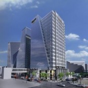
    Mosaic Potash Hill Centre Tower III in the SkyscraperPage Database

Building Data Page   • Comparison Diagram   • Regina Skyscraper Diagram

Map Location

Reply

 
Thread Tools Display Modes
     
     
  #861  
Old Posted Jun 16, 2012, 4:25 PM
jvj jvj is offline
Registered User
 
Join Date: Aug 2006
Location: Regina
Posts: 147
Quote:
Originally Posted by brandon272 View Post


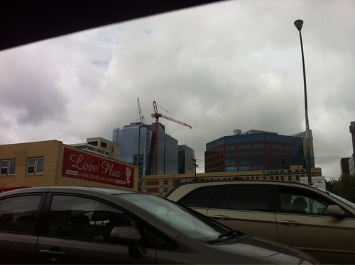
If anyone wants more crane pictures...better do it quick.
Reply With Quote
     
     
  #862  
Old Posted Jun 17, 2012, 9:39 PM
Goose Goose is offline
Registered User
 
Join Date: Sep 2011
Posts: 74
Crane coming down.


Reply With Quote
     
     
  #863  
Old Posted Jun 22, 2012, 2:02 AM
brandon272 brandon272 is offline
Registered User
 
Join Date: Apr 2012
Posts: 3

Reply With Quote
     
     
  #864  
Old Posted Jun 22, 2012, 4:45 PM
wacko wacko is offline
Registered User
 
Join Date: Jun 2011
Location: Saskatchewan
Posts: 419
I am hearing (viva voce) that the first tenants will be moving in in December.
Reply With Quote
     
     
  #865  
Old Posted Jul 1, 2012, 3:09 AM
Chadillaccc's Avatar
Chadillaccc Chadillaccc is offline
ARTchitecture
 
Join Date: Feb 2011
Location: Cala Ghearraidh
Posts: 22,842
You'd think, being that the new 2nd tallest building in the city was just completed, people would be out taking awesome new skyline shots of the city. But nope... I haven't seen any new stuff! Boooo to that! But great looking tower
__________________
Strong & Free

Mohkínstsis — 1.6 million people at the Foothills of the Rocky Mountains, 400 high-rises, a 300-metre SE to NW climb, over 1000 kilometres of pathways, with 20% of the urban area as parkland.
Reply With Quote
     
     
  #866  
Old Posted Jul 1, 2012, 9:21 PM
Dillweed Dillweed is offline
Registered User
 
Join Date: Jul 2011
Location: Vancouver
Posts: 185
Awesome looking tower. Putting a cap (or whatever you call it) like this. Would really accentuate this whole complex I think. Pure fluff I realize but I think it would really look sharp.

Reply With Quote
     
     
  #867  
Old Posted Jul 1, 2012, 9:43 PM
SkydivePilot SkydivePilot is offline
Registered User
 
Join Date: Jun 2010
Location: REGINA
Posts: 2,295
Quote:
Originally Posted by Dillweed View Post
Awesome looking tower. Putting a cap (or whatever you call it) like this. Would really accentuate this whole complex I think. Pure fluff I realize but I think it would really look sharp.

I concur! Tower III is a really nice-looking building; however, the the roof still needs finessing. (Even though I hate to mention that - yet - again.) If it were a 4-storey building, then it wouldn't matter so much. (Due to its would-be lack of height-related prowess.)
Reply With Quote
     
     
  #868  
Old Posted Jul 2, 2012, 7:03 AM
Treesplease Treesplease is offline
Registered User
 
Join Date: Jul 2011
Posts: 990
I agree - not enough attention is given to finishing the tops of buildings in Regina. We have some nice new buildings going up, finishing the roof with something other than a functional box would be nice. But yes, its money spent that doesn't return anything as you can't rent the roof out.
Reply With Quote
     
     
  #869  
Old Posted Jul 2, 2012, 7:36 PM
Dillweed Dillweed is offline
Registered User
 
Join Date: Jul 2011
Location: Vancouver
Posts: 185
Thats the Sheraton Wall Centre Hotel in Vancouver in the pic I posted. And I'm racking my brain trying to remember the name of the company that put the cap (I'll call it) on it.

I remember kinda stumbling upon them by accident several years ago and I don't know if they are even around anymore. All I can remember about them was that they were based in Vancouver. And they were a public company that traded on the stock exchange at the time.

They specialized in these types of fixtures for the top of buildings. I recall they had a rather extensive portfolio of buildings that they had done throughout North America.

Can't for the life of me remember their name. With the beveled roof they have on Tower lll in Regina. Something like they have on the Vancouver Sheraton would really look way cool!

Nice looking tower at any rate.
Reply With Quote
     
     
  #870  
Old Posted Jul 26, 2012, 6:53 PM
Spongebob's Avatar
Spongebob Spongebob is offline
Registered User
 
Join Date: Aug 2009
Posts: 252
Mosaic signs going up on the tower today.
Reply With Quote
     
     
  #871  
Old Posted Jul 27, 2012, 12:43 AM
Draftsman Draftsman is offline
Registered User
 
Join Date: May 2011
Location: Regina, Saskatchewan
Posts: 989
The Mosaic sign on the north side appears to be complete, and it looks great. They have yet to start erecting the sign on the south side.
Reply With Quote
     
     
  #872  
Old Posted Jul 27, 2012, 6:50 AM
Chadillaccc's Avatar
Chadillaccc Chadillaccc is offline
ARTchitecture
 
Join Date: Feb 2011
Location: Cala Ghearraidh
Posts: 22,842
Still no new pics?
__________________
Strong & Free

Mohkínstsis — 1.6 million people at the Foothills of the Rocky Mountains, 400 high-rises, a 300-metre SE to NW climb, over 1000 kilometres of pathways, with 20% of the urban area as parkland.
Reply With Quote
     
     
  #873  
Old Posted Jul 28, 2012, 12:16 AM
Nathan's Avatar
Nathan Nathan is offline
Hmm....
 
Join Date: Mar 2007
Location: Regina
Posts: 3,505
Quote:
Originally Posted by Chadillaccc View Post
Still no new pics?
From the North Side... with a cellphone... from an office building (sorry about the poor quality):


Last edited by Nathan; Jul 28, 2012 at 12:30 AM.
Reply With Quote
     
     
  #874  
Old Posted Jul 28, 2012, 3:29 AM
SkydivePilot SkydivePilot is offline
Registered User
 
Join Date: Jun 2010
Location: REGINA
Posts: 2,295
That logo looks very nice up there! Thanks Nathan!

Now, . . . I'm gonna open another can of worms here: Since H-III has a new, nice-looking logo, it's really the time to update H-I's logo(s). Now, just how many of you guys have always hated those hokey-looking HSBC logos plastered atop of H-I? (Well, . . I always have.) Those towers are/were meant to have glass - top to bottom - that's it. (However, a Mosaic-type of logo for HSBC would be really good though. (With the glass backdrop.)

If I were a Hill family member, I'd be on that like a duck on a June bug!

How many of you agree?
Reply With Quote
     
     
  #875  
Old Posted Jul 28, 2012, 4:36 AM
brithgob brithgob is offline
Registered User
 
Join Date: Dec 2006
Posts: 833
Quote:
Originally Posted by SkydivePilot View Post
That logo looks very nice up there! Thanks Nathan!

Now, . . . I'm gonna open another can of worms here: Since H-III has a new, nice-looking logo, it's really the time to update H-I's logo(s). Now, just how many of you guys have always hated those hokey-looking HSBC logos plastered atop of H-I? (Well, . . I always have.) Those towers are/were meant to have glass - top to bottom - that's it. (However, a Mosaic-type of logo for HSBC would be really good though. (With the glass backdrop.)

If I were a Hill family member, I'd be on that like a duck on a June bug!

How many of you agree?
Nah. Those square signs have been there since Tower One opened. (Previous logos on those squares included Continental Bank of Canada and Lloyd Bank). I can't find a reason to get hot and bothered about them.
Reply With Quote
     
     
  #876  
Old Posted Jul 28, 2012, 5:35 AM
Stormer's Avatar
Stormer Stormer is online now
Registered User
 
Join Date: Jan 2008
Posts: 7,979
Reply With Quote
     
     
  #877  
Old Posted Jul 28, 2012, 7:00 AM
Draftsman Draftsman is offline
Registered User
 
Join Date: May 2011
Location: Regina, Saskatchewan
Posts: 989
Quote:
Originally Posted by SkydivePilot View Post
That logo looks very nice up there! Thanks Nathan!

Now, . . . I'm gonna open another can of worms here: Since H-III has a new, nice-looking logo, it's really the time to update H-I's logo(s). Now, just how many of you guys have always hated those hokey-looking HSBC logos plastered atop of H-I? (Well, . . I always have.) Those towers are/were meant to have glass - top to bottom - that's it. (However, a Mosaic-type of logo for HSBC would be really good though. (With the glass backdrop.)

If I were a Hill family member, I'd be on that like a duck on a June bug!

How many of you agree?
Hokey-looking? HSBC (Hongkong and Shanghai Banking Corp) is one of the world's largest banking institutions. Their logo is very well recognized around the world. My only gripe about the signs on top of Tower I is that the lighting in the signs has been dim for at least a couple of years now due to burned out lights so the signs look bad at night. I am surprised that Harvard does not have a regular maintenance program to check the lights. I wonder why HSBC doesn't press them to replace the burned out lights as I am sure they pay a good dollar to have their logo up there.

Speaking of corporate name/logo signs on top of some of our downtown buildings, does anyone else (besides me) miss the signs of old, such as the Regina Inn's neon script sign; London Life's; North Canadian Oils's, etc. I know they needlessly used electricity but I always thought they looked cool. Even SGI no longer illuminates their logos on top of the tower. I wouldn't be surprised if the Viterra signs come down after the takeover becomes final.
Reply With Quote
     
     
  #878  
Old Posted Jul 28, 2012, 7:43 AM
SkydivePilot SkydivePilot is offline
Registered User
 
Join Date: Jun 2010
Location: REGINA
Posts: 2,295
Ya, I remember the Continental Bank logo being on there --- it looked not bad. After that, Lloyd's Bank initially had a logo with a black backdrop (then a white backdrop). After that, HSBC's logo also initially had a black backdrop --- and now it's white.

Yes I remember London Life [Place]; North Canadian Oils; Regina Inn. 20-25 years ago, our well-lit skyline looked great at night - and with fewer buildings! Also, do you guys remember Saskoil's 3 logos atop the Grenfell Tower? (They were stuck on there during the spring of '86 - but were taken down in about '91.) 'Pioneer' [Life] on Hamilton back in '85? (Later Canada Trust; now Conexus.) Even the present-day Ramada had a honkin' Delta logo atop of it from the late '80s - fall of '97.
Reply With Quote
     
     
  #879  
Old Posted Jul 28, 2012, 9:13 AM
Nathan's Avatar
Nathan Nathan is offline
Hmm....
 
Join Date: Mar 2007
Location: Regina
Posts: 3,505
Quote:
Originally Posted by Draftsman View Post
Hokey-looking? HSBC (Hongkong and Shanghai Banking Corp) is one of the world's largest banking institutions. Their logo is very well recognized around the world. My only gripe about the signs on top of Tower I is that the lighting in the signs has been dim for at least a couple of years now due to burned out lights so the signs look bad at night. I am surprised that Harvard does not have a regular maintenance program to check the lights. I wonder why HSBC doesn't press them to replace the burned out lights as I am sure they pay a good dollar to have their logo up there.

Speaking of corporate name/logo signs on top of some of our downtown buildings, does anyone else (besides me) miss the signs of old, such as the Regina Inn's neon script sign; London Life's; North Canadian Oils's, etc. I know they needlessly used electricity but I always thought they looked cool. Even SGI no longer illuminates their logos on top of the tower. I wouldn't be surprised if the Viterra signs come down after the takeover becomes final.
Yes they do... they are on right now...

And I'm sure the Viterra signs will come down... just have to see if "Glencore" goes up. The Viterra sign on the ground outside the building on Vic is already gone.

Also, I think he was more getting to that it would be nice if it were more the style like mosaic instead of the huge white block... Sort of a more modern look, like the following:


And to be honest, I can sort of see his point (if that's the point he was making).

Something else I've also noticed lately is that there are a lot of empty flag poles on top of buildings. It would be kind of nice if Canadian flags were put up there instead of just having empty poles everywhere; dress it up a bit I guess.

Neither of these are really complaints to me, just more of ways I think the look of downtown could improve. It would give a sense of completeness I think.

Reply With Quote
     
     
  #880  
Old Posted Jul 28, 2012, 7:11 PM
SkydivePilot SkydivePilot is offline
Registered User
 
Join Date: Jun 2010
Location: REGINA
Posts: 2,295
Quote:
Originally Posted by Nathan View Post
Yes they do... they are on right now...

And I'm sure the Viterra signs will come down... just have to see if "Glencore" goes up. The Viterra sign on the ground outside the building on Vic is already gone.

Also, I think he was more getting to that it would be nice if it were more the style like mosaic instead of the huge white block... Sort of a more modern look, like the following:


And to be honest, I can sort of see his point (if that's the point he was making).

Something else I've also noticed lately is that there are a lot of empty flag poles on top of buildings. It would be kind of nice if Canadian flags were put up there instead of just having empty poles everywhere; dress it up a bit I guess.

Neither of these are really complaints to me, just more of ways I think the look of downtown could improve. It would give a sense of completeness I think.

Thank you - that was my point. Maybe the Hills will upgrade that.
Reply With Quote
     
     
This discussion thread continues

Use the page links to the lower-right to go to the next page for additional posts
 
 
Reply

Go Back   SkyscraperPage Forum > Regional Sections > Canada > Manitoba & Saskatchewan
Forum Jump


Forum Jump


All times are GMT. The time now is 3:24 PM.


Powered by vBulletin® Version 3.8.7
Copyright ©2000 - 2026, vBulletin Solutions, Inc.