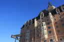
Yeah it's really not the best looking expansion... both in execution and in cohesion with the old Capri. It does look as if the architect has tried to replicate the window pattern of the old Capri in the new building--particularly in the narrow windows. However, it doesn't succeed in complementing (or enhancing) the old building aesthetically. And the orange? I'm all for colour, but...

Also, does anyone know what the reason was behind the removal of the dark stone (granite/marble?) siding between the windows? Is there some plan to re-side these parts of the original facade? Too many questions?





 Prev
Prev








 Linear Mode
