HomeDiagramsDatabaseMapsForum About
     

Go Back   SkyscraperPage Forum > Regional Sections > Canada > Alberta & British Columbia > Vancouver > Transportation & Infrastructure


Closed Thread

 
Thread Tools Display Modes
     
     
  #8441  
Old Posted Jun 11, 2011, 4:17 AM
SpongeG's Avatar
SpongeG SpongeG is offline
Registered User
 
Join Date: Jun 2006
Location: Coquitlam
Posts: 40,127
translink TransLink BC
Crush-loaded trains on Expo/Millennium Lines as far east as Scott Road Station ^ud
12 minutes ago Favorite Retweet Reply

News1130radio News1130
SkyTrain cars "Crush-Loaded". @TransLink advising those downtown to stick around a bit longer until the crowds ease off.
     
     
  #8442  
Old Posted Jun 11, 2011, 4:26 AM
SpongeG's Avatar
SpongeG SpongeG is offline
Registered User
 
Join Date: Jun 2006
Location: Coquitlam
Posts: 40,127
this is crazy traffic

translink TransLink BC
8 Fraser passengers buses going as far as 41st Ave., then Main to Marine Station, no service on Fraser south of 49th ^ud
     
     
  #8443  
Old Posted Jun 11, 2011, 5:18 AM
xd_1771's Avatar
xd_1771 xd_1771 is offline
(daka_x)
 
Join Date: Aug 2010
Location: Metro Vancouver, Canada
Posts: 1,742
I came home from the night market today finding, along the way, a 316 Scottsdale crossing Nordel Way, completely packed with people.
I don't think it was a route that ever had overcapacity problems, at least none I was aware of/heard of.
     
     
  #8444  
Old Posted Jun 11, 2011, 6:18 AM
Spork's Avatar
Spork Spork is offline
Shoebox Dweller
 
Join Date: Sep 2008
Location: Vancouver
Posts: 1,784
I spent about 2 hours in a restaurant downtown after the game. Nothing like tagging into a place after all of the people who were there decide to leave, all while people are battling transit.
     
     
  #8445  
Old Posted Jun 11, 2011, 7:10 AM
teriyaki teriyaki is offline
Registered User
 
Join Date: Nov 2008
Posts: 606
Driving into DT after the game was a breeze, not a car on the road. Manning the streets while in Dt was a whole different story, but overall not as bad as I expected. Lots of people walking over the bridge instead of trying the trains and buses.
     
     
  #8446  
Old Posted Jun 13, 2011, 2:14 AM
CLC CLC is offline
Registered User
 
Join Date: Apr 2008
Posts: 877
Quote:
Originally Posted by bardak View Post
Has translink released any bus ridership numbers since the Canada line opened because I'm really would like to know how much the 351 has gained. For such a suburb route it has really good frequency.
Unfortunately, the only publicly available report is apta, only a summary
http://www.apta.com/resources/statistics/Documents/Ridership/2011_q1_ridership_APTA.pdf
     
     
  #8447  
Old Posted Jun 13, 2011, 6:43 AM
deasine deasine is offline
Vancouver Moderator
 
Join Date: Mar 2007
Posts: 5,747
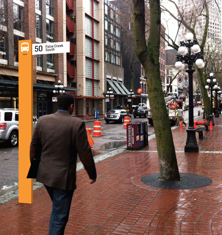
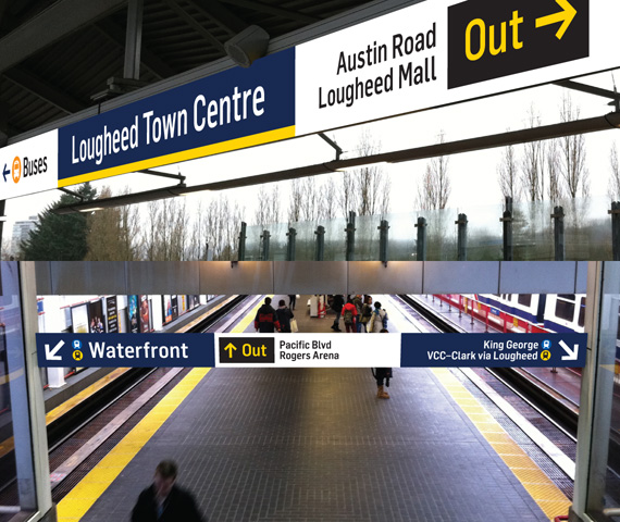
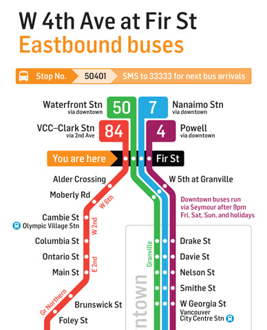
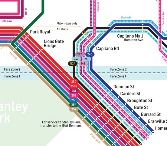
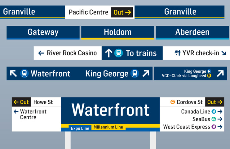
Not sure if you guys have seen this, but it's a cool proposal project. I'm personally not a fan of the signage design, but they are definitely bold and easily recognizable. I love the maps for the most part and see that there are a lot of elements inspired by London's Underground and London's Bus Spider Maps. Anyway, take a look:


(Sam Dal Monte, 2011)

http://negativeboy.com/images/0511/ClarifyingTransitBooklet.pdf
     
     
  #8448  
Old Posted Jun 13, 2011, 7:38 AM
twoNeurons twoNeurons is offline
loafing in lotusland
 
Join Date: Aug 2002
Location: Lotusland
Posts: 6,124
The multi-color bus routes are desperately needed. Seattle does a GREAT job of their downtown bus routes.
     
     
  #8449  
Old Posted Jun 13, 2011, 4:39 PM
Zassk Zassk is offline
Registered User
 
Join Date: Sep 2009
Posts: 2,303
It is all a failure as long as Expo and Canada Lines are still both blue.
     
     
  #8450  
Old Posted Jun 13, 2011, 5:48 PM
djh djh is offline
Registered User
 
Join Date: Jul 2003
Location: Vancouver
Posts: 1,978
Quote:
Originally Posted by Zassk View Post
It is all a failure as long as Expo and Canada Lines are still both blue.
Er, why? They are very different shades of blue. If you talk about the "dark blue line" and the "light blue line" it's not confusing (I'm talking as a tourist here). Many many transit systems have lines with similar colours, so I'm not sure why you have a problem with this.
     
     
  #8451  
Old Posted Jun 13, 2011, 6:40 PM
bardak bardak is offline
Registered User
 
Join Date: Oct 2010
Posts: 370
Not a huge fan of the overly abstracted Skytrain map however I do like the coloured route maps.
     
     
  #8452  
Old Posted Jun 13, 2011, 8:45 PM
Zassk Zassk is offline
Registered User
 
Join Date: Sep 2009
Posts: 2,303
Quote:
Originally Posted by djh View Post
Er, why? They are very different shades of blue. If you talk about the "dark blue line" and the "light blue line" it's not confusing (I'm talking as a tourist here). Many many transit systems have lines with similar colours, so I'm not sure why you have a problem with this.
We only have three lines. I don't understand why we ran out of colours after two lines and had to double one up. No, it's not overly confusing, but it negates any benefit of colour-coding the lines. Either the Canada Line or Expo Line should be coloured red (assuming the colour green will figure into the Evergreen Line in some manner).
     
     
  #8453  
Old Posted Jun 13, 2011, 9:00 PM
officedweller officedweller is offline
Registered User
 
Join Date: Jul 2001
Location: Vancouver
Posts: 41,802
Yeah, the SkyTrain map is off - it bears little resemblance to the actual geographic map in proportioning or line direction/shape.

i.e. it suggests that Holdom and Sperling Stations are up near Hastings St. and that Metrotown is near the Fraser River. The branching in Richmond also suggests the line is farther east than it is.

I find the station signage to be loud and garish - like you'd find at a discount/liquidation retail store.
     
     
  #8454  
Old Posted Jun 13, 2011, 9:07 PM
twoNeurons twoNeurons is offline
loafing in lotusland
 
Join Date: Aug 2002
Location: Lotusland
Posts: 6,124
Quote:
Originally Posted by Zassk View Post
We only have three lines. I don't understand why we ran out of colours after two lines and had to double one up. No, it's not overly confusing, but it negates any benefit of colour-coding the lines. Either the Canada Line or Expo Line should be coloured red (assuming the colour green will figure into the Evergreen Line in some manner).
I agree. I wouldn't call the map a FAILURE, but I do think that one of those lines should be red. The Canada Line comes to mind.

Osaka's network has two lines which are almost the same color, see if you can find them:


I deliberately linked to the Japanese version, so you could focus on the colors. However, in this case, where one line ends (the Yotsubashi Line), the other one starts (Nanko Port Line) leaves. The port line uses an elevated short train (similar to SkyTrain) whereas the Yotsubashi line is a subway. It would be like if you connected to an LRT line in Surrey (going down Fraser Hwy) after getting off at King George station.

In that case, would you color the LRT line another shade of blue to denote that it's essentially a continuation of the Expo Line?

Here's a link to a bigger map in English: http://www.bento.com/pix/subway-osaka2.gif

     
     
  #8455  
Old Posted Jun 13, 2011, 9:14 PM
officedweller officedweller is offline
Registered User
 
Join Date: Jul 2001
Location: Vancouver
Posts: 41,802
I was looking at the 2 green lines before the 3 blue lines.
     
     
  #8456  
Old Posted Jun 13, 2011, 9:19 PM
djh djh is offline
Registered User
 
Join Date: Jul 2003
Location: Vancouver
Posts: 1,978
Quote:
Originally Posted by Zassk View Post
We only have three lines. I don't understand why we ran out of colours after two lines and had to double one up. No, it's not overly confusing, but it negates any benefit of colour-coding the lines. Either the Canada Line or Expo Line should be coloured red (assuming the colour green will figure into the Evergreen Line in some manner).
Oh, OK. I see where you're coming from.
It's not a "total fail" though.

Here's another consideration: 6% of males are colour-blind in the green-red spectrum. So having a green or a red line might be harder to distinguish for those people. I can totally imagine in the OVERLY-P.C fairyland that is Translink/Metro Vancouver, that this became a Major Issue when picking the line colours (!) I can imagine this got bounced around numerous committees and focus groups, and reams of white papers were compiled, and consultants hired for months on end.
     
     
  #8457  
Old Posted Jun 13, 2011, 10:09 PM
Mac Write Mac Write is offline
Registered User
 
Join Date: Dec 2008
Posts: 1,423
Expo line should be red…oh wait the logo was a light blue, nevermind.
     
     
  #8458  
Old Posted Jun 13, 2011, 10:58 PM
Millennium2002 Millennium2002 is offline
Registered User
 
Join Date: Jun 2009
Posts: 1,742
The bus stop signage seems interesting... however there are many problems that I can see with his mockups:

- shouldn't station circles be larger for ease of identification along a line?
- I generally prefer the retro signage of the Expo Line; maybe it should be cleaned up a little but there's no reason to discontinue it as long as its consistent.

And as for the blue Canada Line... that will forever bother me until they change it back to the right colour or add a red line somewhere. =S
     
     
  #8459  
Old Posted Jun 14, 2011, 12:14 AM
Toddlertoddy Toddlertoddy is offline
Registered User
 
Join Date: Jan 2011
Posts: 18
I love the geogrpahical distortion and perfection (yes, I am a perfectionist when drawing maps). I really hate the current maps, especially the one on the Skytrains themselves.

Honestly, I don't care about the colour of the Skytrain lines; as long as the colours are distinguishable, I'm okay with it.
     
     
  #8460  
Old Posted Jun 14, 2011, 3:05 AM
deasine deasine is offline
Vancouver Moderator
 
Join Date: Mar 2007
Posts: 5,747
Quote:
Originally Posted by Zassk View Post
It is all a failure as long as Expo and Canada Lines are still both blue.
If you are directing that to the designer, then it's not a valid criticism because the colours of lines were decided by TransLink/InTransit BC/Provincial Government. The aqua blue colour for the Canada Line is not necessarily a bad choice due to the reasons djh has pointed out above.

Quote:
Originally Posted by officedweller View Post
I find the station signage to be loud and garish - like you'd find at a discount/liquidation retail store.
Agreed.

Last edited by deasine; Jun 14, 2011 at 3:21 AM.
     
     
This discussion thread continues

Use the page links to the lower-right to go to the next page for additional posts
 
 
Closed Thread

Go Back   SkyscraperPage Forum > Regional Sections > Canada > Alberta & British Columbia > Vancouver > Transportation & Infrastructure
Forum Jump


Forum Jump


All times are GMT. The time now is 12:01 PM.


Powered by vBulletin® Version 3.8.7
Copyright ©2000 - 2026, vBulletin Solutions, Inc.