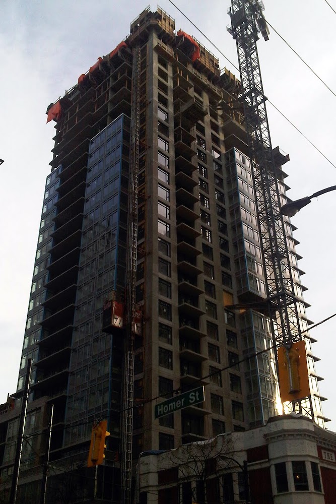
Wow I actually don't hate it as much as I thought I would. As far as sissy beige condos go, this one's surprisingly slick, which makes me wish all the more that the glazing covered the whole buildig and, without as many set-backs. I'm sure I'll hate it again once the brick goes up.
Then youre in luck because there is no brick on the tower, just the townhouse section.
Nice.
The proportions and setbacks look better than (the one angle) shown on the rendering.
Looks like they've reached the top of the punched out windows (NW corner), so 4 more floors to go.
Last edited by officedweller; Jan 24, 2011 at 2:10 AM.
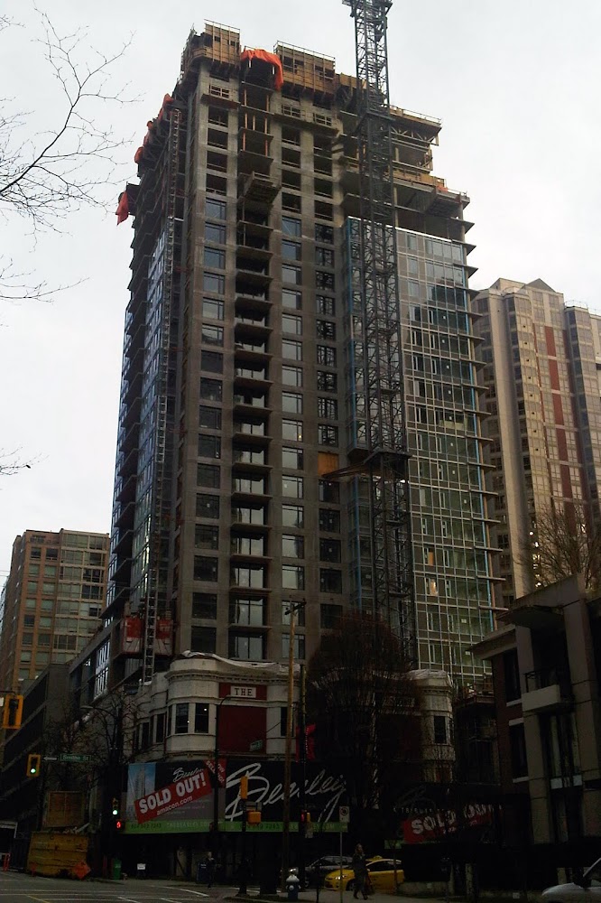
That last picture is depressing. I can forgive the 1990's condos to the right, but how the Yaletown Park towers passed the UDP is beyond comprehension...
As someone who grew up in Halifax (where tall buildings are a huge argument) and now lives in Calgary (where tall buildings are reasonably accepted) - it's so refreshing to see pictures like these of new developments in Yaletown and to see urban density done well!
That last picture is depressing. I can forgive the 1990's condos to the right, but how the Yaletown Park towers passed the UDP is beyond comprehension...
exactly the thought i had. i don't even like to walk by that block, it just feels so hostile, like something out of suburb of shenzen, or some worker housing in dubai.
exactly the thought i had. i don't even like to walk by that block, it just feels so hostile, like something out of suburb of shenzen, or some worker housing in dubai.
Make that three people with the same idea. I can only see it in pictures, but that's how it struck me, right off the bat.
Nice angle but every building in that pic looks like shit including The Beasley. Painted concrete, punched windows, grey spandrel, Vancouver really needs to start expirementing more with different colours, materials and textures.
Nice angle but every building in that pic looks like shit including The Beasley. Painted concrete, punched windows, grey spandrel, Vancouver really needs to start expirementing more with different colours, materials and textures.
lol. You said it very well. This is the posterchild photo of the vancouver special condo tower.
Nice angle but every building in that pic looks like shit including The Beasley. Painted concrete, punched windows, grey spandrel, Vancouver really needs to start expirementing more with different colours, materials and textures.
Quote:
Originally Posted by Spork
lol. You said it very well. This is the posterchild photo of the vancouver special condo tower.
Excuse my parroting, but you both put it perfectly!! It's getting depressing ... and downright freaking bizarre.
its vancouver. a sea of generic 30 floor condos. thats how the rest of the country views us. and the nimby hippy population here will continue to limit creativity and bash every daring design into yet more bland rectangles. (marine gateway)


 Prev
Prev


 Linear Mode
