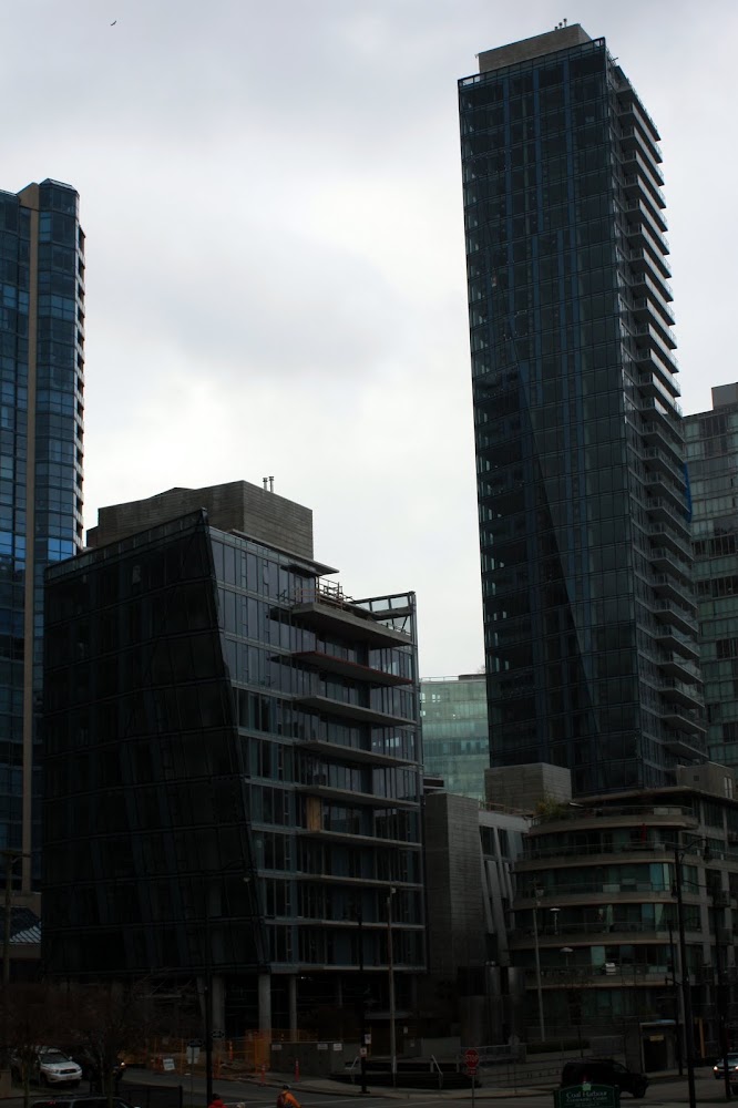
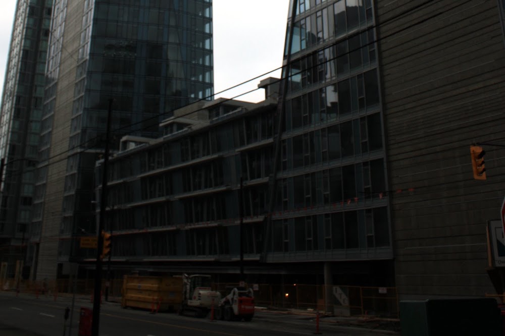
Street interface is disappointingly squashed. I know developers rather have as little retail as possible, but there should be a rule mandating the first level of every development to be just that, and with at least a double-height space, with awnings that I can't jump high enough to touch, unlike the one here.
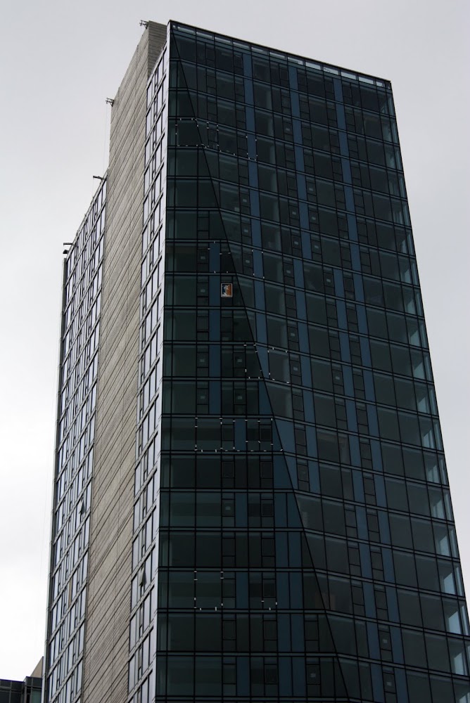
That said, the tower geometry is indeed refreshingly simple and uncluttered.
I love it. This is one of the best in the city, IMHO.
It really shows that overcoming a difficult site often leads us to the best designs.
I agree, this and Jameson are really breaking the mold as far as Vancouver middle of the road designs go. Hopefully we will see more of this in the future.
Had a meeting in the area this morning at just after 9 and WPP was evacuated due to a gas leak. When I headed back at 10:30ish the whole area was cordoned off and their were a large amount of emergency vehicles onsite. Don't believe anything came of it though. Anyone know exactly what happened?
Can someone snap us some shots taken closer to it, of the ground level, the section between the two towers, etc.? Would be much appreciated! I love this project though!
For what it's worth I have found that the Photoshop knock-off GIMP has a wicked tool that fixes lighting issues like yours in seconds. All you do is go into the "curves" menu and pull the curve up higher and presto, your subject is brighter but without the nasty washing out effect that you get from just boosting brightness and constrast. That quick technique I use does, unfortunately, tend to wipe out most of the contrast that was in the sky but that is an okay trade off for me when the subject of the picture is just a building.
^ Another way to do the same thing with the Gimp (or photoshop for that matter) is to make a duplicate layer in 'screen' mode, and adjust opacity of the layer to taste.
I don't know why they bothered with making the podium slanted. It's backside looks more interesting than the front. And I'm pretty sure I can touch the awning without jumping.





 Prev
Prev


 I love this project though!



 Linear Mode
