HomeDiagramsDatabaseMapsForum About
     

Go Back   SkyscraperPage Forum > Regional Sections > Canada > Alberta & British Columbia > Vancouver > Transportation & Infrastructure


Closed Thread

 
Thread Tools Display Modes
     
     
  #3061  
Old Posted Jul 9, 2010, 8:45 PM
mr.x's Avatar
mr.x mr.x is offline
 
Join Date: Dec 2003
Posts: 12,805
Quote:
Originally Posted by GeeCee View Post
Given the funding issues, and as a resident of the area, I'm in favor of stations that are functional (yes, x, this includes 80m platforms ) before architectural beauty. I love Brentwood station, but I don't think we have the money to build stuff like that this time around.

I hope they aren't quite as cookie cutter as Canada Line stations though.. Yaletown is one in particular that comes to mind as blegh.
I personally don't expect anything like Brentwood for Evergreen and I certainly do agree that functionality should come before architectural beauty, but there should be several rules to station design:

1) Lougheed's third platform needs to have the same architectural design as the old centre platform. This should be obvious, but knowing how things go in this region...

2) Coquitlam Centre station, being a major station and a possible future transfer point for an extension further eastward, should be a grander architectural statement design.

3) The remaining stations should be simple, but still original and not cheap looking. See Renfrew, Rupert, and Braid Stations as examples:


http://www.cyburbia.org/forums/showthread.php?t=7759

Rupert & Renfrew


Braid


  #3062  
Old Posted Jul 9, 2010, 9:11 PM
WarrenC12's Avatar
WarrenC12 WarrenC12 is online now
 
Join Date: May 2007
Posts: 24,746
^^^^^^

Classic NDP gold-plating at work. Sorry, but it's true...
     
     
  #3063  
Old Posted Jul 9, 2010, 9:15 PM
deasine deasine is offline
 
Join Date: Mar 2007
Posts: 5,747
Does Lansdowne, Richmond-Brighouse, Aberdeen, and Marine Drive really look cheap? Templeton, Sea Island Centre, and YVR too? I'm only talking about the elevated stations, but other than Bridgeport, I really like the at-grade/elevated stations on the Canada Line.
     
     
  #3064  
Old Posted Jul 9, 2010, 9:41 PM
DKaz DKaz is offline
 
Join Date: Nov 2008
Posts: 4,302
If any at grade stations are planned for the Evergreen Line, Templeton Station should play an important role in influencing their design because the open airy ground level station seems like it would fit in perfectly into any neighbourhood. Marine Drive also has my top picks, as well as Rupert, Renfrew, and Holdom.
     
     
  #3065  
Old Posted Jul 9, 2010, 10:29 PM
Zassk Zassk is offline
 
Join Date: Sep 2009
Posts: 2,303
I agree with your station choices, mr.x, but the Richmond stations look just like that - except for the platform length and the $gold-plating$ wooden beams. The glass and wood panels and tiles are almost exactly the same on Canada Line and Rupert/Renfrew. So I guess what I'm trying to say is that I agree with both you and deasine and I think you're both describing essentially the same thing.
     
     
  #3066  
Old Posted Jul 9, 2010, 11:36 PM
tybuilding tybuilding is offline
 
Join Date: Sep 2009
Posts: 898
Coquitlam Station will need to have a centre platform as well to allow for the possible extension to Port Coquitlam
     
     
  #3067  
Old Posted Jul 10, 2010, 1:38 AM
Millennium2002 Millennium2002 is offline
 
Join Date: Jun 2009
Posts: 1,742
Quote:
Originally Posted by Zassk View Post
I agree with your station choices, mr.x, but the Richmond stations look just like that - except for the platform length and the $gold-plating$ wooden beams. The glass and wood panels and tiles are almost exactly the same on Canada Line and Rupert/Renfrew. So I guess what I'm trying to say is that I agree with both you and deasine and I think you're both describing essentially the same thing.
I disagree. Rupert and Renfrew may look alike but they're not exact twins. Braid on the other hand is completely different in design.

Quote:
Originally Posted by deasine View Post
Does Lansdowne, Richmond-Brighouse, Aberdeen, and Marine Drive really look cheap? Templeton, Sea Island Centre, and YVR too? I'm only talking about the elevated stations, but other than Bridgeport, I really like the at-grade/elevated stations on the Canada Line.
The Millennium Line stations' use of wood stands out from the Canada Line statons' use of wood because they're used much more extensively in the structure... it really gives the feeling that they used real materials compared to the Canada Line. I know, they used real wood on the roof, but from many angles it also looks like an artificial laminated finish... in fact ever since the opening I thought it was done this way. The similar designs of the Richmond branch stations in a way also emphasizes "cheap" because it gives the impression that the builders were not willing to spend sufficient time and money to create something more original.

I think most people would agree that it'd be ideal to have stations that were efficient, cheap, and yet also unique at the same time. Although I consider the Millennium Line to be a work of art due to its extensive use of wood in the structure and its originality, it did probably use more dollars than we wanted. On the other extreme, the Canada Line is completely the opposite... cheap, durable, but mass-produced and horribly identical in design.

I think the best thing to do would be to use the same materials, but use them differently. For example, you could put two sloped flat roofs at Burquitlam, two curved roofs at Port Moody, a green flat roof at Ioco-Moray, a curved central platform roof at Coquitlam, and a single sloping flat roof at Douglas College. =S The stations can also have different colours to match their surroundings. For Ioco-Moray, this could be grey; for Port Moody, maybe a more aquatic blue theme, at Douglas College, green, at Coquitlam Central, orange, and at Burquitlam, red. =S

Last edited by Millennium2002; Jul 10, 2010 at 2:30 AM.
     
     
  #3068  
Old Posted Jul 10, 2010, 2:14 AM
mr.x's Avatar
mr.x mr.x is offline
 
Join Date: Dec 2003
Posts: 12,805
Quote:
Originally Posted by deasine View Post
Does Lansdowne, Richmond-Brighouse, Aberdeen, and Marine Drive really look cheap? Templeton, Sea Island Centre, and YVR too? I'm only talking about the elevated stations, but other than Bridgeport, I really like the at-grade/elevated stations on the Canada Line.
To me Lansdowne, Brighouse, Aberdeen, and Marine look incredibly cheap. However, Templeton, Sea Island, and YVR aren't but the considering the importance of the latter it still doesn't seem "grand" enough or near the level of an architectural statement design it should have been.
     
     
  #3069  
Old Posted Jul 10, 2010, 2:21 AM
nname nname is offline
 
Join Date: Aug 2005
Posts: 5,107
Quote:
Originally Posted by tybuilding View Post
Coquitlam Station will need to have a centre platform as well to allow for the possible extension to Port Coquitlam
Side platform works too:
     
     
  #3070  
Old Posted Jul 10, 2010, 2:27 AM
nname nname is offline
 
Join Date: Aug 2005
Posts: 5,107
Quote:
Originally Posted by allan_kuan View Post
I think the best thing to do would be to use the same materials, but use them differently. For example, you could put two sloped flat roofs at Burquitlam, two curved roofs at Port Moody, a green flat roof at Ioco-Moray, a curved central platform roof at Coquitlam, and a single sloping flat roof at Douglas College. =S The stations can also have different colours to match their surroundings. For Ioco-Moray, this could be grey; for Port Moody, maybe a more aquatic blue theme, at Douglas College, green, at Coquitlam Central, orange, and at Burquitlam, red. =S
Well, at the very least, most stations on the Evergreen Line requires different design:

Burquitlam, [Lincoln], Douglas - Elevated (similar to Richmond stations)
[Queens] - At grade, 2-platforms
Port Moody - At grade, 3-platforms (sort of like Edmonds with an extra platform for WCE?)
Ioco - Trenched (similar to 29th avenue or maybe Commercial?)
Coquitlam - Partially at-grade and elevated, 3 or 4-platforms (similar to Nanaimo?)
     
     
  #3071  
Old Posted Jul 10, 2010, 2:28 AM
mr.x's Avatar
mr.x mr.x is offline
 
Join Date: Dec 2003
Posts: 12,805
Quote:
Originally Posted by Zassk View Post
I agree with your station choices, mr.x, but the Richmond stations look just like that - except for the platform length and the $gold-plating$ wooden beams. The glass and wood panels and tiles are almost exactly the same on Canada Line and Rupert/Renfrew. So I guess what I'm trying to say is that I agree with both you and deasine and I think you're both describing essentially the same thing.
They most certainly don't look the same...and you basically just mentioned everything different between the two.

How exactly are those wooden beams gold plating? Just because they look nice, they're deemed as excess? Is that how far our standards and expectations have fallen?


Aberdeen "IKEA" Station...

http://canadalinephotos.blogspot.com/search/label/Aberdeen


vs.


http://www.cyburbia.org/forums/showthread.php?t=7759
     
     
  #3072  
Old Posted Jul 10, 2010, 2:36 AM
Millennium2002 Millennium2002 is offline
 
Join Date: Jun 2009
Posts: 1,742
Quote:
Originally Posted by nname View Post
Well, at the very least, most stations on the Evergreen Line requires different design:

Burquitlam, [Lincoln], Douglas - Elevated (similar to Richmond stations)
[Queens] - At grade, 2-platforms
Port Moody - At grade, 3-platforms (sort of like Edmonds with an extra platform for WCE?)
Ioco - Trenched (similar to 29th avenue or maybe Commercial?)
Coquitlam - Partially at-grade and elevated, 3 or 4-platforms (similar to Nanaimo?)
For Port Moody and Coquitlam, I think they may only have two platforms... a side platform for WCE and a central platform for SkyTrain. (In the case of Port Moody, there's a lack of space; in the case of Coquitlam, the central platform would help with transferring between the two branches of Evergreen if the other one is built.) For all the others, two platform stations would be suitable.
     
     
  #3073  
Old Posted Jul 10, 2010, 3:10 AM
nname nname is offline
 
Join Date: Aug 2005
Posts: 5,107
Quote:
Originally Posted by allan_kuan View Post
For Port Moody and Coquitlam, I think they may only have two platforms... a side platform for WCE and a central platform for SkyTrain. (In the case of Port Moody, there's a lack of space; in the case of Coquitlam, the central platform would help with transferring between the two branches of Evergreen if the other one is built.) For all the others, two platform stations would be suitable.
Port Moody does not have space for a center-platform config as it would require more land for the tracks to split and converge. From the location of power substation on the diagram, I think side platforms is planned (the third platform is the WCE platform, which can be shared with SkyTrain to form side+center config to save space.)

For Coquitlam, the limitation would be the distance between the pillars of Mariner Way overpass. From the diagram, seems like the east side is barely wide enough for the station. So if center platform is chosen, a sharp curve would be needed for the WB track, which would probably limit the ability for future platform extension.
     
     
  #3074  
Old Posted Jul 10, 2010, 6:09 AM
Zassk Zassk is offline
 
Join Date: Sep 2009
Posts: 2,303
Quote:
Originally Posted by mr.x View Post
They most certainly don't look the same...and you basically just mentioned everything different between the two.

How exactly are those wooden beams gold plating? Just because they look nice, they're deemed as excess? Is that how far our standards and expectations have fallen?
I understand that you are very defensive about the M-line stations, but I have to think that you are being blinded by the shortness of the C-line platform, such that you cannot see the similarities. Your two pictures showed almost the same design in two different lengths: virtually the same tiles, painted steel, windows, lighting, staircases and elevators. The only substantive difference is in the wooden cross-beams, which are clearly a luxury investment, whether we wish to call them an excess or not.

I will also say that the Marine Dr. (and Bridgeport) are probably the worst examples to pull from the C-line, and they underwhelm me too. Brighouse and the other two on that branch would fit in pretty well on the M-line if extended to 80 m. If the Evergreen elevated stations were built like Aberdeen they would not feel out of place when riding all the way from VCC-Clark.
     
     
  #3075  
Old Posted Jul 10, 2010, 6:43 AM
deasine deasine is offline
 
Join Date: Mar 2007
Posts: 5,747
While I partially agree with you Zaak, what is the different between Marine Dr and Brighouse/Lansdowne/Aberdeen other than the fact that the roof is flat and not curved in? Either way, I love the elevated Canada Line stations for its simplicity and airiness, something which is surprisingly not present at all Millennium Line Stations.

I'd like to point out that most of Copenhagen's are stations, aside from some of the underground ones, are simple and still beautiful.


Photography from Metrobits

If you watch this video here, the stations are just literally a roof over your head.
• Video Link
     
     
  #3076  
Old Posted Jul 10, 2010, 9:39 PM
jsbertram jsbertram is offline
 
Join Date: Sep 2009
Posts: 3,245
Quote:
Originally Posted by GeeCee View Post
Given the funding issues, and as a resident of the area, I'm in favor of stations that are functional (yes, x, this includes 80m platforms ) before architectural beauty. I love Brentwood station, but I don't think we have the money to build stuff like that this time around.

I hope they aren't quite as cookie cutter as Canada Line stations though.. Yaletown is one in particular that comes to mind as blegh.


I rarely need to use Canada Line south on Oakridge, and one problem I've found with the C-Line stations is because of the common features of the designs, If you've been busy reading or been otherwise distracted, you can't easily tell what station you're at when the doors open.

I've seen some people make a last-second dash out the doors only to realise they at the wrong station, or not be annoyed that they've just missed their stop because they were still figuring out what station they were in when the doors closed.

Simple fix: Each station has a different highlight colour that you can see from inside the car - through the windows, or closed doors so you know you're at your right stop because 'it's the green station' or 'the orange station'. Helpful too when you can tell someone to take the train to 'the red station' when they get confused between "Burquitlam' and 'Coquitlam' stations.

I'm still puzzled why C-Line made two stations with similar names "Bridgeport" and "Brighouse". I hear people calling them "Brig-Port" or "Bridge-House" without realising they are wrong. It must be especially confusing for people whose first language isn't english.


Another fix: Have the station names low enough on the platform walls so you can read it while you're inside the car - through the windows, or closed doors. Its bad enough that all you see is a tiled wall, but worse when you have to poke your head out the door to see if this is the right station. And hope the door doesn't guillotine you while you're figuring out where you are.

Quick: What station is this?

If you took more than a few seconds to hunt around for the name, I hope you see my point.

Why not make the station name as big as the banner its attached to:


It doesn't help having the station name hidden behind a train:
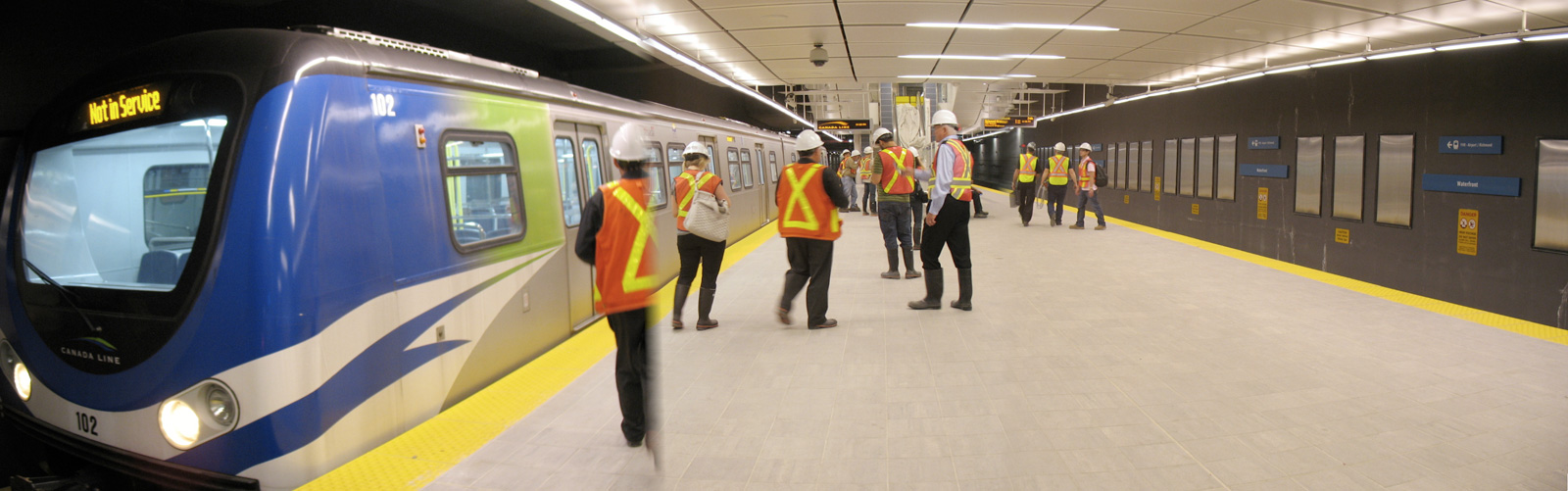

Any idea what this stations name is? (don't cheat by looking at the URL)
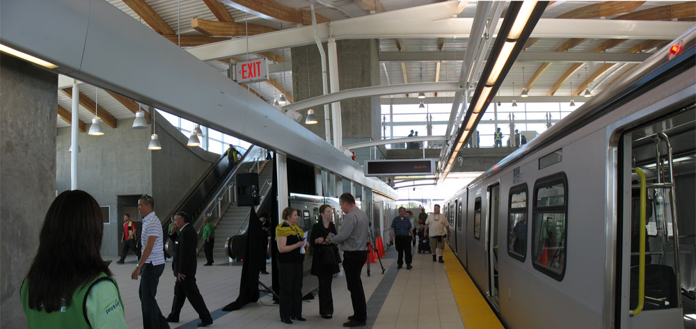

Its easy to see the name once you're out of the train.

If you're waiting for the train, you should already know what station you're in.

A good example of form over function: why not put the name banners on the far side so they are at a lower angle & can be seen from inside the train. There's plenty of room for bigger lettering too.


No guessing what station this is:


Easily readable from the platform, from across the platform & tracks, and from within a train.
Simple & useful.

     
     
  #3077  
Old Posted Jul 10, 2010, 9:54 PM
mr.x's Avatar
mr.x mr.x is offline
 
Join Date: Dec 2003
Posts: 12,805
^ I couldn't agree more. It's also something I've been criticizing too, the wayfinding signage throughout the line is abysmal in both design and placement. I think another reason why we can't see the station name signage that well is because of the smaller train windows.

There are so many things wrong with the signage design....for instance, why is the font so small on a massive sign placard? Why is there a lack of colour? Colour indicates varying importance of the signage message. And why are the platform station names the same font size as "Way Out"?


Translink clearly got it right with their Millennium Line signage, pics below (also examples of great simple station designs).


http://www.flickr.com/photos/75317890@N00/3832089889/sizes/z/in/photostream/


http://www.flickr.com/photos/pacific11/4567544003/sizes/l/in/photostream/


I also agree with you bit on "Brighouse" and "Bridgeport" being confusing to some....same goes with "Vancouver City Centre" and the other VCC Station we have in the system. They really should have left the Richmond terminus as simply "Richmond City Centre".

Last edited by mr.x; Jul 10, 2010 at 10:42 PM.
     
     
  #3078  
Old Posted Jul 10, 2010, 10:40 PM
mr.x's Avatar
mr.x mr.x is offline
 
Join Date: Dec 2003
Posts: 12,805
Quote:
Originally Posted by Zassk View Post
I understand that you are very defensive about the M-line stations, but I have to think that you are being blinded by the shortness of the C-line platform, such that you cannot see the similarities. Your two pictures showed almost the same design in two different lengths: virtually the same tiles, painted steel, windows, lighting, staircases and elevators. The only substantive difference is in the wooden cross-beams, which are clearly a luxury investment, whether we wish to call them an excess or not.
Excess should be determined by the overall design, not necessarily on the materials being used.

A Ferrari versus a BMW.
Beijing National Stadium versus Cape Town Stadium.
Singapore's Marina Bay Sands versus the new BC Place casino-hotel complex.
Brentwood Station versus Rupert Station...or gasp, Aberdeen/Lansdowne/Brighouse


But your argument furthers my point even more. It's a simple station design to start with, it's not another Brentwood Station. Aberdeen and Rupert have similar designs to start with, one went with cheap furnishings and materials and the other with higher quality furnishings - definitely not excess.

Aberdeen's roof structure looks incredibly cheap. I too appreciate simplicity, but there is a point where something simple may be a bit too simple.

The 80-metre platforms have nothing to do with it.
     
     
  #3079  
Old Posted Jul 10, 2010, 11:05 PM
SpongeG's Avatar
SpongeG SpongeG is offline
 
Join Date: Jun 2006
Posts: 40,135
your smashed over the head inside the train when they announce the station name

if u can't pay attention maybe people shouldn't leave their houses

just sayings leave the big bad world to the roamasexuals
     
     
  #3080  
Old Posted Jul 10, 2010, 11:12 PM
Zassk Zassk is offline
 
Join Date: Sep 2009
Posts: 2,303
I couldn't agree more about the Canada Line signage. You would think that the signage would have followed the Millennium Line standard.

Even the color of the line - light blue - on a network that already had a dark blue line - a travesty! Two out of three lines are the same primary color!

It's terrible and someone should have lost their job over it.

Something named "Canada" should have been colored red, and the red should have been everywhere - on the maps, in the stations, on the trains. But any color other than yellow or blue would have sufficed.

Let's hope that this is fixed and not repeated on the Evergreen Line.
     
     
This discussion thread continues

Use the page links to the lower-right to go to the next page for additional posts
   
Closed Thread

Go Back   SkyscraperPage Forum > Regional Sections > Canada > Alberta & British Columbia > Vancouver > Transportation & Infrastructure
Forum Jump


Forum Jump


All times are GMT. The time now is 5:13 PM.


Powered by vBulletin® Version 3.8.7
Copyright ©2000 - 2026, vBulletin Solutions, Inc.

