HomeDiagramsDatabaseMapsForum About
     

Go Back   SkyscraperPage Forum > Regional Sections > Canada > Alberta & British Columbia > Vancouver > Transportation & Infrastructure


Closed Thread

 
Thread Tools Display Modes
     
     
  #10181  
Old Posted Oct 23, 2009, 9:00 PM
SpongeG's Avatar
SpongeG SpongeG is offline
Registered User
 
Join Date: Jun 2006
Location: Coquitlam
Posts: 39,979
its nice when you pull up to an empty station - i hate sitting here when there is no one to pick up
__________________
belowitall
     
     
  #10182  
Old Posted Oct 23, 2009, 9:31 PM
officedweller officedweller is offline
Registered User
 
Join Date: Jul 2001
Location: Vancouver
Posts: 41,484
Side note: Look at the overbuilding for the TTC's Spadina line extension:
Apart from the cool design (Will Alsop) it has two station houses and two bus terminals because buses from both TTC and York Regional Transit will stop at the station - and they can't share.
Cost of one station: $145 million.

http://www3.ttc.ca/About_the_TTC/Commiss...29_2009/Reports/TYSSE_Steeles_West_S.pdf
     
     
  #10183  
Old Posted Oct 23, 2009, 9:40 PM
mr.x's Avatar
mr.x mr.x is offline
Registered User
 
Join Date: Dec 2003
Location: Stockholm
Posts: 12,805
^ would have loved to see more quality design like that for the Canada Line.


I've always envisioned that type of configuration for the SkyTrain terminus station at UBC. A entrance at Wesbrook and University Blvd located right at the corner of the administration building facing Wesbrook, and another but larger entrance that connects with the bus loop, SUB, and street level.
     
     
  #10184  
Old Posted Oct 23, 2009, 10:00 PM
Metro-One's Avatar
Metro-One Metro-One is online now
Registered User
 
Join Date: Sep 2008
Location: Japan
Posts: 17,901
At the open house last night I asked a few questions to some translink reps about the station designs of the Canada Line, and they said they are primarily the outcome from community input. The majority public input from Richmond specified that they wanted to have a "family" of stations that all look similar to one and other, and on the Vancouver stretch the majority of public input specified that they wanted the station entrances to be as mute as possible, so they did not infringe on the landscape. No big surprise from Vancouver there. So a lot of the "lackluster" designs along the C-line is from the community input. So if you guys want better stations for the E-line, fill out the forms that you want fancy unique stations!!!!
__________________
Bridging the Gap
Check out my Flickr: https://www.flickr.com/photos/30634635@N03/with/29495547810/ and Youtube channel https://www.youtube.com/channel/UCV0_0h9qKlhxXFxuAey_q6Q
     
     
  #10185  
Old Posted Oct 24, 2009, 3:40 AM
Millennium2002 Millennium2002 is offline
Registered User
 
Join Date: Jun 2009
Posts: 1,742
You know... it might also be the unwillingness to spend more money on a PPP that led to cheap and boring station designs rather than community input alone.
     
     
  #10186  
Old Posted Oct 24, 2009, 4:16 AM
mr.x's Avatar
mr.x mr.x is offline
Registered User
 
Join Date: Dec 2003
Location: Stockholm
Posts: 12,805
Quote:
Originally Posted by Metro-One View Post
At the open house last night I asked a few questions to some translink reps about the station designs of the Canada Line, and they said they are primarily the outcome from community input. The majority public input from Richmond specified that they wanted to have a "family" of stations that all look similar to one and other, and on the Vancouver stretch the majority of public input specified that they wanted the station entrances to be as mute as possible, so they did not infringe on the landscape. No big surprise from Vancouver there. So a lot of the "lackluster" designs along the C-line is from the community input. So if you guys want better stations for the E-line, fill out the forms that you want fancy unique stations!!!!
I highly doubt it had much to do with community design, rather more along the lines of a very tight budget. It sounds like they're trying to cover their asses on that one.

Sure, the 16 stations were divided into 7 families with different architect firms designing each station (there were one or two families that shared the same architects):

- Downtown: Waterfront, VCS, Yaletown
- Upper Cambie: OV, Broadway
- Lower Cambie: King Ed, 41st, 49th
- Marine
- Bridgeport
- No.3 Road: Aber., Lans., Brig.
- YVR: Templeton, Sea Is., Airport

In the first and second consultations, there was a description of what kind of materials were going to be used, what kind of look they were going for, etc. The families were all relatively quite original.

But the end product was:
- all of the underground stations look virtually the same, there's no distinction to them at all. The only exception might be Waterfront.
- the No.3 Road and Marine Drive Stations have almost the exact same pre-fabricated roof designs, despite being two different families designed by two different architectural firms. (Bridgeport and the 3 airport stations are obviously quite original, though quality lacks quite a bit for Bridgeport)

In other words, a lot of that "family" distinction dissapeared. The quality of materials also seem bathroom tile-like.

     
     
  #10187  
Old Posted Oct 24, 2009, 4:41 AM
lightrail lightrail is offline
Registered User
 
Join Date: Oct 2007
Posts: 809
Quote:
Originally Posted by officedweller View Post
Side note: Look at the overbuilding for the TTC's Spadina line extension:
Apart from the cool design (Will Alsop) it has two station houses and two bus terminals because buses from both TTC and York Regional Transit will stop at the station - and they can't share.
Cost of one station: $145 million.

http://www3.ttc.ca/About_the_TTC/Commiss...29_2009/Reports/TYSSE_Steeles_West_S.pdf
True - but to be fair, the TTC bus station is behind the faregates, as there's no need to pay to transfer. The York Region and Go buses are on a separate fare structure, so you need to pay again, unless you have a combined pass.
     
     
  #10188  
Old Posted Oct 24, 2009, 4:43 AM
Metro-One's Avatar
Metro-One Metro-One is online now
Registered User
 
Join Date: Sep 2008
Location: Japan
Posts: 17,901
I do feel you are a little harsh on the stations. Most of the train stations in Japan, especially non hub stations, are extremely basic and carbon copy in design but are functional, and many other cities (such as Calgary) the stations are nothing more then beefed up bus shelters for the most part.
__________________
Bridging the Gap
Check out my Flickr: https://www.flickr.com/photos/30634635@N03/with/29495547810/ and Youtube channel https://www.youtube.com/channel/UCV0_0h9qKlhxXFxuAey_q6Q
     
     
  #10189  
Old Posted Oct 24, 2009, 4:54 AM
deasine deasine is offline
Vancouver Moderator
 
Join Date: Mar 2007
Posts: 5,747
Quote:
Originally Posted by mr.x View Post
In other words, a lot of that "family" distinction dissapeared. The quality of materials also seem bathroom tile-like.

That is completely wrong. The materials used on the Canada Line are made to last and not look dirty. Everytime I use the Canada Line, and I do it on almost daily, the stations still look clean and inviting, even on a damp, dirty, and disgustingly wet day. We aren't Dubai, nor do we have Omni Cleaners at every station.

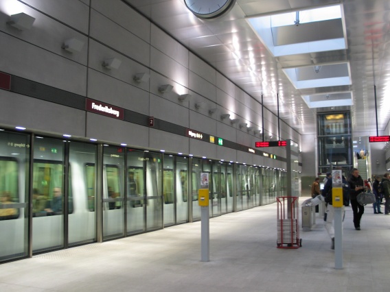
The architecture on the Canada Line is slightly disappointing, but function is really the main key and the Canada Line stations function fine. Comparing to Copenhagen Metro's stations, the situation is quite the same: they have steel glass, boxy-looking stations. Whether you like their minimalist architectural style over the "west-coast inspired" one in the Canada Line, that's a different story.

I'm more disappointed that our stations still lack community art. I know it's an ongoing process, but in the States, a large portion of transit infrastructure projects are for community art. I can't say I like Seattle's aquarium/science museum-like art in most of its stations for the LRT, but LA's gold line does have its art integrated into the architecture.


Photography by Bigbend700 of Flickr


Photography by Bigbend700 of Flickr


Photography by Bigbend700 of Flickr

Last edited by deasine; Oct 24, 2009 at 2:19 PM.
     
     
  #10190  
Old Posted Oct 24, 2009, 4:57 AM
Millennium2002 Millennium2002 is offline
Registered User
 
Join Date: Jun 2009
Posts: 1,742
@ Metro-One: Under that comparison... maybe.

I think Mr.X must be comparing to the Millennium Line for the above-ground stations... all with their distinctly unique and sometimes innovative designs. For the underground stations, comparisons may also be drawn from Moscow and St Petersburg Metros.

From that perspective the stations in the Canada Line do lack variety and uniqueness. I actually think Yaletown-Roundhouse has a really bad design by not matching up with the rest of the brick-walled buildings in the area. A similar story might also apply with Waterfront Stn.

I've also wondered a bit about this... why hasn't Vancouver used any ideas from the metros of Russia and put in some cool designs and decorations for their underground stations? It would be a huge draw for commuters and boost ridership and demand. =O

EDIT:
@ Deasine:
It is true that the stations are made for functionality in mind.

I'm not exactly sure if Vancouver's metro design is in any way different from Copenhagen. In some places of course it may look West-Coast inspired with a splash of modernity but in other cases (particularly the Canada Line in fact) things do look somewhat minimalist especially for the underground stations and a few of the elevated ones.
     
     
  #10191  
Old Posted Oct 24, 2009, 6:04 AM
mr.x's Avatar
mr.x mr.x is offline
Registered User
 
Join Date: Dec 2003
Location: Stockholm
Posts: 12,805
Quote:
Originally Posted by Metro-One View Post
I do feel you are a little harsh on the stations. Most of the train stations in Japan, especially non hub stations, are extremely basic and carbon copy in design but are functional, and many other cities (such as Calgary) the stations are nothing more then beefed up bus shelters for the most part.
Quote:
Originally Posted by deasine View Post
That is completely wrong. The materials used on the Canada Line are made to last and not look dirty. Everytime I use the Canada Line, and I do it on almost daily, the stations still look clean and inviting, even on a damp, dirty, and disgustingly wet day. We aren't Dubai, nor do we have Omni Cleaners at every station.

The architecture on the Canada Line is slightly disappointing, but function is really the main key and the Canada Line stations function fine. Comparing to Copenhagen Metro's stations, the situation is quite the same: they have steel glass, boxy-looking stations. Whether you like their minimalist architectural style over the "west-coast inspired" one in the Canada Line, that's a different story.

I'm more disappointed that our stations still lack community art. I know it's an ongoing process, but in the States, a large portion of transit infrastructure projects are for community art. I can't say I like Seattle's aquarium/science museum-like art in most of its stations for the LRT, but LA's gold line does have its art integrated into the architecture.

SSC's unfortunately down, I'll post the photos later on.
Well, I'm not asking for ridiculously expensive Dubai starchitecture designs but rather more types of materials being used....akin to the Millennium Line.

The problem is all they thought about was functional, almost as if very little actual creative architectural thought went to the design.

At the end of the day it came to cost.


The Copenhagen Metro station designs (and trains for that matter) trump the Canada Line by a wide margin. There's no comparison. The underground stations have a much more cleaner (not as in not dirty, but appealing to look at) and sleeker look than the Canada Line.


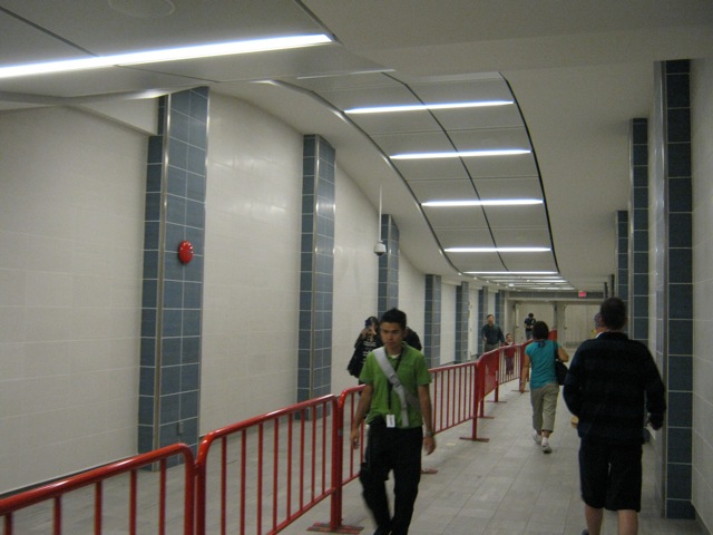
With Copenhagen, it appears there was careful attention to aesthetic design throughout the design and construction process. With the Canada Line, it looks like the slapped on whatever that works and was functional. The white/blue tile corridor between the Waterfront platform and the CPR building is the most bizarre part of the whole line.


As for the elevated Marine and No.3 Road stations, they're alright though I would have preferred more original designs even though they're a family of stations (take Renfrew and Rupert Stations for example: they were a family of stations designed by the same architect...they used similar materials and designs, but their designs weren't exactly cookie cutter either). Aberdeen, Lans., Marine, and Brighouse are virtually the same.

Bridgeport is absolutely disappointing, given its importance as a major interchange: a functional and aesthetic disappointment. They lost a huge opportunity to make a real architectural statement for this station.


And finally, public art. Anything but those weird pictures on a piece of plywood.


Renfrew


Rupert
     
     
  #10192  
Old Posted Oct 24, 2009, 6:25 AM
deasine deasine is offline
Vancouver Moderator
 
Join Date: Mar 2007
Posts: 5,747
Quote:
Originally Posted by mr.x View Post
Well, I'm not asking for ridiculously expensive Dubai starchitecture designs but rather more types of materials being used....akin to the Millennium Line.
Honestly, I didn't find Dubai's metro had "impressive architecture." I mean, sure the stations look nice, but all the elevated station shared quite a similar design. I guess you can say that's the same for the Canada Line Richmond elevated ones.

Quote:
Originally Posted by mr.x View Post
The Copenhagen Metro station designs (and trains for that matter) trump the Canada Line by a wide margin. There's no comparison. The underground stations have a much more cleaner (not as in not dirty, but appealing to look at) and sleeker look than the Canada Line.

With Copenhagen, it appears there was careful attention to aesthetic design throughout the design and construction process. With the Canada Line, it looks like the slapped on whatever that works and was functional. The white/blue tile corridor between the Waterfront platform and the CPR building is the most bizarre part of the whole line.
You are only looking at the underground portions of the line. The at-grade/elevated stations look quite different. While I agree with you, I like the minimalistic style on the Copenhagen Metro a lot more, it's a matter of tastes.


Photography by Ma Rui, Flickr


Photography by ITDP-Europe, Flickr

Their Airport Station. If you ask me, I take YVR's over this one for sure.

Photography by hugh1936uk

I didn't mind the white/blue tiles used in the downtown stations: actually, I rather they have an accent colour rather than using the same white tiles. The blue tiles gives the corridor, and the rest of the stations, more texture and definition. Again, it's a matter of tastes.

Quote:
Originally Posted by mr.x View Post
Bridgeport is absolutely disappointing, given its importance as a major interchange: a functional and aesthetic disappointment. They lost a huge opportunity to make a real architectural statement for this station.
That I agree with. I think I'll take Richmond's simplistic wood/glass design over the current Bridgeport one.
     
     
  #10193  
Old Posted Oct 24, 2009, 6:42 AM
mr.x's Avatar
mr.x mr.x is offline
Registered User
 
Join Date: Dec 2003
Location: Stockholm
Posts: 12,805
Quote:
Originally Posted by deasine View Post
Honestly, I didn't find Dubai's metro had "impressive architecture." I mean, sure the stations look nice, but all the elevated station shared quite a similar design. I guess you can say that's the same for the Canada Line Richmond elevated ones.
Well, not specifically Dubai's architecture...but I mentioned Dubai since most people immediately think of expensive oversensory architecture.


Quote:
You are only looking at the underground portions of the line. The at-grade/elevated stations look quite different. While I agree with you, I like the minimalistic style on the Copenhagen Metro a lot more, it's a matter of tastes.

Their Airport Station. If you ask me, I take YVR's over this one for sure.
Haha, well i never intended to compare our elevated stations with theirs...that's why i specifically said "underground".


Quote:
I didn't mind the white/blue tiles used in the downtown stations: actually, I rather they have an accent colour rather than using the same white tiles. The blue tiles gives the corridor, and the rest of the stations, more texture and definition. Again, it's a matter of tastes.


Not a fan at all....and the metal protruding on the corners of those blue tiles just screams ugly. Sure, it's for functional purposes when someone bumps into those corners but it's terribly retro looking. It's almost as bad taste as the ridiculously looking "ghetto" railings and barriers Beijing had for some Olympic subway stations.

That's just the tip of the iceberg, I actually think it would have looked nicer if they went with all white tiles...no blue. And perhaps ditch the fluorsescent lighting bars for this corridor for the more traditional type of lighting.


The funky wall to ceiling lights in the corridor before this also look incomplete...this mostly has to do with personal taste, but it would have been great if they had made it symmetrial and had those wall to ceiling lights stretch to the other half of the corridor as well instead of having one side lit up brightly while the other side is dark.


Quote:
That I agree with. I think I'll take Richmond's simplistic wood/glass design over the current Bridgeport one.
Bridgeport should have gotten a much grander design, perhaps on par with YVR Airport. So much talk about that station being the "mother of all stations" and "a working machine"....it doesn't look like one.
     
     
  #10194  
Old Posted Oct 24, 2009, 6:55 AM
deasine deasine is offline
Vancouver Moderator
 
Join Date: Mar 2007
Posts: 5,747
Quote:
Originally Posted by mr.x View Post
Haha, well i never intended to compare our elevated stations with theirs...that's why i specifically said "underground".
Much of Copenhagen's Metro is quite deep in the ground, but many of their station entrance at street level directly above the platform, which allows for that stream of light shown in many photos. For the Canada Line, I can't think of any stations that would be able to do this, besides Olympic Village. This also has a lot to do with the alignment of the line in relation to the streets above.

You have to look at the context of the entire line (or lines) and not just the underground stations... -__-"
     
     
  #10195  
Old Posted Oct 24, 2009, 7:11 AM
mr.x's Avatar
mr.x mr.x is offline
Registered User
 
Join Date: Dec 2003
Location: Stockholm
Posts: 12,805
^ well, the Copenhagen example was only meant for inspiration, not suggesting to directly applying their design to our the Canada Line. Of course, we would have to apply it to the context of our stations.

Their stations are simply much more sleeker than ours.
     
     
  #10196  
Old Posted Oct 24, 2009, 7:22 AM
Metro-One's Avatar
Metro-One Metro-One is online now
Registered User
 
Join Date: Sep 2008
Location: Japan
Posts: 17,901
I cant believe you don't like the lighting bars that run down the walls of the Waterfront walkway, that is one of my favorite prts of the C-line. I honestly think you are being far to picky. Yes you have shown us a few good examples of other lines/stations, but if you look at the big picture, compared to the AVERAGE metro/LRT station around the world, the C-line does just fine and the airport 3 are actually far above average. The M-line is a gem, and arguably has the best modern stations in Canada. So in a way or persecption has been spoiled.
__________________
Bridging the Gap
Check out my Flickr: https://www.flickr.com/photos/30634635@N03/with/29495547810/ and Youtube channel https://www.youtube.com/channel/UCV0_0h9qKlhxXFxuAey_q6Q
     
     
  #10197  
Old Posted Oct 24, 2009, 7:33 AM
Zassk Zassk is offline
Registered User
 
Join Date: Sep 2009
Posts: 2,303
The M-line is ridiculously gold-plated. Everything about it screams reckless NDP spending. We will never get another line like that again. If you think the Evergreen or UBC stations will live up to the existing M-line stations, then I think you are living in a dream land.

As I said before, I would happily accept getting 3 stations at C-line quality rather than 2 stations at M-line quality for the same price.
     
     
  #10198  
Old Posted Oct 24, 2009, 7:44 AM
agrant's Avatar
agrant agrant is offline
Cheers!
 
Join Date: Sep 2006
Location: Vancouver, BC
Posts: 1,869
At least someone invented something called renovations. There is always hope that someday a station can be made more aesthetically pleasing. So I wouldn't get too upset about how some stations look now. Best to get it up and funcioning first, the looks can always come later.
__________________
I hate palm trees.
     
     
  #10199  
Old Posted Oct 24, 2009, 7:48 AM
Metro-One's Avatar
Metro-One Metro-One is online now
Registered User
 
Join Date: Sep 2008
Location: Japan
Posts: 17,901
Very true, just like how the city of Vancouver will be looking at adding public art in the time to come. So even though it is up and running, the C-Line is still not quite 100% complete.

I hope once #3 road is complete we will see those lighting effects and LED signs Richmond was mentioning putting on the guideways.
__________________
Bridging the Gap
Check out my Flickr: https://www.flickr.com/photos/30634635@N03/with/29495547810/ and Youtube channel https://www.youtube.com/channel/UCV0_0h9qKlhxXFxuAey_q6Q
     
     
  #10200  
Old Posted Oct 24, 2009, 7:57 AM
red-paladin red-paladin is offline
Vancouver Moderator
 
Join Date: Sep 2008
Location: Burnaby
Posts: 3,626
My main concern is that they don't use the same tiles for the evergreen line.
I don't think anyone wrote in saying "I want the stations to feature tiling that looks like a 1950s 'pee-wall' urinal in scotland"
     
     
This discussion thread continues

Use the page links to the lower-right to go to the next page for additional posts
 
 
Closed Thread

Go Back   SkyscraperPage Forum > Regional Sections > Canada > Alberta & British Columbia > Vancouver > Transportation & Infrastructure
Forum Jump


Forum Jump


All times are GMT. The time now is 8:29 AM.

     
SkyscraperPage.com - Privacy Statement - Top

Powered by vBulletin® Version 3.8.7
Copyright ©2000 - 2026, vBulletin Solutions, Inc.