HomeDiagramsDatabaseMapsForum About
     

Go Back   SkyscraperPage Forum > Regional Sections > Canada


Reply

 
Thread Tools Display Modes
     
     
  #1021  
Old Posted Feb 8, 2024, 1:38 AM
megadude megadude is offline
Registered User
 
Join Date: Sep 2017
Location: N. York/Bram/Mark/Sauga/Burl/Oak/DT
Posts: 3,681
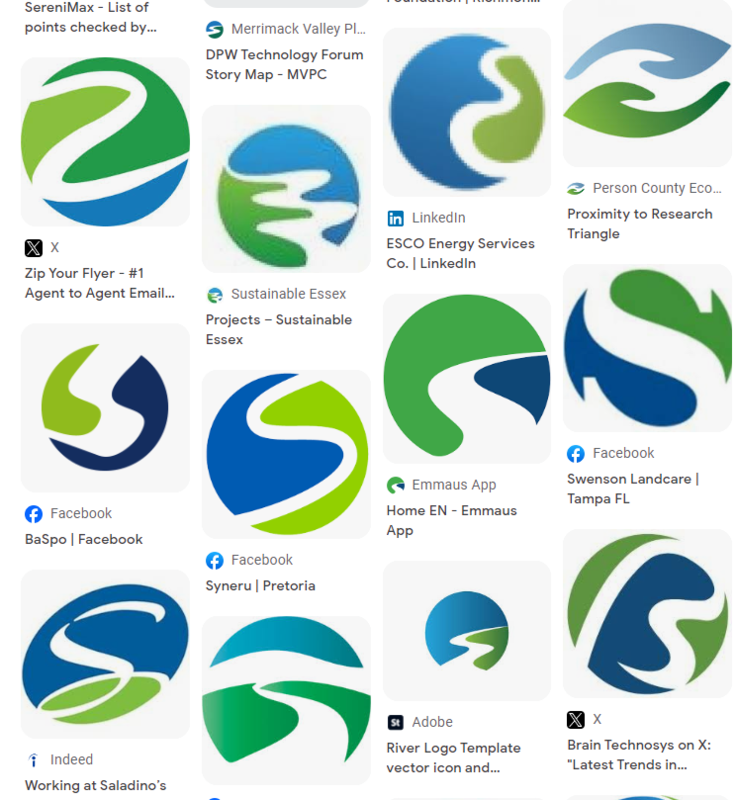
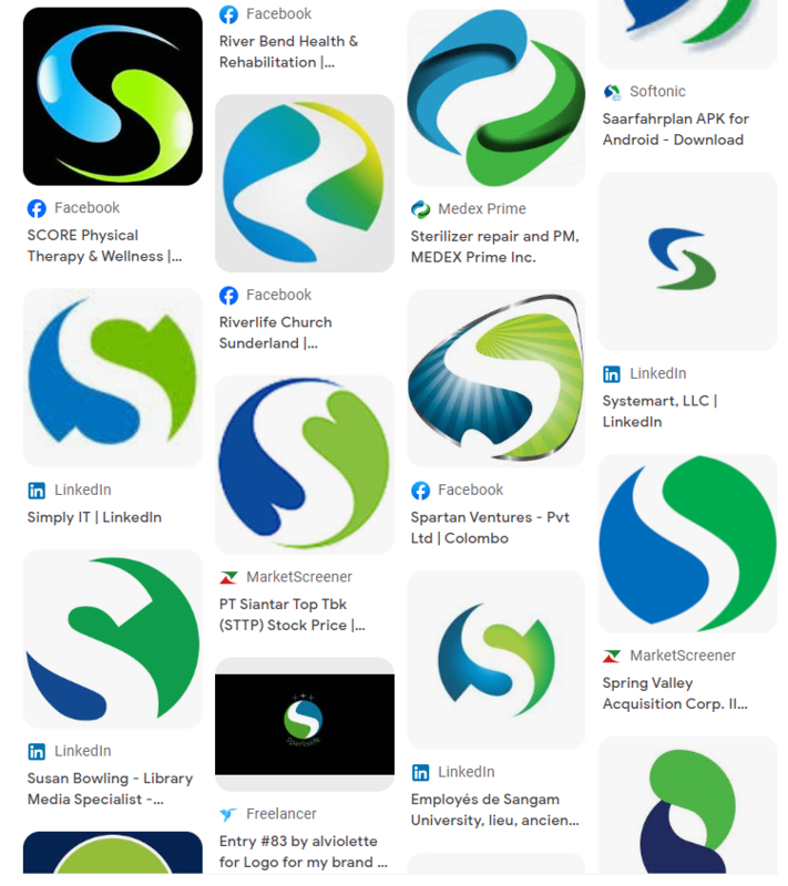
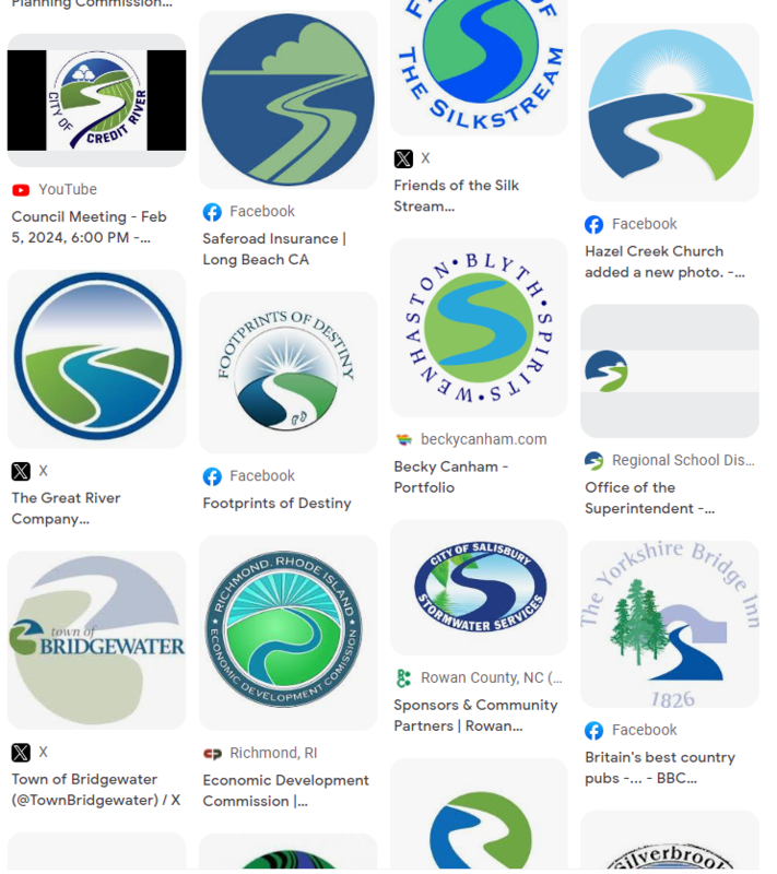
Someone on here pointed out years ago how so many town logos use blue and green. Saw a video on tik tok of the logo for Bridgewater NS and the Mississippi River Museum in Iowa. And it was pointed out that this logo basically exists everywhere in the world. A Google reverse image search very much demonstrates this. Also, instead of a B or a river, there's an S for Schulich School of Business at York U. Not sure why Schulich has a couple of leaves. You'd think it's for the department of environmental studies or something.


https://twitter.com/TownBridgewater


https://scoutingevent.com/178-Museum


https://en.wikipedia.org/wiki/Schulich_School_of_Business


Reply With Quote
     
     
  #1022  
Old Posted Feb 8, 2024, 1:42 AM
megadude megadude is offline
Registered User
 
Join Date: Sep 2017
Location: N. York/Bram/Mark/Sauga/Burl/Oak/DT
Posts: 3,681
Also, reminds of a few years ago when the Alberta War Room, lol, was ripping off company logos:


Reply With Quote
     
     
  #1023  
Old Posted Feb 8, 2024, 2:17 PM
MolsonExport's Avatar
MolsonExport MolsonExport is offline
Touching grass everyday.
 
Join Date: Oct 2003
Location: Otisburgh
Posts: 51,348
^fugly logos, whether plagiarized or not.
__________________
The whole problem with the world is that fools and fanatics are always so certain of themselves, and wiser people so full of doubts. (Bertrand Russell). Sweet Loretta fart thought she was a cleaner, but she was a frying pan. (John Lennon)
Reply With Quote
     
     
  #1024  
Old Posted Feb 8, 2024, 2:18 PM
MolsonExport's Avatar
MolsonExport MolsonExport is offline
Touching grass everyday.
 
Join Date: Oct 2003
Location: Otisburgh
Posts: 51,348
Quote:


I hate the Pepsi logo.

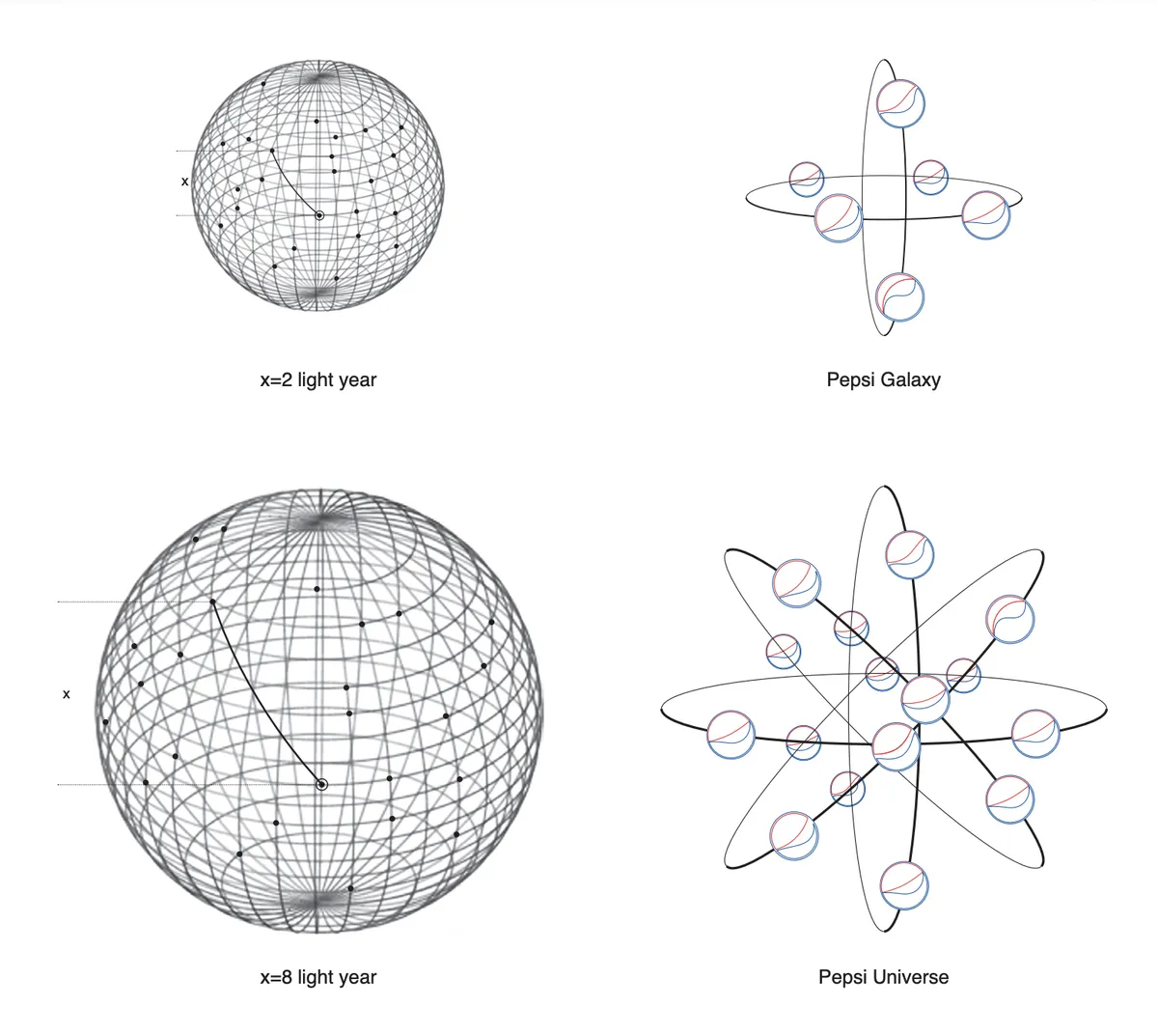
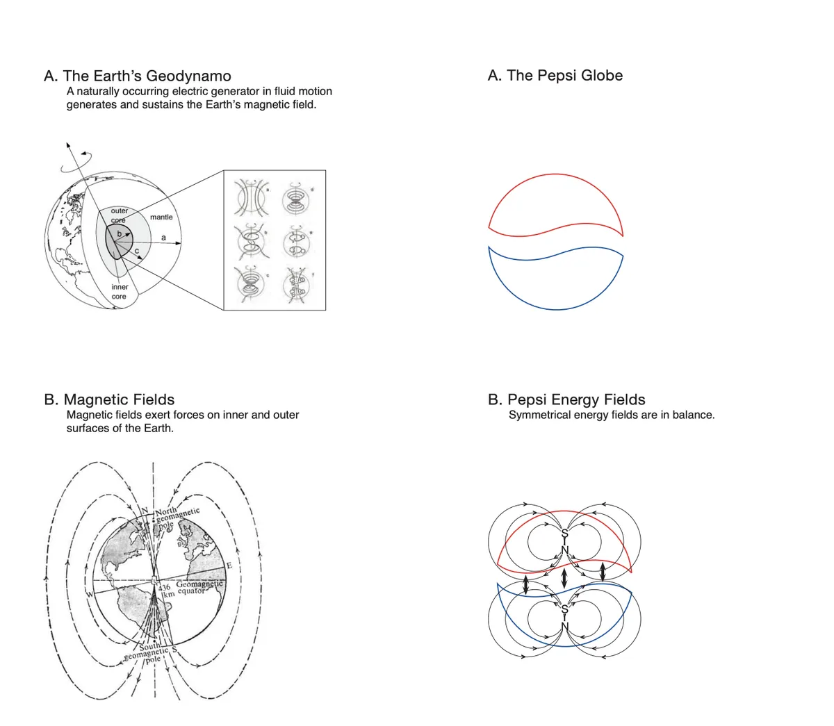
Read the story about the ridiculous Pepsi logo here (absolutely bollocks-loaded pseudo-scientific, phrenology-style horseshit):
https://www.goldennumber.net/wp-content/uploads/pepsi-arnell-021109.pdf[/QUOTE]
__________________
The whole problem with the world is that fools and fanatics are always so certain of themselves, and wiser people so full of doubts. (Bertrand Russell). Sweet Loretta fart thought she was a cleaner, but she was a frying pan. (John Lennon)
Reply With Quote
     
     
  #1025  
Old Posted Feb 8, 2024, 3:07 PM
phone's Avatar
phone phone is offline
Unregistered User
 
Join Date: Oct 2012
Location: Saskatoon
Posts: 745
Quote:
Originally Posted by MolsonExport View Post

I hate the thankfully now former Pepsi logo.


Much better now
Reply With Quote
     
     
  #1026  
Old Posted Feb 8, 2024, 3:28 PM
harls's Avatar
harls harls is offline
Mooderator
 
Join Date: Jan 2002
Location: Aylmer, Québec
Posts: 21,408
Reply With Quote
     
     
  #1027  
Old Posted Feb 8, 2024, 7:57 PM
harls's Avatar
harls harls is offline
Mooderator
 
Join Date: Jan 2002
Location: Aylmer, Québec
Posts: 21,408
Please, continue..


edit - aw.. xelebes deleted the spammer's post.
Reply With Quote
     
     
  #1028  
Old Posted Feb 8, 2024, 9:33 PM
MolsonExport's Avatar
MolsonExport MolsonExport is offline
Touching grass everyday.
 
Join Date: Oct 2003
Location: Otisburgh
Posts: 51,348
Quote:
Originally Posted by phone View Post


Much better now
yes, that is at least 1000 times better. I don't know why I hated the previous Pepsi logo...probably because that brand doesn't seem to know what it wants to be, and probably also due to the insane and preposterous horseshit that was part of the rebranding report. It was truly insane and preposterous horseshit.


https://www.creativebloq.com/news/never-forget-that-utterly-ridiculous-pepsi-logo-design-document
__________________
The whole problem with the world is that fools and fanatics are always so certain of themselves, and wiser people so full of doubts. (Bertrand Russell). Sweet Loretta fart thought she was a cleaner, but she was a frying pan. (John Lennon)
Reply With Quote
     
     
  #1029  
Old Posted Feb 8, 2024, 9:42 PM
phone's Avatar
phone phone is offline
Unregistered User
 
Join Date: Oct 2012
Location: Saskatoon
Posts: 745
You're just saying that because you're not part of the Pepsi Generation
Reply With Quote
     
     
  #1030  
Old Posted Feb 8, 2024, 9:46 PM
MolsonExport's Avatar
MolsonExport MolsonExport is offline
Touching grass everyday.
 
Join Date: Oct 2003
Location: Otisburgh
Posts: 51,348
Neither was Michael Jackson, even though he had his hair burned away for Pepsi.

https://www.youtube.com/watch?v=zY4J6qSUqFM

King of Pop? Definitely not the King of Soda Pop. Jackson expressed that he didn't really like Pepsi and had agreed with them on not holding a Pepsi can and not drinking Pepsi during the commercial because he didn't like it.
__________________
The whole problem with the world is that fools and fanatics are always so certain of themselves, and wiser people so full of doubts. (Bertrand Russell). Sweet Loretta fart thought she was a cleaner, but she was a frying pan. (John Lennon)
Reply With Quote
     
     
  #1031  
Old Posted Apr 14, 2026, 10:54 AM
megadude megadude is offline
Registered User
 
Join Date: Sep 2017
Location: N. York/Bram/Mark/Sauga/Burl/Oak/DT
Posts: 3,681
For Toronto’s new WNBA team. I like the colour and name,but the logo? That’s the best they could do?


https://www.instagram.com/p/DDMinhZRjL4/
Reply With Quote
     
     
  #1032  
Old Posted Apr 14, 2026, 11:04 AM
megadude megadude is offline
Registered User
 
Join Date: Sep 2017
Location: N. York/Bram/Mark/Sauga/Burl/Oak/DT
Posts: 3,681
And the Canadian PWHL teams. WTH Ottawa? Charge and Sceptres for the first two for those wondering.


Reply With Quote
     
     
  #1033  
Old Posted Apr 14, 2026, 12:57 PM
jonny24 jonny24 is offline
Registered User
 
Join Date: Aug 2017
Location: Caledonia, often in Hamilton and Norfolk
Posts: 1,734
Quote:
Originally Posted by megadude View Post
For Toronto’s new WNBA team. I like the colour and name,but the logo? That’s the best they could do?


https://www.instagram.com/p/DDMinhZRjL4/
It's just this, pretty much:


Only lacking the bare minimum of cleverness of it fitting into the letter.

Does the WNBA have the same rule as the NBA that logos must have a basketball in them? It comes off as incredibly cheesy.
__________________
Mods: Don't delete my posts without explaining why. I broke no rules. I wasn't inappropriate.

Don't ruin what is a good forum.
Reply With Quote
     
     
  #1034  
Old Posted Apr 14, 2026, 1:13 PM
J.OT13's Avatar
J.OT13 J.OT13 is offline
Moderator
 
Join Date: Mar 2012
Location: Ottawa
Posts: 28,869
Quote:
Originally Posted by megadude View Post
And the Canadian PWHL teams. WTH Ottawa? Charge and Sceptres for the first two for those wondering.
Yeah... not a fan of Ottawa's logo. Looks too much like a minor league version of the Calgary Flames' logo.
Reply With Quote
     
     
  #1035  
Old Posted Aug 21, 2026, 2:46 AM
megadude megadude is offline
Registered User
 
Join Date: Sep 2017
Location: N. York/Bram/Mark/Sauga/Burl/Oak/DT
Posts: 3,681
241 Pizza was way more popular in the 90s when I would frequent it. Now there aren't many left. I passed by a couple of stores the past few months and I really wonder why they went super simple with their newer logo. Like, the old one definitely needed to be replaced or updated, but the new one is literally opening up Microsoft Word, typing in the company name, changing the colour of three letters and calling it a day.




Reply With Quote
     
     
End
 
 
Reply

Go Back   SkyscraperPage Forum > Regional Sections > Canada
Forum Jump


Forum Jump


All times are GMT. The time now is 5:29 AM.


Powered by vBulletin® Version 3.8.7
Copyright ©2000 - 2026, vBulletin Solutions, Inc.