Not sure why the pics from
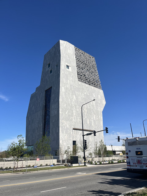
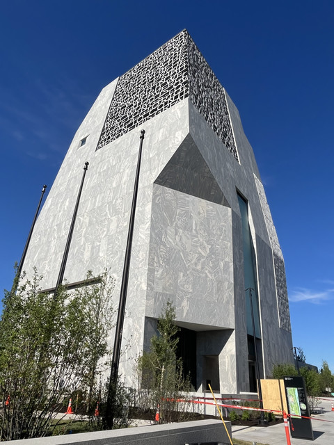
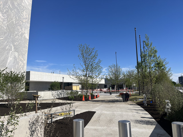
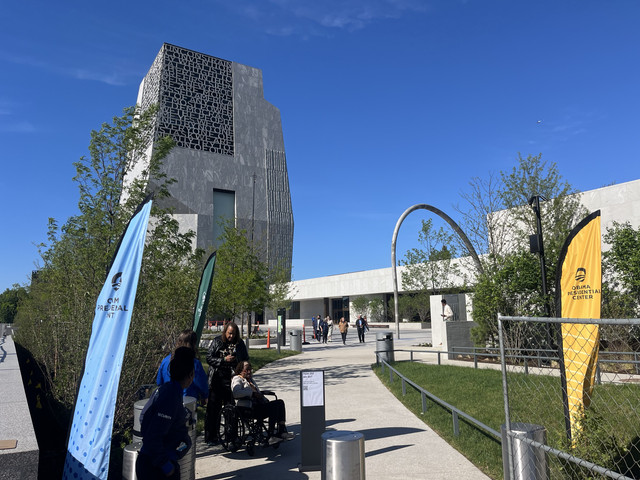
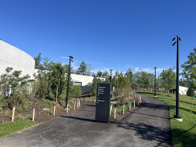
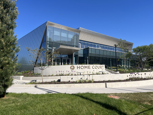
Lakeside Alliance's linkedin post aren't showing up on my end, but figured I'd reupload them here in case anyone else is having trouble seeing them:


It's turning out great. I love a good monolith, especially amidst trees and parkland-- and the asymmetrical design will reward walking around the grounds and seeing how it looks from different angles.
As for the lettering, it's typography-as-art. It's not a billboard-- it doesn't need to be immediately legible. It's a modern version of the way the ancient Greeks and Romans preferred the typography on their monuments: an imposing block of unpunctuated text that requires some focus and patience to read.





 Prev
Prev






 Linear Mode
