Quote:
Originally Posted by officedweller

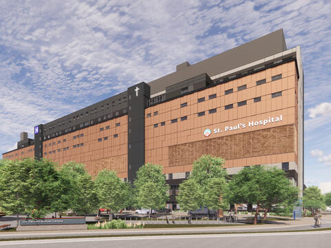
Wasn't that orange supposed to be copper?
I think it's a trend in Vancouver architecture generally.
There must be a generation that has a bias against clean simple modernist design (even a brutalist design like the Pattison Tower at VGH would look better than this) - or it's design by committee with multiple parties trying to 'have a voice' in the final design.
|
It was specified as built - the colour varies with the light. It's a metallic aluminum panel system - on an overcast day it reads as orange, but in sunlight, depending on the angle, it can vary from a pale to a quite dark bronze colour. It's also 3 dimensional - panels are thicker and thinner, but that variation isn't obvious from a distance. Similar (flat) paneling is on a West 6th
an industrial/office building in Mount Pleasant.
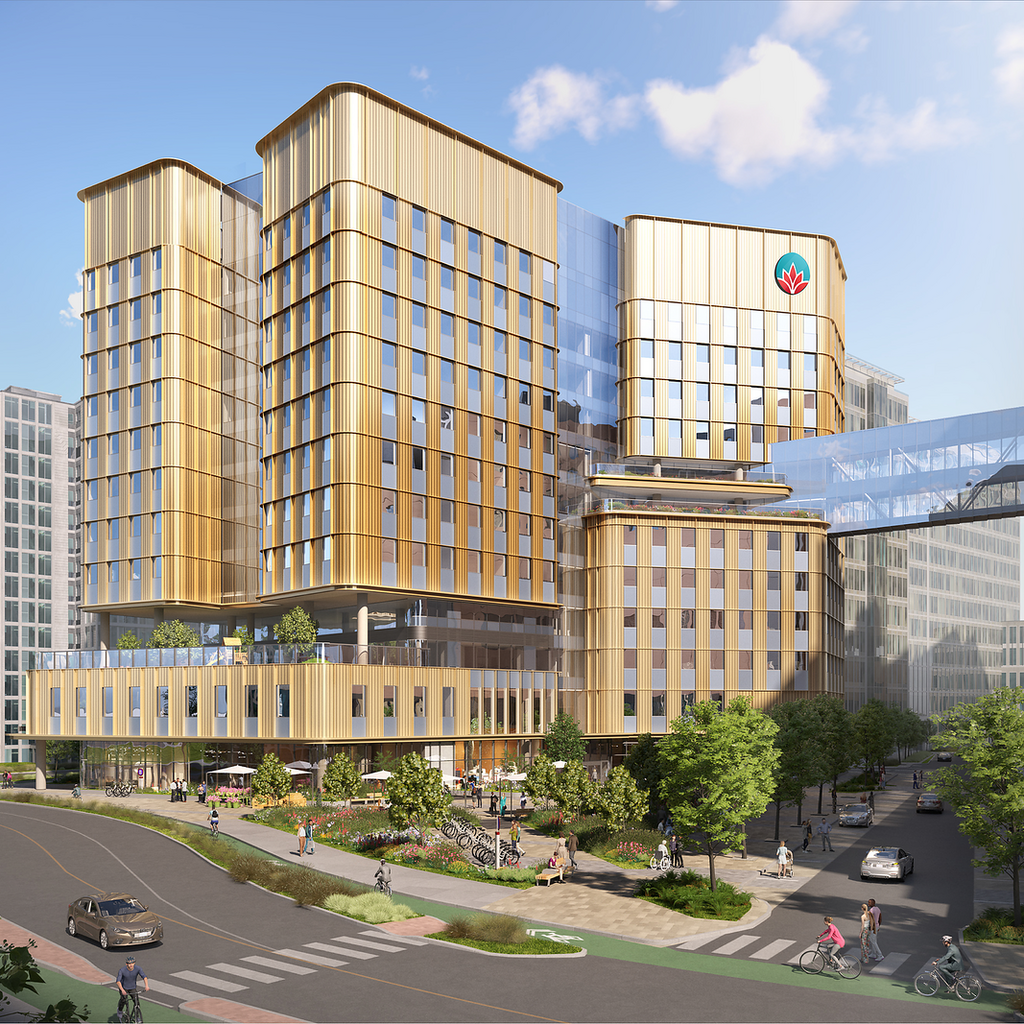
Brutalist concrete wouldn't perform to contemporary energy code - this is double rain screened and insulated inside and out. It has international architects, (HDR and Stantec) with a lot of experience of building hospital projects. One thing that makes the building much bigger, (but more earthquake proof), is the very tall third floor plant floor, with the black louvres. At this point they appear to have switched the colour from the earlier renders, when they matched a paler panel system. The current appearance certainly enhances the industrial feel, but that may not be how the final building will look (see the render above).





 Prev
Prev




 Linear Mode
