Quote:
Originally Posted by MIPS

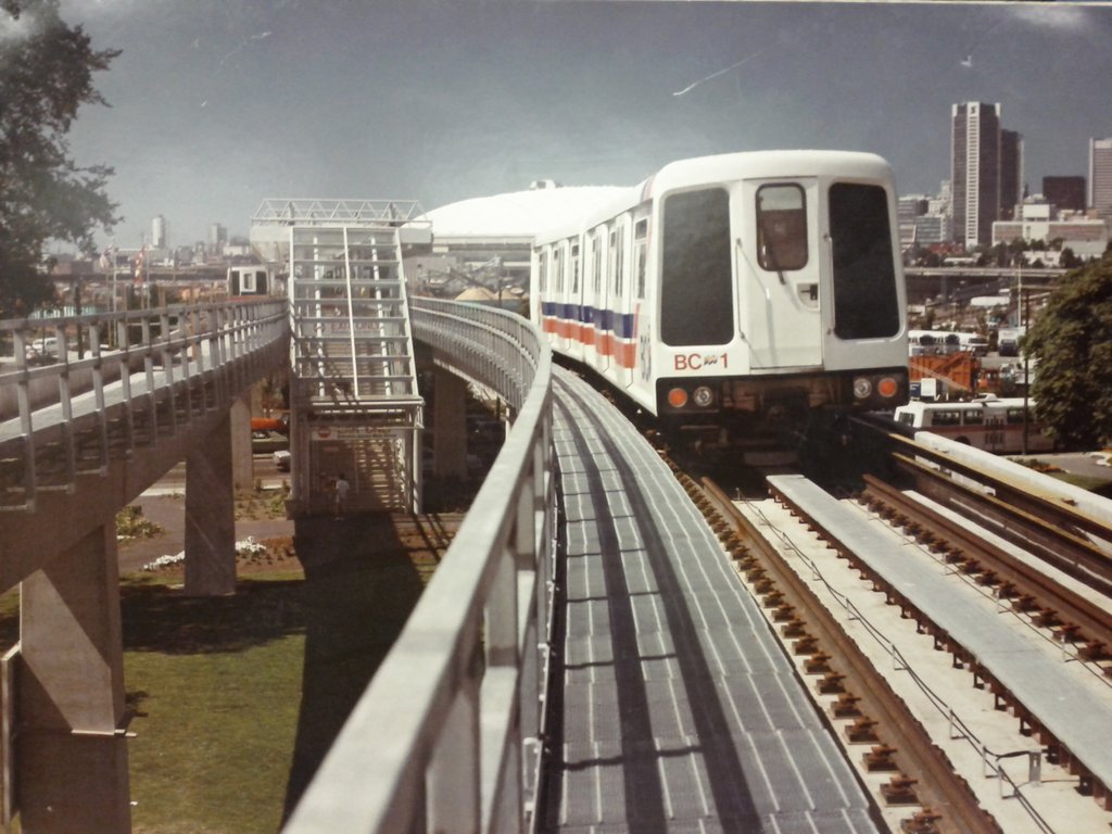
The problem is that the old color theme was selected to reflect BC Transit's own livery at the time which reflected the official provincial BC flag emblem which was adopted across multiple corporations in the BC public sector. It spanned across the entire transit system including wayfinding signage, street-level station signage and print literature. OMC may still have them but they used to have white storage totes painted in the same red/white/blue livery. None of that styling has been used in something like 25 years and TransLink's color theme has always been blue. The charcoal grey is used mainly to defer having to more routinely keep the cars washed.
|
Yea, I know. It's a colour scheme the province ran away from after the 00s, too, by and large.
Ultimately, the red and blue comes from the top half(union jack) of our flag, while the later blue-yellow is meant to reflect the lower half(waves and sunrise).
Still, whatever the politics, the organisation, the whatever, I just always loved the OG BC Transit colours more than the Translink ones.
Dishonourable mention, though, to the
newer BC Transit White-black-fucking
green colours you see in Abby and Victoria. That is just nasty-looking.


 To each his/her own.


 Linear Mode
