Quote:
Originally Posted by Sheepish

TV...I appreciate you engaging me on this.
There are some engaging bldings on Portage Ave...Hydro, Air Canada, and even the Investors and Canada Life Centre. But there is lots more dead space, including Portage Place.
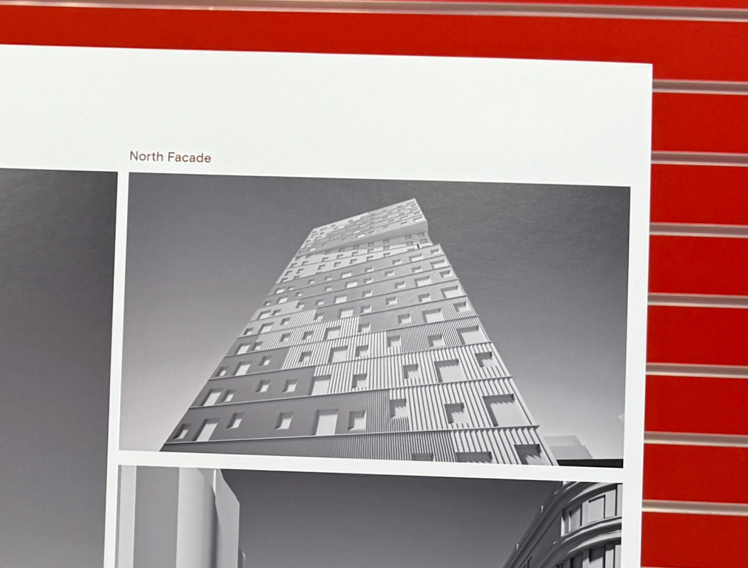
I completely agree that moving away from drab is key, and that indifference is the enemy. In this case, I am not indifferent to the rendering that has surfaced. Just because it is red, to me does not distract that it is otherwise pretty dull and lifeless. The building in Chicago, rises gracefully above other structures that line Michigan Ave, and is amongst other iconic structures (like the formally named Sears Tower). In that context, it works just fine. The rendering for Portage Place does not succeed in this...to my eyes and heart. It's flat, with tiny windows and no connection to the streetscape. Your buiding on Princess in the Marketland - similar in some ways - is more successful. Much like you argue about the Exchange District - I believe Portage Ave deserves better.
Again...thanks for the opportunity to engage.
|
No worries. I always appreciate the dialogue. I take no offence.
The rendering that was posted is not my favourite. It’s an awkward angle. But I totally understand some of your points. Especially if you were expecting a soaring glass tower. The far more expensive medical tower will be that, but it’s not a reality for affordable housing in Winnipeg.
Because of that, to be interesting and provocative, you have to try different things. You have to be more creative. Otherwise the building just fades into the background. In this case, a bold colour scheme that stands in stark contrast with the monochromatic city is an important move to create a visual landmark in the skyline. Much like the Chicago building, which is otherwise a dull modernist tower. This will of course elicit strong reaction both negative and positive.
Other moves to create interest are to incorporate a slice through the building that cantilevers the top floors and expresses the diagonal that Portage Avenue creates through the regular street grid of downtown. A composition of custom profile textured cladding creates patterns of light and shadow across the facade that change colour and expression as the sun moves through the sky. Random windows complement these textured patterns that read like pathways through a prairie grassland.
I’m not typically a random windows guy either but in this instance, it worked with the composition and texture of the cladding.





 Prev
Prev


 !). If Winnipeg was to house even have the concentration of interesting towers I wouldn't pay much attention. But given the otherwise mostly drab structure that line Portage, this doesn't move the needel. Second, the red building is also more interesting and alluring than the one in the redndering. Again...not here for a fight or argument...I just want to see something that is more thoughtful and intersting.




 Linear Mode
