HomeDiagramsDatabaseMapsForum About
     

Go Back   SkyscraperPage Forum > Urban Art > Google Sketchup


Reply

 
Thread Tools Display Modes
     
     
  #1  
Old Posted Nov 3, 2009, 10:22 PM
guyFROMtheBURGH guyFROMtheBURGH is offline
Registered User
 
Join Date: Dec 2007
Location: Allentown, PA
Posts: 178
The city of Monaca, Ohio

Monaca, Ohio is a new city I have been working on for quite some time. I thought now would be the best time to show some of my work. Although the city is much bigger than shown, I only want to show everyone 90%+ completed areas.

Please, any and all criticism is highly appreciated! I think you people on here are so awesome at what you design and can sketch, it's amazing!

I will try to update every 1 - 2 weeks. I am currently in college for civil engineering which really limits my time on here and it seems like the rest of my time goes into my fraternity (FIJI) and friends.

The downtown of the city is over a mile long, located along the shores of the Ohio river in the southeastern part of the state. Only a mountain is on the other side of the river currently and I think I intend on keeping it that way.

More details to follow!
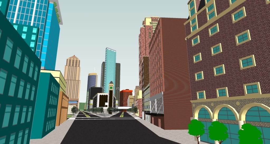


This view is looking down United (street), which splits to the right down Freedom Lane. The tall glass building is 110 Liberty East (banking building). Its height is 830' and is the tallest building in the city. (I intend on keeping it that way).
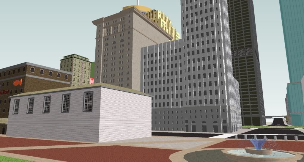


This view is from the waterfront walk (historic) with a water fountain at the intersection. To the left is the fish market and warehouse with a few historic buildings across the street. 110 Liberty East can be seen to the right.
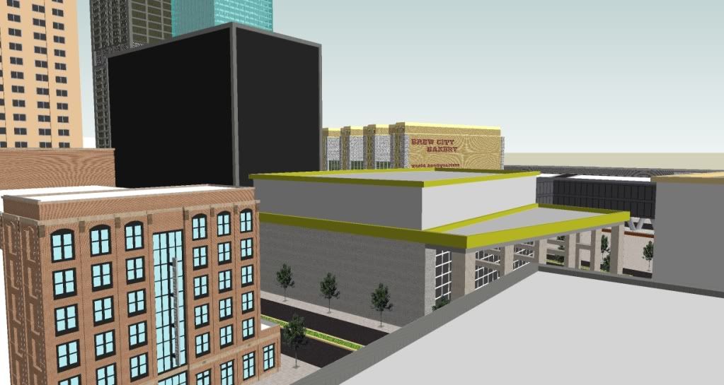


This view shows Fairfield inn & suites in the foreground on the left. You can see Brew City Bakery (WHQ) in the background. The city is renowned for its rich history for brewing beer although there is not too much of that left. (to be seen in future pictures) The black building is a government building (not finished).
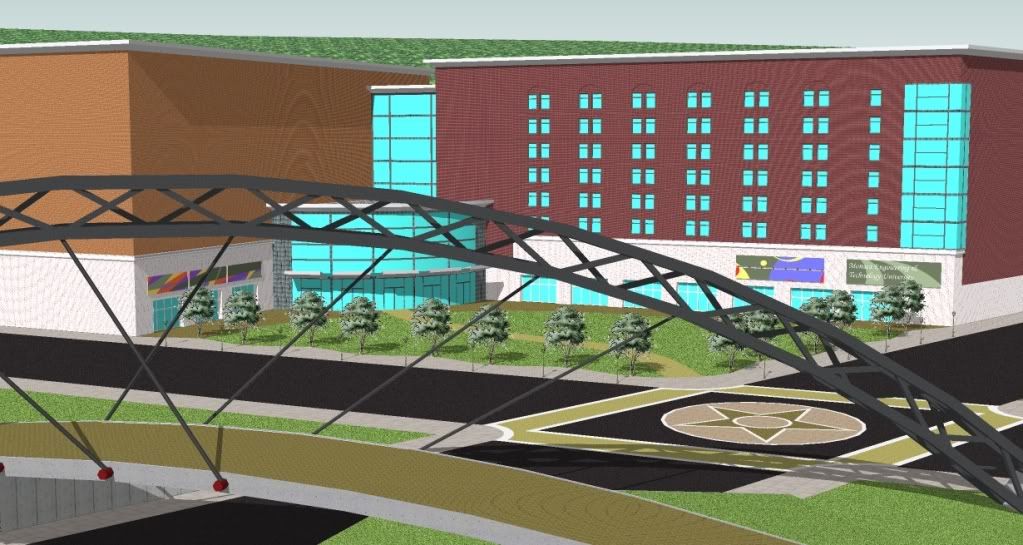


This is Monaca Tech (official name: Monaca Engineering & Technology University). You can see the pedestrian bridge in the foreground and the mountain on the other side of the river in the background.
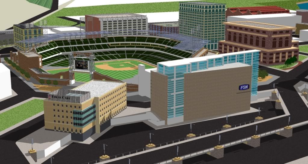


This is the baseball field. Cisco Field is the crown jewel of this area and began the revitalization of the area in the early 90's. It completely changed the look and feel of the east side around the train tracks and warehouses. It also prompted lofts to be converted.


More to come!
Please, any suggestions or comments are appreciated!

Last edited by guyFROMtheBURGH; Nov 4, 2009 at 12:09 AM.
Reply With Quote
     
     
  #2  
Old Posted Nov 3, 2009, 11:24 PM
BoiseAirport BoiseAirport is offline
Dare Mighty Things
 
Join Date: Jun 2005
Location: Boise, Idaho
Posts: 2,252
WOW! This city is off to an absolutely amazing start! Wonderfully done, I can't wait to see more!
__________________
BOISETOPIA is hibernating
Reply With Quote
     
     
  #3  
Old Posted Nov 4, 2009, 9:14 PM
toyota74 toyota74 is offline
Registered User
 
Join Date: Jan 2009
Location: Ireland
Posts: 1,739
.

Excellent,that stadium looks great in that area.

overall looks good bar that black building.
__________________
Photography Facebook page
Reply With Quote
     
     
  #4  
Old Posted Nov 4, 2009, 10:09 PM
OllyRogers OllyRogers is offline
Registered User
 
Join Date: Mar 2009
Posts: 91
Stadium alone gets 2 thumbs up from me!
Reply With Quote
     
     
  #5  
Old Posted Nov 4, 2009, 11:03 PM
Flamesrule Flamesrule is offline
Closed account
 
Join Date: Feb 2009
Location: Pastime- Calgary
Posts: 2,665
Nice stadium .Very mixed in the city!Can't wait for the city to turn out!
Reply With Quote
     
     
  #6  
Old Posted Nov 22, 2009, 8:36 AM
Vellu's Avatar
Vellu Vellu is offline
Registered User
 
Join Date: Jan 2009
Location: skyscraperless Finland
Posts: 784
A really great start! Please continue this! It looks realistic and I really like the city's atmossphere. And I think the mix of old and new buildings is really well balanced.
Reply With Quote
     
     
  #7  
Old Posted Nov 25, 2009, 8:18 AM
verticalextropy's Avatar
verticalextropy verticalextropy is offline
Registered User
 
Join Date: Sep 2007
Location: Buenos Aires
Posts: 1,304
Nice Broadway First Shot! Looking forward for more!
Reply With Quote
     
     
  #8  
Old Posted Jan 21, 2010, 5:16 PM
guyFROMtheBURGH guyFROMtheBURGH is offline
Registered User
 
Join Date: Dec 2007
Location: Allentown, PA
Posts: 178
update time!

Although I've been extremely busy lately, Ive managed to update a few areas of my city, mainly with highway and byways. Please let me know what you guys think!


Interchange between main highway intersecting the city and a few side streets:
Note that you can see the beginnings of the hospital in the background.


Interchange on west side of the city:
Note that neither of these interchange areas are nearly finished but I thought it would be better to show now so yins can suggest some ideas maybe


An update from the historic waterfront area:
I added the church you can see to the right and a building along the river.


An interesting corner building that will be surrounded with highrises. I think this building has enough interesting architecture to "stand up" with some taller competition, do you?


Here is my most recently completed piece of the puzzle. It's located across from the stadium and is supposed to look rather old but with a touch of class. I personally love the area around the stadium and have a few new ideas brewing up now .
Reply With Quote
     
     
  #9  
Old Posted Jan 21, 2010, 6:13 PM
Flamesrule Flamesrule is offline
Closed account
 
Join Date: Feb 2009
Location: Pastime- Calgary
Posts: 2,665
Nice!Great job.
Reply With Quote
     
     
  #10  
Old Posted Jan 21, 2010, 8:07 PM
Pingyao's Avatar
Pingyao Pingyao is offline
Registered User
 
Join Date: Sep 2007
Posts: 458
Realistic zoning and architecture here, good job. I love the classical American cities with brownstone buildings next to shiny glass. The freeway intersections look fine, personally i hate building flyovers and on ramps I don't know about you?
__________________
Check out my threads
Sta Fee - 3D city
Norscand - Geofictional city visuals
Reply With Quote
     
     
  #11  
Old Posted Jan 21, 2010, 9:22 PM
toyota74 toyota74 is offline
Registered User
 
Join Date: Jan 2009
Location: Ireland
Posts: 1,739
.

Nice sketching man!!Ilike all the freeways and flyovers but for me
the grey texture beneath them looks funny....maybe some landscaping
underneath would look better with some grass and maybe some curved
ponds etc.......but over all looking good
__________________
Photography Facebook page
Reply With Quote
     
     
  #12  
Old Posted Jan 21, 2010, 10:14 PM
guyFROMtheBURGH guyFROMtheBURGH is offline
Registered User
 
Join Date: Dec 2007
Location: Allentown, PA
Posts: 178
Pingyao: The classic American cities seem so hearty to me. Every time I drive or walk through a city with so much warmth, my jaw just drops. This is where I get most of my inspiration. The brick just seems so inviting to me. I'm glad you like it! Glass is extremely difficult to work with on sketchup for me actually. The flyovers were such a pain though! After all that work, I think it seems rather realistic though so the time was worth it


Toyota74: Thanks! The grey texture is temporary for me so that I can tell where the ground is as I build. I really wasn't sure what to do with it though. What type of landscaping are you thinking of for such an area?
Reply With Quote
     
     
  #13  
Old Posted Jan 31, 2010, 6:15 AM
Patrick's Avatar
Patrick Patrick is offline
Editor
 
Join Date: Aug 2003
Location: Phoenix, AZ
Posts: 4,612
A M A Z I N G, reminds me of Cleveland! I do see the Midwestern American City feel you are trying to get at here, Please do go on with Monaca
Reply With Quote
     
     
  #14  
Old Posted Jan 31, 2010, 4:36 PM
Dac150's Avatar
Dac150 Dac150 is offline
World Machine
 
Join Date: Sep 2006
Location: NY/CT
Posts: 6,749
Really great detailing and thought put into this city. Please continue to update when you have time.
__________________
"I'm going there, but I like it here wherever it is.."
Reply With Quote
     
     
  #15  
Old Posted Jan 31, 2010, 4:48 PM
sketchup_fan sketchup_fan is offline
Registered User
 
Join Date: Aug 2008
Posts: 79
Very, very, very american city, i love american cities, good job!
Reply With Quote
     
     
  #16  
Old Posted Feb 14, 2010, 8:36 AM
Vellu's Avatar
Vellu Vellu is offline
Registered User
 
Join Date: Jan 2009
Location: skyscraperless Finland
Posts: 784
Great job! This city is so detailed and has a lovely atmosphere. I especially love the fact that there's so many older buildings left.
Reply With Quote
     
     
  #17  
Old Posted Feb 14, 2010, 12:29 PM
Flamesrule Flamesrule is offline
Closed account
 
Join Date: Feb 2009
Location: Pastime- Calgary
Posts: 2,665
Very nice! I see a big City developing!
Reply With Quote
     
     
  #18  
Old Posted Apr 17, 2010, 1:01 AM
guyFROMtheBURGH guyFROMtheBURGH is offline
Registered User
 
Join Date: Dec 2007
Location: Allentown, PA
Posts: 178
finally an update!

Hey sketchup world, I've had some MAJOR issues recently. My computer crashed and I lost everything until my friend somehow accessed my hard drive LUCKILY! Therefore, Monaca is not lost. But, due to college kicking my ass recently, there is little progress...civil engineering homework and labs suck!

Anyway...enjoy these


Here's a view of a small office building with some pretty sweet row houses beside it. This is located across the street from the baseball field:


I absolutely loved making this...the detail is unreal cause I use all lines and components. It seems bland in the picture but there are so many layers and there are actually multiple buildings around the complex. This complex used to be a large bakery industrial place along the train tracks and right along the north edge of the city. But because of recent trends in industry moving out to the country where the land is cheaper, the bakery left and now its office space mixed with retail. Good to keep the old buildings (I can see this in Pittsburgh and Akron OH) The 2 places that I've lived.


Lastly, This shot was taken beside the hospital on the hill. The second oldest part of the hospital is situated on your left and an old town hall (from when there were small towns before the industry came). In the background, you can see the crosstown highway, Brew City Bakery on bottom, a residential tower on the right, 70's box building beside that, 110 Liberty East (glass building), and the granite building. any suggestions on names for it?
Reply With Quote
     
     
  #19  
Old Posted May 8, 2010, 9:50 AM
Vellu's Avatar
Vellu Vellu is offline
Registered User
 
Join Date: Jan 2009
Location: skyscraperless Finland
Posts: 784
I love the details and atmosphere in this city! I think the most important thing in making a great 3d city is that the maker really loves the city himself / herself. That he / she is its biggest fan. This city really shows that love.
Reply With Quote
     
     
  #20  
Old Posted Aug 26, 2010, 4:30 PM
guyFROMtheBURGH guyFROMtheBURGH is offline
Registered User
 
Join Date: Dec 2007
Location: Allentown, PA
Posts: 178
golf course

I saw that the forum was slow so I figured to get back to sketchup a bit. Since summer was in session, I've been in the golf mode so the plan is to have a country club near the city (urban).


I don't want to give too much away yet but it's going to look good in the upcoming days
Reply With Quote
     
     
This discussion thread continues

Use the page links to the lower-right to go to the next page for additional posts
 
 
Reply

Go Back   SkyscraperPage Forum > Urban Art > Google Sketchup
Forum Jump


Forum Jump


All times are GMT. The time now is 10:19 AM.

     
SkyscraperPage.com - Archive - Privacy Statement - Top

Powered by vBulletin® Version 3.8.7
Copyright ©2000 - 2024, vBulletin Solutions, Inc.