From Kamin's piece:
But as rendered, the tower looks leaden and crudely detailed, as though giant boxes had been piled atop one another, then squashed from above. There’s none of the lyrical fluidity of Aqua’s balconies. A tower this big and prominent must rise to a higher aesthetic level, as Trump’s eventually did after a woeful preliminary design.
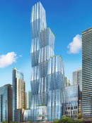
Still, there’s hope: One rendering of the project, visible online but not released by the city, shows a compelling close-up view: Three, crisply detailed towers with gracefully curving surfaces instead of stolid, folded planes. They suggest three sisters of different ages, standing side by side. The interior views are also enticing, promising big spaces, tilting columns and striking views of the river and nearby park.
Is he referring to the below rendering?
Quote:
Originally Posted by Via Chicago

|
IMO, Kamin's review is not his finest work. After his shameful aversion to the Lucas Museum, I'm growing a bit weary of his criticism. What, exactly, are his issues with the design? It seems like he devotes the majority of his review to the lack of emphasis on a connection between Wacker and Lakeshore East. To be fair, I, too, share his concern about just how compartmentalized and isolated the park is, and I agree that the dearth of renderings is surprising and disappointing. But that doesn't necessarily mean the design "needs work"; it means we need more information. And let's acknowledge some of the parameters: how many of us believe Magellan truly wants LSE to be easily accessible? My understanding is that the suburban nature of the site plan is intentional. Not that the city shouldn't push for something more integrated. It for sure should, and if the current design really does represent a missed opportunity (again, hard to tell based on what we have seen so far), then, yes, it would be smart for Rahm to leverage his influence over zoning to extract some concessions. Let's dispense, though, with the idea that this is a feature Studio Gang has much control over.
Moving from hypotheticals to the images he
does have, he just confuses me. If the online rendering he mentions is indeed the one posted by Via Chicago, then I simply don't understand how he fails to recognize it as the same design. And what are these "graceful curves" he's referring to? Speaking of which, his insistence on fluidity and aversion to blockiness leads me to believe he isn't speaking metaphorically and would prefer a design that's literally rounder. I don't disagree that there's a frustrating sketchiness to the main rendering, but reverting to the organic language of Aqua's balconies is not the solution. (I can't help but feel he's suggesting as much with that reference to Mies.)
Lastly: Wanda's neighbors are "bland"? To the east, for sure, but did he forget about Coast, Swissotel, and the soon-to-be-constructed GEMS upper school? I certainly hope so, because that's otherwise a serious lapse in taste.
Tsk, tsk, Blair.


 Prev
Prev


 Linear Mode
