Quote:
Originally Posted by Via Chicago

Once you start noticing this pattern you see it on every other new development. I have no clue what series of events in the past 10 years gave developers the idea this is the look that needs to be copied en masse. It's well out of style already if it ever was to begin with, just stop
|
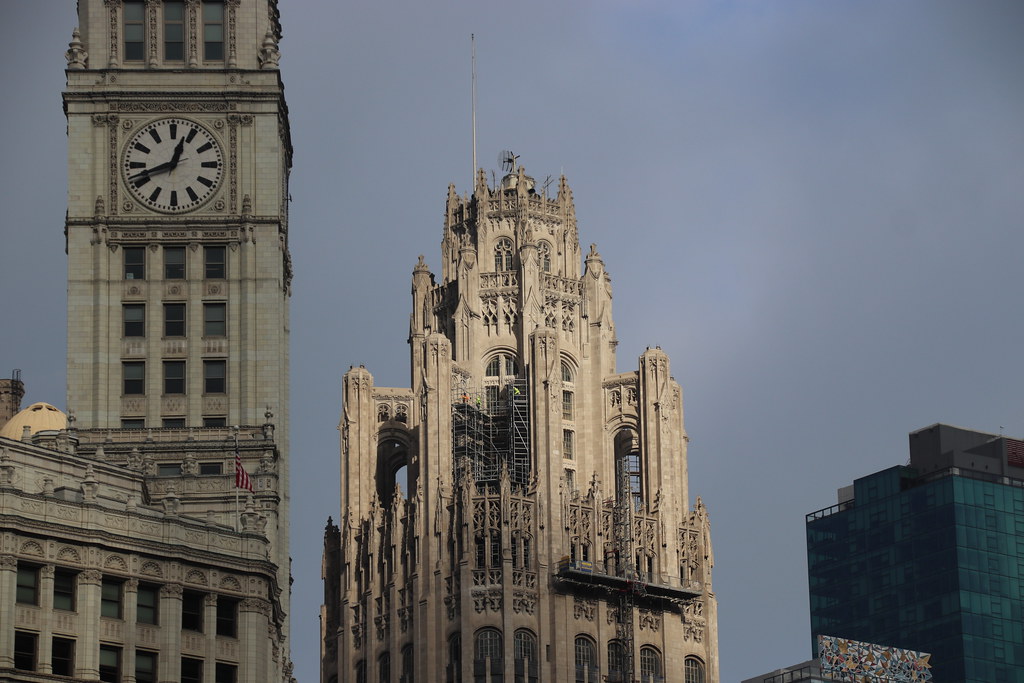
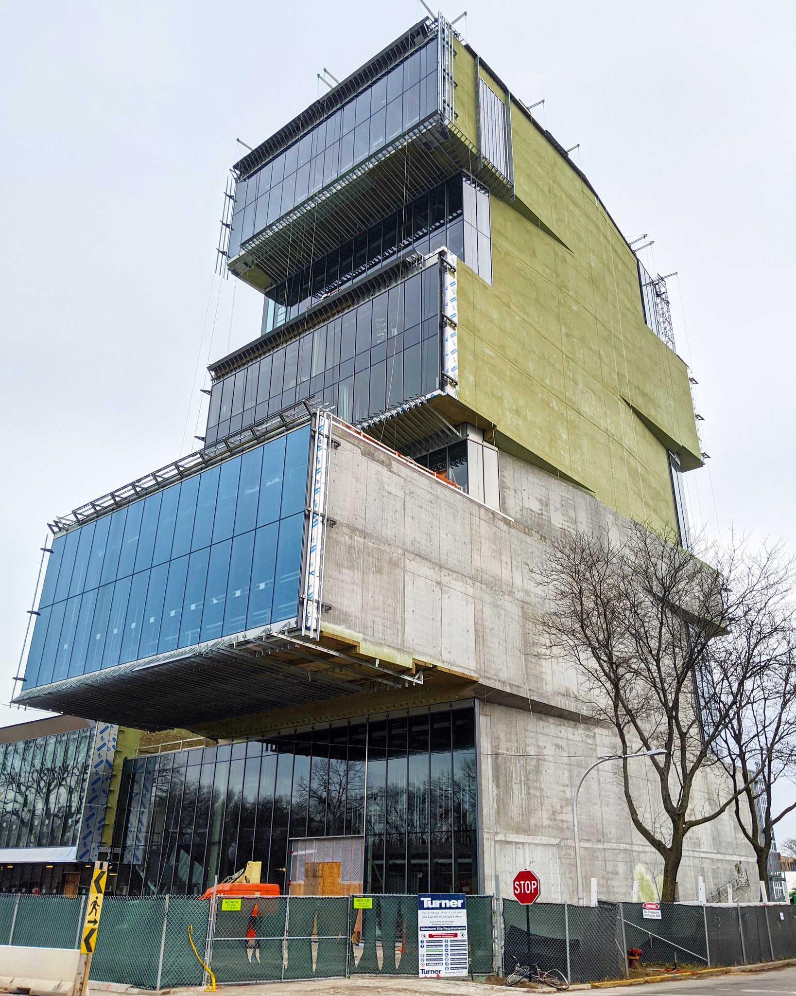
I don't mind the pattern, per se. The use of the pattern is the issue for me here. (although I generally prefer a lower contrast pattern). It is particularly disharmonious in relation to Willis tower — and its implementation weirdly breaks the clean structural lines of the addition. (why does the pattern on the second floor go the full height and cut through the spandrels?) It's whole use just looks ill considered. Commit to it or don't. I can imagine some middle manager looking and early renderings with just glass and steel and demanding that the architect add something to 'make it pop'…
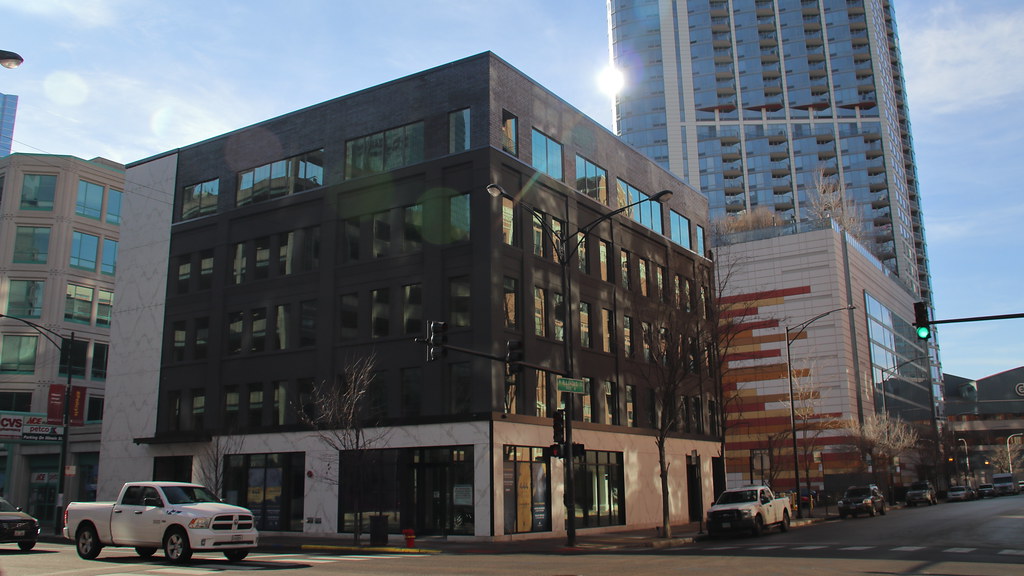
There are places it works. The subtle variation of the stone pattern on the new CNA tower looks good and looks like it is a part of a sort of inside-out lobby concept that uses good materials and craftsmanship (the chamfered edges on some of the stones are great).
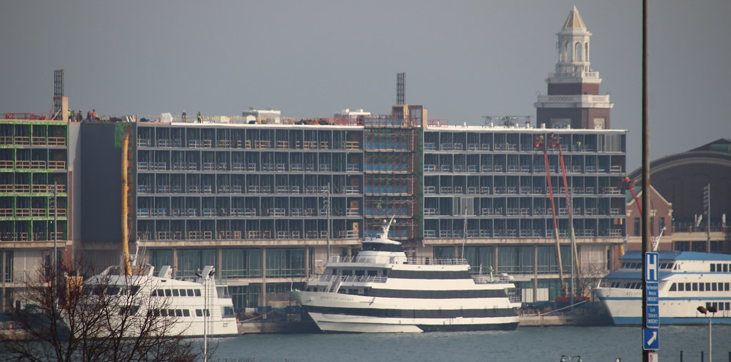
Similarly the large pattern (and again fairly subtle in contrast) on the side the Hilton Garden Inn on E Wacker is also very good and part of a great collection of various architectural styles/textures that makes for one of my favorite compositions in the city.


 Prev
Prev


 Linear Mode
