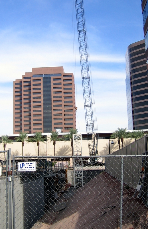
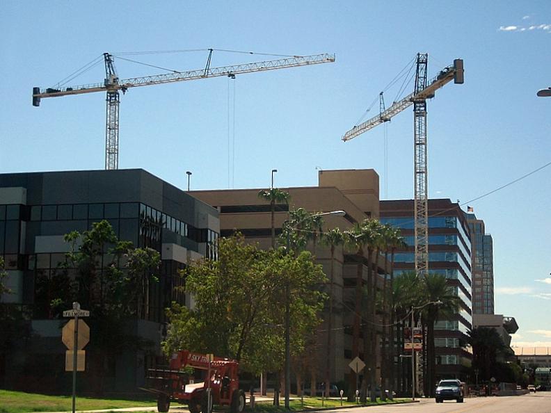
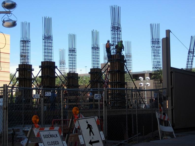
Maybe we should stick with this thread for the Sheraton since it has a more definitive title.

I'm glad that the thread was started with the renderings. Architectural renderings always make the project look glowing and other-wordly. These try to hide the fact that this hotel is a mediocre design at best (IMO). It already looks dated, and not in a good way! The hi-resolution photo on another thread shows the vertical walls between windows as alternating orange and gold. I think this color scheme is horrible ... something from the Michale Brady school of architecture, circa 1972.

The only thing I like about this hotel is the outward orientation of the ground floor public spaces. A couple of the interior shots show the floor to ceiling glass walls that look out to the street scene.
Other than that Mrs. Lincoln?
I really hate being negative as I was very excited when this project was first announced, but the city really missed the boat here. The Phoenix tax payers are spending a lot of money for this sucker and the design
could have and
should have been something special. I sure hope I'm wrong and I'll actually like it when its done...we shall see.


 Prev
Prev


 Vertex, I like Gumby, but you should pose him doing the splits since he's a pretty tall fella. You're dating yourself... I used to have a Gumby and a Poky when they were all the rage back in 60-something.


 Linear Mode
