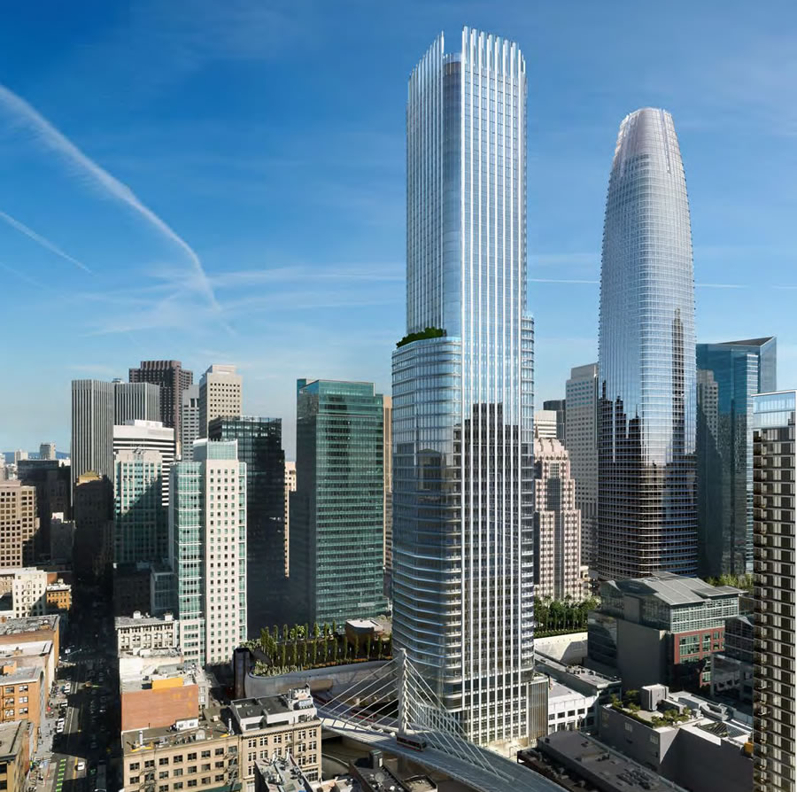
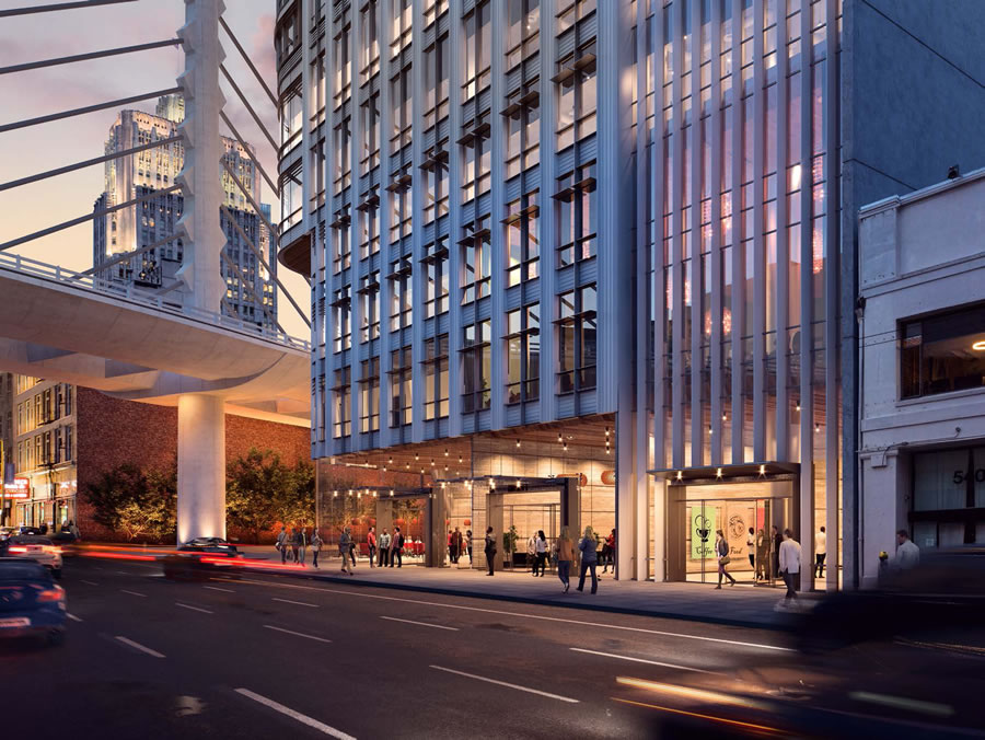
Graceful, yet not overpowering, with a good ratio of design elements to work with the height. Great base, and incorporation of what looks like a restaurant.
^ The glass curtain wall looks too similar to SF Tower's.
The archetype in SF for this intricate metal curtain wall type is the JP Morgan Building at 560 Mission, which has won a lot of praise from architects, and is becoming kind of a signiture of the Pelli firm.
While Pelli Clark Pelli are masters of the curtainwall, they are not as crafty at massing or shaping their skyscrapers - so far. The obelisk shape can't help them here. This is still a work in progress, so let's see what they come up with.
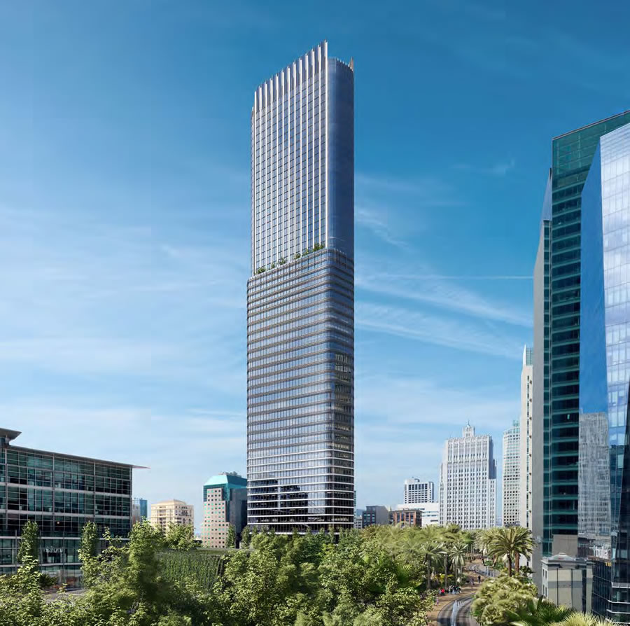
^^I like the renderings above on this page. They look Art Deco to me--kind of retro to the golden ages of skyscrapers in the 1930s and 1950s. Some may say that makes them imitative and something that's "been done" but beyond Timothy Pfleuger's couple of ornate buildings, we don't have much from that era in SF and nothing near so tall.
^^^I don't know if this is gold or brass trim, but this rendering actually reminds me more of Steampunk. I do also see a bit of Art Deco as well. I actually like it.
Last edited by SFView; Feb 9, 2017 at 5:51 AM.
Reason: missed another typo again...
As one of the four largest towers in the city, the Department recommends that the massing [ie, shape of the building] be more gently and iconically-shaped. The current massing asymmetry and steps might work as a formal strategy if repeated; as they only occur once within the most visible height of the tower, they seem episodic and less architecturally intentional.
The Department recommends that the project express significant façade depth, provide high-quality materials, and meet the architectural detailing and character of the neighborhood.
In other words, the current look is still more blocky and uniform than the city might prefer to see in such a huge and prominent structure.
^^These are the people who approved the Bank of America Building which for 4 or 5 decades has been the second most prominent form on the skyline, blockiness and all.
I think the Aon towers in LA and Chicago are exemplary and they are nothing but blocks. This stands out so much because there aren't many towers this tall in SF. I like the simple block shape of it. The square shapes can provide nice complements to the points and cone shapes of the other taller towers.
I could agree with this. Given its prominence, I think its in the best interest for the sake of aesthetics for it to be super stellar. Key word is "super" as it's quite stellar already. So long as they don't modify the current proposal too much as it looks stunning in its blocky form.
Quote:
The Department recommends that the project express significant façade depth, provide high-quality materials, and meet the architectural detailing and character of the neighborhood.
At least they like the proposal. Had they out flat rejected it, it would of been a problem. Hopefully they can modify it, and get this thing to hard cost stage ASAP.


 Prev
Prev


 ) and now this.


/cdn0.vox-cdn.com/uploads/chorus_asset/file/7952789/howard3.jpg)
/cdn0.vox-cdn.com/uploads/chorus_asset/file/7952795/howard1.jpg)

 All you need to know about this project in PDF

 Linear Mode
