Yea..I really don't enjoy seeing Circle K's simpler and less visually appealing logo plastered over Mac's. The whole Mac's logo was a pretty unique logo, something that could always be immediately identified by seeing the font or the creature. The owl may have been a tad fugly, but I enjoyed it as a kid and still do.
There's still two locations I know of with a Mac's branding....one along Eglinton Ave in Midtown Toronto, and another right near Mississauga's "downtown".
Going back to the thread at hand...I kind of like the logo of 7-11...it's a simple blend of three colours that makes a concise logo.
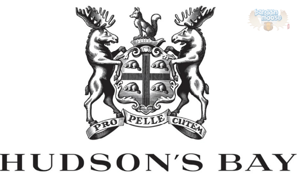
And....one logo that I could never understand as a kid was the Hudson's Bay logo. I always misinterpreted the squiggle as either a B or an M...though part of me enjoys the logo for being a tad unreadable yet a tad elegant. The new logo is nice with the two moose and all...I'm alright with it.
Former Hudson's Bay logo (1960-2013)

Newer Hudson's Bay logo (2013-present)


 Prev
Prev


 Linear Mode
