HomeDiagramsDatabaseMapsForum About
     

Go Back   SkyscraperPage Forum > Regional Sections > United States > Pacific West > Portland > Downtown & City of Portland


Reply

 
Thread Tools Display Modes
     
     
  #41  
Old Posted Dec 5, 2014, 7:17 AM
zilfondel zilfondel is offline
Submarine de Nucléar
 
Join Date: Mar 2006
Location: Missouri
Posts: 4,477
Quote:
Originally Posted by maccoinnich View Post
Looking at how the units are arranged in plan, I'm fairly confident that wont be blank facade.

As much as I'm recoiling at the facade treatment, I'm more concerned about the massing. A 15 story U-shaped building is going to be very very bulky.
Agreed; I don't see how you could have that much of the building's envelope be blank walls... would make a lot of unleasable space for residential use. I would guess they didn't finish their (crappy) sketchup model before submitting it.


This would be one of the bulkiest buildings in downtown, if built. Look how it dwarfs the Harrison towers and everything else!

Gah, is there any design intent in this thing? Sky lobbies like the recent PSU dorm? Internal circulation or hangout spaces???
Reply With Quote
     
     
  #42  
Old Posted Dec 5, 2014, 8:06 AM
Derek Derek is offline
Registered User
 
Join Date: Aug 2006
Location: Portland, OR
Posts: 9,546
Aside from the strangely blank wall facing the courtyard, I love it. There's nothing tall-ish in Portland being built right now that really pushes architectural boundaries. I feel like this project isn't big enough to make a huge impact on the skyline, but it'll definitely get people talking when they see it at ground level (if it looks anything like the rendering). Obviously reactions will be mixed, but hey, keep Portland weird.
__________________
Portlandia
Reply With Quote
     
     
  #43  
Old Posted Dec 5, 2014, 8:58 AM
urbanlife's Avatar
urbanlife urbanlife is offline
A before E
 
Join Date: Aug 2001
Location: Milwaukie, Oregon
Posts: 11,784
I have a feeling we will see this building change a lot during the design process to the final built building.
Reply With Quote
     
     
  #44  
Old Posted Dec 5, 2014, 9:01 AM
maccoinnich maccoinnich is online now
Moderator
 
Join Date: Jan 2009
Location: Portland
Posts: 7,405
They have their first Design Advice hearing next week. Audio is normally posted to Efiles shortly afterwards. I'll be very curious to listen and find out how it went.
__________________
"Maybe to an architect, they might look suspicious, but to me, they just look like rocks"

www.twitter.com/maccoinnich
Reply With Quote
     
     
  #45  
Old Posted Dec 5, 2014, 8:49 PM
ablerock's Avatar
ablerock ablerock is offline
Registered User
 
Join Date: Jan 2007
Posts: 153
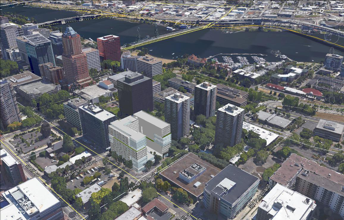
This building looks like a timid, lazy-man's version of a SHoP Architects-inspired design (1, 2, 3), what with all the different facades and pseudo modules. SHoP knocks it out of the park though, whereas this just feels underdeveloped and boringly awkward. It's just so huge and basically a square! At least they could vary the height to give the roofline some interest. And be less timid about varying the facade depth. (again see links above)

The huge grocery will be awesome for that area, though.

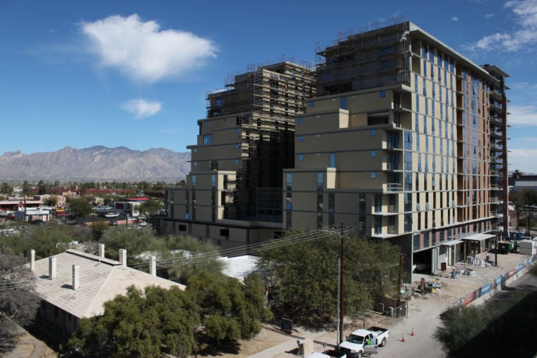
This "Hub on Campus" thing is on other campuses in the US as well. I guess it's a newish development package concept? http://huboncampus.com
__________________
http://matthaledesign.com
Reply With Quote
     
     
  #46  
Old Posted Dec 5, 2014, 10:27 PM
mmeade mmeade is offline
Registered User
 
Join Date: Dec 2008
Location: Portland
Posts: 171
Quote:
Originally Posted by maccoinnich View Post
They have their first Design Advice hearing next week. Audio is normally posted to Efiles shortly afterwards. I'll be very curious to listen and find out how it went.
I was looking forward to David Keltner's comments on this building as he was on the design team for Cyan/pdx. It looks like his commission expired in November, so he may not be part of the review. That is a shame.
Reply With Quote
     
     
  #47  
Old Posted Dec 13, 2014, 8:13 PM
maccoinnich maccoinnich is online now
Moderator
 
Join Date: Jan 2009
Location: Portland
Posts: 7,405
This had a first Design Advice hearing this session. There were major concerns about the massing raised by the Bureau of Development Services, the three Commissioners present and members of the public who testified. University Pointe was mentioned more than once, and Ben Kaiser admitted that he regretted voting to approve it. Unfortunately, I'm not really sure how the design team can resolve this. A taller, more slender building would undeniably be more elegant, but they're maxed out on height, and the zoning code doesn't allow bonuses or modifications to height in this location.

Other concerns included: whether green walls are an appropriate response to the ground level elevation at the Halprin sequence, given their history of not performing well; the location and configuration of the loading dock / garage entry; and overall building elevations, and whether the various pattern shifts were just a graphic device or actually represented something going on in the building.
__________________
"Maybe to an architect, they might look suspicious, but to me, they just look like rocks"

www.twitter.com/maccoinnich
Reply With Quote
     
     
  #48  
Old Posted Dec 14, 2014, 2:27 AM
zilfondel zilfondel is offline
Submarine de Nucléar
 
Join Date: Mar 2006
Location: Missouri
Posts: 4,477
What? bonuses aren't allowed at this site?

That really sucks. No FAR transfers possible?
Reply With Quote
     
     
  #49  
Old Posted Dec 14, 2014, 3:00 AM
maccoinnich maccoinnich is online now
Moderator
 
Join Date: Jan 2009
Location: Portland
Posts: 7,405
The FAR is 6:1, but is bonusable to 9:1 with housing, which is what they're doing. The height limit is 175', and I don't think they're eligible for any option to increase that.
__________________
"Maybe to an architect, they might look suspicious, but to me, they just look like rocks"

www.twitter.com/maccoinnich
Reply With Quote
     
     
  #50  
Old Posted Dec 14, 2014, 4:19 PM
soleri soleri is offline
Registered User
 
Join Date: Jun 2005
Posts: 4,246


I saw this Hub student housing in Tucson last year and, as you can see, it's hideous. The problem with this kind of proposal cannot be solved by adding floors while reducing the overall bulkiness. The bulk is its economic premise. If it looks cheap, it's for a reason, not just because the architects are uninspired. Hub has tweaked this basic design by adding color, offsets, appliqués, etc., but it's unlikely to change the core concept: lots of units, cheaply constructed, and overpriced. The only question I have is whether a compromise is possible with this kind of business model.
Reply With Quote
     
     
  #51  
Old Posted Feb 18, 2015, 3:29 AM
maccoinnich maccoinnich is online now
Moderator
 
Join Date: Jan 2009
Location: Portland
Posts: 7,405
Design Advice Request #2 drawings [PDF, 42 MB]. Has not substantially improved.
__________________
"Maybe to an architect, they might look suspicious, but to me, they just look like rocks"

www.twitter.com/maccoinnich
Reply With Quote
     
     
  #52  
Old Posted Feb 18, 2015, 6:13 AM
QAtheSky QAtheSky is offline
Registered User
 
Join Date: Dec 2014
Posts: 104


The renderings and sketches do not really make it look very appealing. Its looks... disorganized?
Reply With Quote
     
     
  #53  
Old Posted Feb 18, 2015, 7:12 AM
zilfondel zilfondel is offline
Submarine de Nucléar
 
Join Date: Mar 2006
Location: Missouri
Posts: 4,477
Quote:
Originally Posted by QAtheSky View Post


The renderings and sketches do not really make it look very appealing. Its looks... disorganized?
I can't believe how massive the building is. Just a large, mass of building. Doesn't really have anything else going on there - just leasable space with enough access to air and natural daylight. Funny it only has a FAR of 9 though - wonder if they will qualify for the +3 bonus?

Oh look, Myhre Group - big surprise there. HPA's work, on the other hand, reminds me of modernist works ala SOM. Wonder if they are trying to do some sort of weird massing like one of Koolhaas' offset tower blocks.

Last edited by zilfondel; Feb 18, 2015 at 7:23 AM.
Reply With Quote
     
     
  #54  
Old Posted Feb 18, 2015, 7:34 AM
urbanlife's Avatar
urbanlife urbanlife is offline
A before E
 
Join Date: Aug 2001
Location: Milwaukie, Oregon
Posts: 11,784
It kind of makes me wish they would just go with a bland design....maybe something in beige.
Reply With Quote
     
     
  #55  
Old Posted Feb 18, 2015, 7:53 AM
zilfondel zilfondel is offline
Submarine de Nucléar
 
Join Date: Mar 2006
Location: Missouri
Posts: 4,477
Actually, after reading through their PDF, I think the detailing of the facade may be decent. They seem to have a good grasp of materiality and facade detailing... their list of Portland precedents includes a number of nearby university buildings (for better or worse) - they've done their homework. The facade is all metal panel and fully glazed; the envelope is pretty fleshed out in their elevations but not the 3d model. The banding in the middle and the massing is pretty odd, tho - it does seem too hectic compared to their portfolio.

Also, their landscape architect seems to have done a bang-up job in designing a match for the pedestrian street along Montgomery, so that is *really* good news.
Reply With Quote
     
     
  #56  
Old Posted Feb 18, 2015, 7:57 AM
urbanlife's Avatar
urbanlife urbanlife is offline
A before E
 
Join Date: Aug 2001
Location: Milwaukie, Oregon
Posts: 11,784
Quote:
Originally Posted by zilfondel View Post
Actually, after reading through their PDF, I think the detailing of the facade may be decent. They seem to have a good grasp of materiality and facade detailing... their list of Portland precedents includes a number of nearby university buildings (for better or worse) - they've done their homework. The facade is all metal panel and fully glazed; the envelope is pretty fleshed out in their elevations but not the 3d model. The banding in the middle and the massing is pretty odd, tho - it does seem too hectic compared to their portfolio.

Also, their landscape architect seems to have done a bang-up job in designing a match for the pedestrian street along Montgomery, so that is *really* good news.
That at least sounds good, I didn't stop to read through the pdf.
Reply With Quote
     
     
  #57  
Old Posted Feb 18, 2015, 3:23 PM
bvpcvm bvpcvm is online now
Registered User
 
Join Date: Apr 2004
Location: Portland
Posts: 2,788
Maybe it's just artistic license, but in the rendering it looks like 3rd (and maybe 2nd) have been returned to vehicular traffic. Is that in some plan I'm unaware of? I hope not.
Reply With Quote
     
     
  #58  
Old Posted Feb 19, 2015, 12:58 AM
2oh1's Avatar
2oh1 2oh1 is offline
9-7-2oh1-!
 
Join Date: May 2007
Location: downtown Portland
Posts: 2,486
Quote:
Originally Posted by bvpcvm View Post
Maybe it's just artistic license, but in the rendering it looks like 3rd (and maybe 2nd) have been returned to vehicular traffic. Is that in some plan I'm unaware of? I hope not.
I was confused by that too. They're showing intersections where there can't possibly be any. 3rd & Harrison? 2nd & Harrison? Not a chance.
Reply With Quote
     
     
  #59  
Old Posted Feb 19, 2015, 8:22 AM
davehogan davehogan is offline
Registered User
 
Join Date: May 2008
Location: Portland OR
Posts: 639
Quote:
Originally Posted by 2oh1 View Post
I was confused by that too. They're showing intersections where there can't possibly be any. 3rd & Harrison? 2nd & Harrison? Not a chance.
Maybe they mixed up the pedestrian crossings with being actual intersections? Looking closely, at least at 3rd, it looks like a few parking spots maybe?

With a streetcar stop right there it's more likely just a mistake, but maybe there will be right in/right out parking there or something?
Reply With Quote
     
     
  #60  
Old Posted Feb 20, 2015, 6:19 PM
ORNative ORNative is offline
Registered User
 
Join Date: Aug 2014
Posts: 262
Design Review Commission

Yesterday HUB gave its presentation on the modified design to the Design Review Commission. I had opportunity to drop in several times during the course of the presentation and testimony. While I am not sold on the design, the speakers appeared thoughtful and considerate of the suggestions previously made by the Commission. The neighbors, however, were not appeased.

There was a parade of individuals testifying against the design, and one individual whose comments were endorsed by 65 others. Among their concerns were: Lot line - unlike other towers in the neighborhood which are set back and surrounded by landscaped, park-like grounds, HUB builds up from the property lines with little regard for landscaping. The landscaped areas of the building are internal and for exclusive use of residents. It does not create a public space, but instead a gated community feel; Massing - the building mass will cast a significant shadow on neighborhood parks, potentially damaging the vegetation and impacting park use. Neighbors recommended a study on the impact of the shadow, not just the amount of shadow.

Interestingly, neighbors appeared to prefer a taller, slimmer building. The primary opposition was to full-block massing of the structure. At least from those whom I heard testify.
Reply With Quote
     
     
This discussion thread continues

Use the page links to the lower-right to go to the next page for additional posts
 
 
Reply

Go Back   SkyscraperPage Forum > Regional Sections > United States > Pacific West > Portland > Downtown & City of Portland
Forum Jump


Forum Jump


All times are GMT. The time now is 4:41 PM.

     
SkyscraperPage.com - Archive - Privacy Statement - Top

Powered by vBulletin® Version 3.8.7
Copyright ©2000 - 2024, vBulletin Solutions, Inc.